Advanced customization
EARLY ACCESS
This feature is released as Early Access.
Advanced Customization gives you full control over your Live Chat widget's design and behavior on a per-theme basis. Each theme can include multiple customization capabilities:
- Styles: Override CSS variables to change colors, dimensions, spacing, and visibility of widget elements.
- Fonts: Load custom web fonts (Google Fonts, Adobe Fonts, or self-hosted) to match your brand's typography.
Each capability is configured inside the theme object in JSON.
With advanced customization enabled, you can change the widget’s appearance at runtime using the set_theme SDK command.
To enable advanced customization:
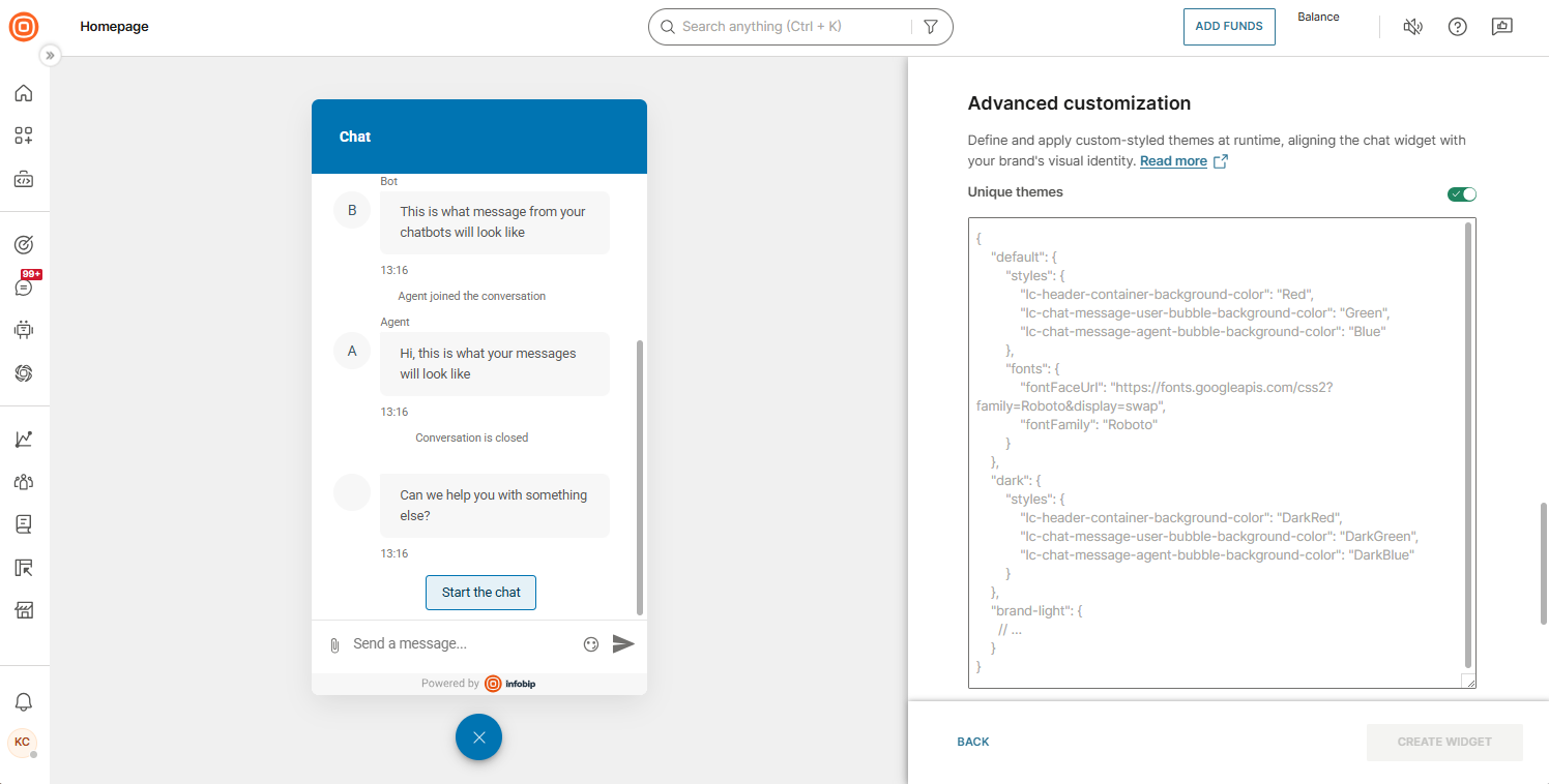
- Go to your widget's configuration page.
- Find the Themes section → Advanced customization and enable Unique themes.
Customization configuration structure [#customization-configuration-structure]
Themes are defined using a JSON object with the following structure:
The first-level keys, in this case default and my-theme, are the names of your themes. You will use these names as arguments with the set_theme command.
Each theme object can include:
- Styles: CSS variable key-value pairs. Specify only the variables you want to override.
- Fonts: Custom font configuration. If present, both fontFaceUrl and fontFamily are required.
All properties within a theme are optional. A theme with no Fonts object uses Roboto as the built-in default.
default theme is always required.Below is a working sample configuration:
Setting a theme [#setting-a-theme]
To apply a specific theme to your Live Chat widget, use the set_theme SDK command.
You can call the command either before initializing the widget and the widget will render with the theme already applied, or after the widget is loaded and the theme will update immediately.
In case of an error (for example, an invalid JSON structure or using a theme that does not exist), the widget will keep the previously set theme, or revert to the default CSS variable values.
default theme, you do not need to call the set_theme command. The default theme is automatically applied to a widget with advanced customization.Styles [#styles]
You can customize the appearance of your Live Chat widget by adjusting its CSS properties through a set of supported CSS variables. This allows you to easily modify elements such as background colors, dimensions, or the visibility of certain features.
Supported CSS variables [#supported-css-variables]
The names of all supported CSS variables follow the atomic design methodology, which organizes styling in a structured, modular way.
Each CSS variable is declared based on the following pattern:
lc-{section}-{organism}-{molecule}-{atom}
lc- Indicates Live Chat.section- Refers to the larger part of the widget (header, chat, footer, etc.).organism- Corresponds to a significant component or area within a section (form, carousel, thread item, etc.).molecule- Represents a specific group within the organism (header title, avatar, bubble, etc.).atom- The smallest visual element affected (background-color, padding, border-radius, etc.).
Below you will find a comprehensive list of all currently supported CSS variables, along with their names, impacted styles, and default values.
General [#general-supported-css-variables]
lc-brand-background-color - represents the color selected on the widget configuration page under Theme. The primary color is used by other CSS variables as the default value (default: the one set on the widget configuration page)
lc-brand-text-color - represents the color selected on the widget configuration page under Theme. The primary text color is used by other CSS variables as the default value (default: the one set on the widget configuration page)
lc-chat-background-color - represents the color selected on the widget configuration page under Theme. The background color is used by other CSS variables as the default value (default: the one set on the widget configuration page)
lc-focus-outline-color - represents the color selected for the focus outline (default: #5d72c2)
lc-focus-outline - represents the focus outline on elements (default: 2px solid $lc-focus-outline-color)
The variables lc-focus-outline-color and lc-focus-outline are linked to our accessibility support. Make changes with caution. To disable the outline, set "lc-focus-outline": "none" in the theme setup.
Use the lc-focus-outline variable to disable focus outlines when required by a specific client. This setting is not recommended for general use, as it does not comply with accessibility standards.
Container [#container-supported-css-variables]
lc-widget-wrapper-loading-background-color - sets the background color of the container loading widget (default: lc-chat-background-color)
lc-widget-wrapper-loading-spinner-color - sets the color of spinner in container that is loading widget (default: lc-brand-background-color)
lc-widget-wrapper-width - sets the width of the widget wrapper (default: 360px)
lc-widget-wrapper-height - sets the height of the widget wrapper (default: calc(100vh - 120px))
lc-widget-wrapper-max-height - sets the maximum height of the widget wrapper (default: 640px)
lc-widget-wrapper-border-radius - sets the border radius of the widget wrapper (default: 8px)
lc-widget-wrapper-box-shadow - sets the box shadow of the widget wrapper (default: rgba(0, 0, 0, 0.25) 0 4px 16px)
lc-widget-wrapper-y-position - sets the vertical position of the widget wrapper (default: 100px)
lc-widget-wrapper-x-position - sets the horizontal position of the widget wrapper (default: 20px)
lc-widget-button-width - sets the width of the widget button (default: 60px)
lc-widget-button-height - sets the height of the widget button (default: 60px)
lc-widget-button-position-y - sets the vertical position of the widget button (default: 20px)
lc-widget-button-position-x - sets the horizontal position of the widget button (default: 20px)
lc-widget-button-background-color - sets the background color of the widget button (default: lc-brand-background-color)
lc-widget-button-border-radius - sets the border radius of the widget button (default: 50%)
lc-widget-button-box-shadow - sets the box shadow of the widget button (default: rgba(0, 0, 0, 0.25) 0 4px 16px)
lc-widget-button-close-icon-color - sets the color of the Close icon in the widget button (default: lc-brand-text-color)
lc-widget-unread-messages-counter-width - sets the width of the unread messages counter (default: 23px)
lc-widget-unread-messages-counter-height - sets the height of the unread messages counter (default: 23px)
lc-widget-unread-messages-counter-top - sets the top position of the unread messages counter (default: -3px)
lc-widget-unread-messages-counter-right - sets the right position of the unread messages counter (default: -4px)
lc-widget-unread-messages-counter-color - sets the color of the unread messages counter (default: lc-brand-text-color)
lc-widget-unread-messages-counter-background-color - sets the background color of the unread messages counter (default: #e0283e)
lc-widget-unread-messages-counter-border-radius - sets the border radius of the unread messages counter (default: 50%)
Header [#header-supported-css-variables]
lc-header-container-height - sets the height of the widget header (default: 80px)
lc-header-container-padding - sets the padding from individual header elements (default: 20px)
lc-header-container-background-color - sets the background color of the widget header (default: lc-brand-background-color)
lc-header-container-border-bottom - sets properties for the bottom border of the widget header (default: none)
lc-header-container-item-gap - sets the gap between header elements (navigation button, title, avatar; default: 10px)
lc-header-thread-list-nav-bar-color - sets the color of the button icon navigating to the thread list in the multi-thread widget (default: lc-brand-text-color)
lc-header-logo-width - sets the width of the widget logo (default: 40px)
lc-header-logo-height - sets the height of the widget logo (default: 40px)
lc-header-logo-margin - sets the margins for the widget logo (default: (0px 0px))
lc-header-logo-border-radius - sets the border radius for the widget logo (default: 50%)
lc-header-title-color - sets the text color of the widget title (default: lc-brand-text-color)
lc-header-title-font-size - sets the font size of the widget title (default: 16px)
lc-header-title-font-weight - sets the font weight of the widget title (default: bold)
lc-header-close-button-visibility - sets the visibility of the Close button if there is one present in the header; by default, it is only shown on mobile-sized screens (default: hidden)
lc-header-close-button-width - sets the width of the Close button (default: 40px)
lc-header-close-button-height - sets the height of the Close button (default: 40px)
lc-header-close-button-color - sets the icon color of the Close button (default: lc-brand-text-color)
Chat [#chat-supported-css-variables]
lc-chat-message-bubble-margin - sets the margin around the message bubble (default: (0, 0, 8px, 0))
lc-chat-message-bubble-padding - sets the padding around the message bubble (default: (12px 20px))
lc-chat-message-bubble-text-color - sets the color of the text in the message bubble; it is used for agent/user bubble text color when they are not defined
lc-chat-message-user-bubble-text-color - sets the color of the text in the user message bubble (default: lc-brand-text-color)
lc-chat-message-user-bubble-background-color - sets the background color of the user message bubble (default: lc-brand-background-color)
lc-chat-message-user-bubble-border-radius - sets the border radius of the user message bubble (default: (8px 2px 8px 8px))
lc-chat-message-agent-bubble-text-color - sets the color of the text in the agent message bubble (default: #000)
lc-chat-message-agent-bubble-background-color - sets the background color of the agent message bubble (default: #f7f7f7)
lc-chat-message-agent-bubble-border-radius - sets the border radius of the user message bubble (default: (2px 8px 8px 8px))
lc-chat-message-bubble-send-time-color - sets the margin around the first message bubble (it overrides lc-chat-message-bubble-margin) (default: 0, 0, 4px, 0)
lc-chat-message-bubble-middle-margin - sets the margin around the middle message bubble(s) (it overrides lc-chat-message-bubble-margin) (default: 0, 0, 4px, 0)
lc-chat-message-bubble-last-margin - sets the margin around the last message bubble (it overrides lc-chat-message-bubble-margin) (default: 0, 0, 4px, 0)
lc-chat-message-bubble-first-margin - sets the color of the send time below the message bubble (default: #737376)
lc-chat-message-bubble-agent-name-color - sets the color of the agent name next to the message bubble (default: #737376)
lc-chat-message-bubble-resend-button-color - sets the color of the Resend button in case the message was not sent successfully (default: lc-brand-text-color)
lc-chat-agent-typing-indicator-first-color - sets the color of the first color in the "Agent typing" indicator animation (default: #d8d8d8)
lc-chat-agent-typing-indicator-second-color - sets the color of the second color in the "Agent typing" indicator animation (default: #b0b0b0)
lc-chat-agent-typing-indicator-circle-color - sets the color of the circle in the "Agent typing" indicator animation (default: #b0b0b0)
lc-chat-agent-avatar-name-text-color - sets the color of the agent name text in the avatar (default: #3d5869)
lc-chat-agent-avatar-name-background-color - sets the color of the agent name background in the avatar (default: #f7f7f7)
lc-chat-time-divider-text-color - sets the color of the time divider text (default: #979797)
lc-chat-carousel-background-color - sets the background color of the carousel (default: none)
lc-chat-carousel-message-border-radius - sets the border radius of the carousel message item (default: 4px)
lc-chat-carousel-message-background-color - sets the background color of the carousel message item (default: #F7F7F7)
lc-chat-quickreply-button-background-color - sets the background color of the quick reply buttons (default: color-mix(in srgb, lc-brand-background-color 10%, transparent))
lc-chat-quickreply-button-background-color-hover - sets the background color of the quick reply buttons when hovered over (default: lc-brand-background-color)
lc-chat-quickreply-button-border - sets the border properties of the quick reply buttons (default: 1px solid lc-brand-background-color)
lc-chat-quickreply-button-border-hover - sets the border properties of the quick reply buttons when hovered over (default: lc-chat-quickreply-button-border)
lc-chat-quickreply-button-border-radius - sets the border radius of the quick reply buttons (default: 4px)
lc-chat-quickreply-button-color - sets the text color of the quick reply buttons (default: lc-brand-background-color-darker)
lc-chat-quickreply-button-color-hover - sets the text color of the quick reply buttons when hovered over (default: lc-brand-text-color)
lc-chat-scrollbar-background-color - sets the color of the scrollbar (default: inherit)
lc-chat-scrollbar-background-color-hover - sets the color of the scrollbar when hovered over (default: lc-chat-scrollbar-background-color)
lc-chat-scrollbar-border - sets the border properties of the scrollbar (default: 5px solid transparent)
lc-chat-scrollbar-border-hover - sets the border properties of the scrollbar when hovered over (default: lc-chat-scrollbar-border)
lc-chat-scrollbar-border-radius - sets the border radius of the scrollbar (default: 16px)
lc-chat-scrollbar-box-shadow - sets the box shadow of the scrollbar (default: inset 0 0 100px 100px rgba(0, 0, 0, 0.3))
lc-chat-scrollbar-box-shadow-hover - sets the box shadow of the scrollbar when hovered over (default: lc-chat-scrollbar-box-shadow)
lc-chat-scrollbar-width - sets the width of the scrollbar (default: 16px)
lc-chat-loading-spinner-fill-color - sets the fill color of the loading spinner (default: lc-brand-text-color)
lc-chat-loading-spinner-stroke-color - sets the stroke color of the loading spinner (default: lc-brand-background-color)
Footer [#footer-supported-css-variables]
lc-footer-container-background-color - sets the background color of the widget footer (default: lc-chat-background-color)
lc-footer-start-chat-button-background-color - sets the background color of the Start New Chat button used in multi-thread widgets (default: lc-brand-background-color)
lc-footer-start-chat-button-color - sets the text color of the Start New Chat button used in multi-thread widgets (default: lc-brand-text-color)
lc-footer-start-chat-text-color - sets the color of information text explaining why the Start New Chat button is visible, for example, when a conversation is closed (default: #545454)
lc-footer-attachment-icon-hover-background-color - sets the background color of the attachment button when hovered over (default: #f5f5f5)
lc-footer-attachment-icon-color - sets the color of the attachment icon (default: #B4B4B4)
lc-footer-attachment-icon-selected-color - sets the color of the attachment icon after the user selects an attachment they intend to send (default: lc-brand-background-color)
lc-footer-attachment-background-color - sets the background color of the component representing the attachment ready to be sent by the user (default: lc-brand-background-color)
lc-footer-attachment-color - sets the text color of the component representing an attachment ready to be sent by the user (default: lc-brand-text-color)
lc-footer-send-button-color - sets the color of the Send Message button (default: lc-brand-background-color)
lc-footer-send-button-disabled-color - sets the color of the Send Message button while it is disabled, for example, when a message input is empty (default: #B4B4B4)
lc-footer-emoji-picker-icon-hover-background-color - sets the background color of the emoji picker button when hovered over (default: #f5f5f5)
lc-footer-emoji-picker-icon-color - sets the color of the emoji picker (default: #72716F)
lc-footer-emoji-picker-icon-selected-color - sets the color of the emoji picker when the emoji picker modal is open (default: lc-brand-background-color)
lc-footer-emoji-picker-color - sets the text color in the emoji picker menu (default: #222427)
lc-footer-emoji-picker-border-color - sets the border color of the emoji picker menu (default: #d9d9d9)
lc-footer-emoji-picker-background-color - sets the background color of the emoji picker menu (default: lc-chat-background-color)
lc-footer-emoji-picker-search-color - sets the search color of the text in the emoji search component (default: lc-footer-emoji-picker-color)
lc-footer-emoji-picker-search-border-color - sets the border color of the emoji search component (default: lc-footer-emoji-picker-border-color)
lc-footer-emoji-picker-search-background-color - sets the background color of the emoji search component (default: lc-footer-emoji-picker-background-color)
lc-footer-emoji-picker-search-icon-color - sets the search icon color in the emoji search component (default: lc-footer-emoji-picker-color)
lc-footer-emoji-picker-search-no-result-color - sets the color of information text displaying that no emoji within search parameter was found (default: #B4B4B4)
lc-footer-emoji-hover-background-color - sets the emoji background color in the picker menu that is currently hovered (default: #f5f5f5)
lc-footer-start-chat-button-border-radius - sets the border radius for the 'Start new chat' button (default: 4px)
lc-footer-container-padding - sets the padding of the widget footer (default: 10px 10px)
lc-footer-container-margin - sets the margin of the widget footer (default: 0)
lc-footer-container-border-top - sets the top border of the widget footer (default: solid 1px rgba(0, 0, 0, 0.1))
lc-footer-input-container-background-color - sets the background color of the input container in the widget footer (default: lc-chat-background-color)
lc-footer-input-container-padding - sets the padding of the input container in the widget footer (default: 0)
lc-footer-input-container-margin - sets the margin of the input container in the widget footer (default: 0)
lc-footer-input-container-gap - sets the gap between elements in the input container in the widget footer (default: 5px)
lc-footer-message-input-width - sets the width of the message input in the widget footer (default: 100%)
lc-footer-message-input-padding - sets the padding of the message input in the widget footer (default: 3px 0)
lc-footer-message-input-margin - sets the margin of the message input in the widget footer (default: 0)
lc-footer-message-input-font-size - sets the font size of the message input in the widget footer (default: 15px)
lc-footer-message-input-font-weight - sets the font weight of the message input in the widget footer (default: normal)
lc-footer-message-input-font-style - sets the font style of the message input in the widget footer (default: normal)
lc-footer-message-input-line-height - sets the line height of the message input in the widget footer (default: 24px)
lc-footer-message-input-background-color - sets the background color of message input (default: lc-chat-background-color)
lc-footer-message-input-min-lines - sets the minimum number of lines for input, when combined with
lc-footer-message-input-line-height, defines the minimum height for input (default: 1)
lc-footer-message-input-max-lines - sets the maximum number of lines for input, when combined with
lc-footer-message-input-line-height, defines the maximum height for input (default: 5)
lc-footer-message-input-color - sets the message input color (default: black)
lc-footer-attachment-button-width - sets the width of the attachment button in the widget footer (default: 30px)
lc-footer-attachment-button-height - sets the height of the attachment button in the widget footer (default: 30px)
lc-footer-attachment-button-padding - sets the padding of the attachment button in the widget footer (default: 0)
lc-footer-attachment-button-margin - sets the margin of the attachment button in the widget footer (default: 0)
lc-footer-attachment-button-border-radius - sets the border radius of the attachment button in the widget footer (default: 50%)
lc-footer-attachment-button-background-color - sets the background color of the attachment button in the widget footer (default: inherit)
lc-footer-attachment-button-display - sets the display property of the attachment button in the widget footer (default: flex)
lc-footer-send-button-width - sets the width of the Send Message button in the widget footer (default: 30px)
lc-footer-send-button-height - sets the height of the Send Message button in the widget footer (default: 30px)
lc-footer-send-button-padding - sets the padding of the Send Message button in the widget footer (default: 0)
lc-footer-send-button-margin - sets the margin of the Send Message button in the widget footer (default: 0)
lc-footer-send-button-background-color - sets the background color of the Send Message button in the widget footer (default: inherit)
lc-footer-attachment-container-padding - sets the padding of the attachments preview container in the widget footer (default: 0)
lc-footer-attachment-container-margin - sets the margin of the attachments preview container in the widget footer (default: 10px 0)
lc-footer-attachment-min-width - sets the minimum width of the attachment preview in the widget footer (default: 130px)
lc-footer-attachment-min-height - sets the minimum height of the attachment preview in the widget footer (default: 30px)
lc-footer-attachment-padding - sets the padding of the attachment preview in the widget footer (default: 0)
lc-footer-attachment-margin - sets the margin of the attachment preview in the widget footer (default: 0)
lc-footer-attachment-border - sets the border of the attachment preview in the widget footer (default: solid 1px #e4e4e4)
lc-footer-attachment-border-radius - sets the border radius of the attachment preview in the widget footer (default: 4px)
lc-footer-attachment-font-size - sets the font size of the attachment preview in the widget footer (default: 14px)
lc-footer-attachment-font-weight - sets the font weight of the attachment preview in the widget footer (default: normal)
lc-footer-attachment-font-style - sets the font style of the attachment preview in the widget footer (default: normal)
lc-footer-attachment-image-max-width - sets the maximum width of the image attachment preview in the widget footer (default: 150px)
lc-footer-attachment-image-max-height - sets the maximum height of the image attachment preview in the widget footer (default: 250px)
lc-footer-attachment-image-border-radius - sets the border radius of the image attachment preview in the widget footer (default: 4px)
lc-footer-attachment-document-max-width - sets the maximum width of the document attachment preview in the widget footer (default: 300px)
lc-footer-attachment-document-padding - sets the padding of the document attachment preview in the widget footer (default: 0)
lc-footer-attachment-document-margin - sets the margin of the document attachment preview in the widget footer (default: 0 32px 0 6px)
lc-footer-attachment-detach-icon-top - sets the top position of the detach icon in the attachment preview in the widget footer (default: 6px)
lc-footer-attachment-detach-icon-right - sets the right position of the detach icon in the attachment preview in the widget footer (default: 6px)
lc-footer-attachment-detach-icon-background-color - sets the background color of the detach icon in the attachment preview in the widget footer (default: rgba(0, 0, 0, 0.5))
lc-footer-attachment-detach-icon-color - sets the color of the detach icon in the attachment preview in the widget footer (default: #FFFFFF)
lc-footer-error-stack-gap - sets the gap between individual error messages (default: 4px)
lc-footer-error-stack-margin - sets the margin of the error stack in the widget footer (default: 4px 0 0 0)
lc-footer-error-message-width - sets the width of the error messages in the widget footer (default: 90%)
lc-footer-error-message-padding - sets the padding of the error messages in the widget footer (default: 2px 0px 0px 0px)
lc-footer-error-message-margin - sets the margin of the error messages in the widget footer (default: 0px 0px 0px 5px)
lc-footer-error-message-gap - sets the gap between elements in the error messages in the widget footer (default: 12px)
lc-footer-error-message-color - sets the color of the error messages in the widget footer (default: #c84714)
lc-footer-error-message-border-top - sets the top border of the error messages in the widget footer (default: solid 1px)
lc-footer-start-chat-container-gap - sets the gap between elements in the "Start chat" container in the widget footer (default: 10px)
lc-footer-start-chat-container-padding - sets the padding of the "Start chat" container in the widget footer (default: 0px)
lc-footer-start-chat-container-margin - sets the margin of the "Start chat" container in the widget footer (default: 0px)
lc-footer-start-chat-container-background-color - sets the background color of the "Start chat" container in the widget footer (default: lc-chat-background-color)
lc-footer-start-chat-text-background-color - sets the background color of the "Start chat" text in the widget footer (default: lc-chat-background-color)
lc-footer-start-chat-text-padding - sets the padding of the "Start chat" text in the widget footer (default: 5px 0px)
lc-footer-start-chat-text-margin - sets the margin of the "Start chat" text in the widget footer (default: 0px)
lc-footer-start-chat-text-font-size - sets the font size of the "Start chat" text in the widget footer (default: 15px)
lc-footer-start-chat-text-font-weight - sets the font weight of the "Start chat" text in the widget footer (default: normal)
lc-footer-start-chat-text-font-style - sets the font style of the "Start chat" text in the widget footer (default: normal)
lc-footer-start-chat-button-width - sets the width of the Start Chat button in the widget footer (default: 85%)
lc-footer-start-chat-button-height - sets the height of the Start Chat button in the widget footer (default: 48px)
lc-footer-start-chat-button-padding - sets the padding of the Start Chat button in the widget footer (default: 0px)
lc-footer-start-chat-button-margin - sets the margin of the Start Chat button in the widget footer (default: 0px)
lc-footer-start-chat-button-border-radius - sets the border radius of the Start Chat button in the widget footer (default: 4px)
lc-footer-start-chat-button-font-size - sets the font size of the Start Chat button in the widget footer (default: 15px)
lc-footer-start-chat-button-font-weight - sets the font weight of the Start Chat button in the widget footer (default: normal)
lc-footer-start-chat-button-font-style - sets the font style of the Start Chat button in the widget footer (default: normal)
Survey [#survey-supported-css-variables]
lc-survey-content-flex-direction - sets the survey type content flex direction (default: column)
lc-survey-content-font-size - sets the survey content font size (default: 4vw)
lc-survey-content-gap - sets a gap between the survey content elements (default: 20px)
lc-survey-content-padding - sets the padding of the survey content (default: 10px)
lc-survey-modal-background-color - sets the background color of the survey modal window (default: lc-chat-background-color)
lc-survey-modal-flex-direction - sets the flex direction of elements inside the survey modal window (default: column)
lc-survey-modal-padding - sets the padding of the survey modal window (default: 5px)
lc-survey-user-rating-item-background-color - sets the background color of the user rating button option (thumbs up, thumbs down) (default: lc-chat-background-color)
lc-survey-user-rating-item-box-shadow - sets the box shadow of the user rating button options (default: 0 1px 3px 1px rgba(0, 0, 0, 0.1))
lc-survey-user-rating-item-box-shadow-hover - sets the hover box shadow of the user rating button options (default: 0 1px 3px 1px rgba(0, 0, 0, 0.2))
lc-survey-user-rating-item-icon-color - sets the color of the icon on the user rating button option (default: lc-brand-background-color)
lc-survey-user-rating-item-negative-background-color - sets the background color of the negative user rating button option (default: lc-chat-background-color)
lc-survey-user-rating-item-negative-icon-color - sets the color of the icon of the negative user rating button option (default: lc-brand-background-color)
lc-survey-user-rating-item-padding - sets the padding of the user rating button options (default: 10px 20px)
lc-survey-user-rating-item-selected-background-color - sets the background color of the user rating button option when selected by the user (default: lc-brand-background-color)
lc-survey-user-rating-item-selected-icon-color - sets the color of the icon on the user rating button option when selected by the user (default: lc-brand-text-color)
lc-survey-user-rating-options-gap - sets a gap between the user rating button options (default: 20px)
lc-survey-user-rating-options-flex-direction - sets a flex direction of the user rating button options (default: row)
lc-survey-user-rating-options-justify-content - sets the justify content type of the user rating button options (default: center)
lc-survey-user-input-width - sets the width of the user feedback input (default: 100%)
lc-survey-user-input-line-height - sets the line height of the user feedback input (default: 24px)
lc-survey-user-input-min-lines - sets the minimum number of lines for feedback input, when combined with
lc-survey-user-input-line-height, defines the minimum height for feedback input (default: 2)
lc-survey-user-input-max-lines - sets the maximum number of lines for feedback input, when combined with
lc-survey-user-input-line-height, defines the maximum height for feedback input (default: 7)
lc-survey-user-input-padding - sets the padding for the user feedback input (default: 3px)
lc-survey-user-input-background-color - sets the user feedback input background color (default: white)
lc-survey-submit-button-align-self - aligns the Submit Survey button position in a horizontal direction (default: center)
lc-survey-submit-button-background-color - sets the background color of the Submit Survey button (default: lc-brand-background-color)
lc-survey-submit-button-color - sets text color of the Submit Survey button (default: lc-brand-text-color)
lc-survey-submit-button-disabled-background-color - sets the background color of the Submit Survey button when it is disabled (default: #e4e4e4)
lc-survey-submit-button-disabled-color - sets the text color of the Submit Survey button when it is disabled (default: #737376)
lc-survey-submit-button-padding - sets the padding of the Submit Survey button (default: 10px 30px)
Thread list [#thread-list-supported-css-variables]
lc-thread-list-background-color - sets the background color of the thread list view (default: lc-chat-background-color)
lc-thread-list-border-radius - sets the border radius of the thread list view (default: initial)
lc-thread-list-margin - sets the margin of the thread list view (default: initial)
lc-thread-list-padding - sets the padding of the thread list view (default: initial)
lc-thread-list-card-background-color - sets the background color of individual thread cards (default: lc-thread-list-background-color)
lc-thread-list-card-border-radius - sets the border radius of individual thread cards (default: 2px)
lc-thread-list-card-box-shadow - sets the box shadow of individual thread cards (default: 0 1px 3px rgba (0, 0, 0, 0.17))
lc-thread-list-card-box-shadow-hover - sets the hover box shadow of individual thread cards (default: 2px 2px 5px grey)
lc-thread-list-card-height - sets the height of individual thread cards (default: 72px)
lc-thread-list-card-margin - sets the margin of individual thread cards (default: 8px 12px)
lc-thread-list-card-padding - sets the padding of individual thread cards (default: initial)
lc-thread-list-card-avatar-align-items - aligns the avatar in the vertical direction (default: center)
lc-thread-list-card-avatar-background-color - sets the background color of the box for the card avatar (default: initial)
lc-thread-list-card-avatar-border-radius - sets the border radius of the box for the card avatar (default: initial)
lc-thread-list-card-avatar-justify-content - aligns the avatar in the horizontal direction (default: center)
lc-thread-list-card-avatar-logo-height - sets the height of the avatar logo (default: 30px)
lc-thread-list-card-avatar-logo-width - sets the width of the avatar logo (default: 30px)
lc-thread-list-card-avatar-margin - sets the margin of the box for the card avatar (default: initial)
lc-thread-list-card-avatar-padding - sets the padding of the box for the card avatar (default: initial)
lc-thread-list-card-avatar-width - sets the width of the box for the card avatar (default: 70px)
lc-thread-list-card-message-container-background-color - sets the background color of the card message container (default: initial)
lc-thread-list-card-message-container-border-radius - sets the border radius of the card message container (default: initial)
lc-thread-list-card-message-container-margin - sets the margin of the card message container (default: initial)
lc-thread-list-card-message-container-padding - sets the padding of the card message container (default: initial)
lc-thread-list-card-message-container-width - sets the width of the card message container (default: 75%)
lc-thread-list-card-message-content-background-color - sets the background color of the card message preview (default: initial)
lc-thread-list-card-message-content-border-radius - sets the border radius of the card message preview (default: initial)
lc-thread-list-card-message-content-color - sets the text color of the thread card message preview (default: #B4B4B4)
lc-thread-list-card-message-content-font-size - sets the font size of the card message preview (default: 14px)
lc-thread-list-card-message-content-font-style - sets the font style of the card message preview (default: normal)
lc-thread-list-card-message-content-font-weight - sets the font weight of the card message preview (default: normal)
lc-thread-list-card-message-content-line-height - sets the line height of the card message preview (default: 140%)
lc-thread-list-card-message-content-margin - sets the margin of the card message preview (default: 2px 0px 0px 0px)
lc-thread-list-card-message-content-padding - sets the padding of the card message preview (default: initial)
lc-thread-list-card-message-info-background-color - sets the background color of the card message info (default: initial)
lc-thread-list-card-message-info-border-radius - sets the border radius of the card message info (default: initial)
lc-thread-list-card-message-info-color - sets the text color of the thread card header and timestamp (default: #545454)
lc-thread-list-card-message-info-flex-direction - sets the flex direction type of the card message info (default: row)
lc-thread-list-card-message-info-font-size - sets the font size of the card message info (default: 14px)
lc-thread-list-card-message-info-font-style - sets the font style of the card message info (default: normal)
lc-thread-list-card-message-info-font-weight - sets the font weight of the card message info (default: normal)
lc-thread-list-card-message-info-line-height - sets the line height of the card message info (default: 115%)
lc-thread-list-card-message-info-margin - sets the margin of the card message info (default: 16px 0px 0px 0px)
lc-thread-list-card-message-info-padding - sets the padding of the card message info (default: initial)
lc-thread-list-card-message-info-name-background-color - sets the background color of the name box in the card message info (default: initial)
lc-thread-list-card-message-info-name-border-radius - sets the border radius of the name box in the card message info (default: initial)
lc-thread-list-card-message-info-name-color - sets the text color of the name in the card message info (default: initial)
lc-thread-list-card-message-info-name-font-size - sets the font size of the name in the card message info (default: initial)
lc-thread-list-card-message-info-name-font-style - sets the font style of the name in the card message info (default: initial)
lc-thread-list-card-message-info-name-font-weight - sets the font weight of the name in the card message info (default: initial)
lc-thread-list-card-message-info-name-margin - sets the margin of the name box in the card message info (default: initial)
lc-thread-list-card-message-info-name-padding - sets the padding of the name box in the card message info (default: initial)
lc-thread-list-card-message-info-name-width - sets the width of the name box in the card message info (default: 90%)
lc-thread-list-card-lock-icon-height - sets the proportional size of the lock icon (default: 16px)
lc-thread-list-card-lock-icon-margin-left - sets the margin left for the horizontal lock icon positioning (default: 10px)
lc-thread-list-card-lock-icon-margin-top - sets the margin top for the vertical lock icon positioning (default: 10px)
lc-thread-list-card-channel-switch-height - sets the proportional size of the channel switch icon (default: 16px)
lc-thread-list-card-channel-switch-margin-left - sets the margin left for the horizontal channel switch icon positioning (default: 37px)
lc-thread-list-card-channel-switch-margin-top - sets the margin top for the vertical channel switch icon positioning (default: 12px)
lc-thread-list-card-unread-message-counter-background-color - sets the background color of the unread message counter (default: #C84714)
lc-thread-list-card-unread-message-counter-border-radius - sets the border radius of the unread message counter (default: 50%)
lc-thread-list-card-unread-message-counter-color - sets the text color of the unread message counter (default: #FFFFFF)
lc-thread-list-card-unread-message-counter-font-size - sets the font size of the unread message counter (default: 12px)
lc-thread-list-card-unread-message-counter-font-weight - sets the font weight of the unread message counter (default: initial)
lc-thread-list-card-unread-message-counter-height - sets the height of the unread message counter (default: 18px)
lc-thread-list-card-unread-message-counter-right - sets the right property for the horizontal unread message counter positioning (default: 15px)
lc-thread-list-card-unread-message-counter-top - sets the top property for the vertical unread message counter positioning (default: 38px)
lc-thread-list-card-unread-message-counter-width - sets the width of the unread message counter (default: 18px)
Eye-catcher [#eye-catcher-supported-css-variables]
lc-eye-catcher-container-x-position - sets the horizontal position of the eye-catcher container (default: 100px)
lc-eye-catcher-container-y-position - sets the vertical position of the eye-catcher container (default: 20px)
lc-eye-catcher-container-gap - sets the gap between elements in the eye-catcher container (default: 3px)
lc-eye-catcher-close-button-width - sets the width of the Close button in the eye-catcher (default: 30px)
lc-eye-catcher-close-button-height - sets the height of the Close button in the eye-catcher (default: 30px)
lc-eye-catcher-close-button-border-radius - sets the border radius of the Close button in the eye-catcher (default: 50%)
lc-eye-catcher-close-button-background-color - sets the background color of the Close button in the eye-catcher (default: rgba(white, 0.8))
lc-eye-catcher-close-button-hover-background-color - sets the background color of the Close button in the eye-catcher when it is hovered over (default: #f5f5f5)
lc-eye-catcher-close-button-color - sets the color of the Close button in the eye-catcher (default: #999999)
lc-eye-catcher-close-button-hover-color - sets the color of the Close button in the eye-catcher when it is hovered over (default: #4c4c4c)
lc-eye-catcher-message-bubble-max-width - sets the maximum width of the message bubble in the eye-catcher (default: 220px)
lc-eye-catcher-message-bubble-min-width - sets the minimum width of the message bubble in the eye-catcher (default: 80px)
lc-eye-catcher-message-bubble-max-height - sets the maximum height of the message bubble in the eye-catcher (default: 125px)
lc-eye-catcher-message-bubble-padding - sets the padding of the message bubble in the eye-catcher (default: 18px)
lc-eye-catcher-message-bubble-margin - sets the margin of the message bubble in the eye-catcher (default: 0)
lc-eye-catcher-message-bubble-background-color - sets the background color of the message bubble in the eye-catcher (default: white)
lc-eye-catcher-message-bubble-box-shadow - sets the box shadow of the message bubble in the eye-catcher (default: 0px 5px 10px rgba(0, 0, 0, 0.18))
lc-eye-catcher-message-bubble-border-radius - sets the border radius of the message bubble in the eye-catcher (default: 8px)
lc-eye-catcher-message-bubble-text-font-size - sets the font size of the message bubble text in the eye-catcher (default: 14px)
lc-eye-catcher-message-bubble-text-font-weight - sets the font weight of the message bubble text in the eye-catcher (default: normal)
lc-eye-catcher-message-bubble-text-font-style - sets the font style of the message bubble text in the eye-catcher (default: normal)
lc-eye-catcher-message-bubble-text-line-height - sets the line height of the message bubble text in the eye-catcher (default: 18px)
lc-eye-catcher-message-bubble-text-color - sets the color of the message bubble text in the eye-catcher (default: black)
Custom fonts [#custom-fonts]
Advanced Customization enables you to configure custom fonts for your Live Chat widget on a per-theme basis. You can use any web font, including Google Fonts or your own self-hosted font, as long as a CSS stylesheet URL is available.
Use custom fonts when you want the widget to match your brand's typography or meet accessibility requirements that Roboto (the built-in default font) does not satisfy.
How it works [#how-it-works-custom-fonts]
Fonts are declared inside the Advanced Customization JSON under themes[themeName].fonts. When the widget loads, it retrieves the font stylesheet, waits for the font to be available, and then applies it across the widget.
Font loading happens entirely inside the widget iframe. The font is loaded from the Infobip domain and is not subject to the Content Security Policy (CSP) of the page where the widget is embedded.
Your site's font-src or style-src directives do not interfere with widget font loading.
Configure fonts [#configure-fonts]
-
In the Infobip web interface, go to Live Chat > Widgets and open the widget you want to configure.
-
Go to the Customization tab and scroll to the Advanced Customization section.
-
Enable Unique themes if it is not already enabled.
-
In the JSON textarea, add a
fontsobject inside your theme. Both fields are required iffontsis present:json1{2 "default": {3 "styles": {},4 "fonts": {5 "fontFaceUrl": "https://fonts.googleapis.com/css2?family=Inter&display=swap",6 "fontFamily": "Inter"7 }8 }9} -
Select Save. The widget uses the configured font the next time it loads.
Validation rules
- The JSON must be a valid JSON object.
- A
"default"theme must always be present. - If a theme includes a
fontsobject, bothfontFaceUrlandfontFamilyare required. Providing only one field produces a validation error and the configuration is not saved.
Font configuration reference [#font-configuration-reference]
| Field | Type | Required | Description |
|---|---|---|---|
fontFaceUrl | string | Yes (if fonts is present) | URL of a CSS stylesheet that declares the @font-face rule. This is typically a Google Fonts or Adobe Fonts CSS URL. Must be a fully qualified URL. |
fontFamily | string | Yes (if fonts is present) | The CSS font-family value to apply. Must match the family name exposed by the stylesheet at fontFaceUrl. |
JSON example [#json-example]
The following example configures two themes:
- The
defaulttheme uses a custom font. - The
darktheme uses the default font fallback (Roboto) because nofontsobject is defined.
To apply a custom font to all themes, add a fonts object to each theme individually:
fontFaceUrl, the stylesheet is retrieved only once.Font priority [#font-priority]
When the widget applies a theme, it resolves the font to use in this order:
- Per-theme font: the
fontsobject defined on the active theme. - Default font: Roboto, if no
fontsobject is defined on the active theme.
Notes [#notes-custom-fonts]
fontFaceUrlmust point to a CSS stylesheet, not a font binary (.ttf,.woff2, and similar). Google Fonts and Adobe Fonts both serve CSS URLs. If you are self-hosting fonts, make sure the URL returns a CSS file with a valid@font-facedeclaration.- The back end does not validate the font URL. If the URL is unreachable or returns an error, the widget falls back to Roboto silently.
- Roboto is only loaded when needed. If every theme in your configuration defines its own
fonts, Roboto is not retrieved, avoiding an unnecessary network request.