Understand platform behavior differences
RCS feature support and rendering behavior varies across Android and iOS devices, carriers, and regions. This page explains platform-specific rendering differences so you can design messages that work across Android and iOS. For design guidelines, see Follow RCS best practices. For known issues and workarounds, see Troubleshoot Android and iOS issues.
Platform-specific behavior summary
| Feature | Android | iOS |
|---|---|---|
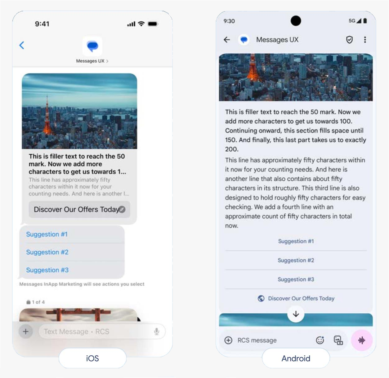
| URL clickability in rich card descriptions | Plain text only | Plain text only |
| Privacy policy in agent preview | Visible | Not visible |
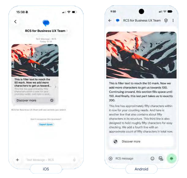
| Agent banner | Visible | Not visible |
| Multiuse label | Visible | Not visible |
| Card height variations | Supported | Single height only |
| GIFs in rich cards | Animated | Static images |
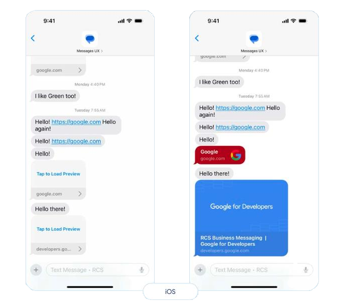
Hyperlinks
Android and iOS: URLs in rich card and carousel descriptions are not clickable and appear as plain text. Use suggested actions with OPEN_URL (Browser or WebView mode) type instead. See URLs in rich cards and carousels for details.
Rich cards
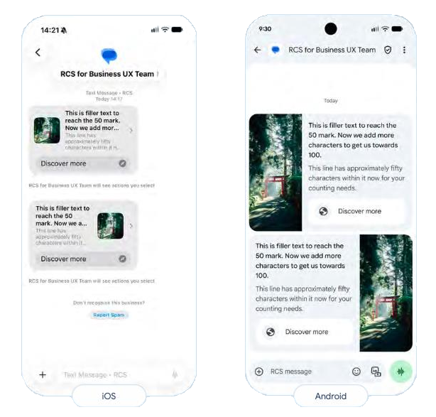
Vertical orientation:
- Best for: Single-column layouts with prominent media
- Recommendation: Use vertical tall height for consistent display across platforms
- iOS consideration: iOS renders all vertical heights identically. Choose "tall" to maximize image area for Android users; iOS users will see the same single height regardless of your selection. See Media preview - vertical card orientation for details.
Horizontal orientation:
- Android: Displays correctly with image on left or right
- iOS: Causes image truncation and video display issues
- Recommendation: Use vertical tall setup for cross-platform compatibility
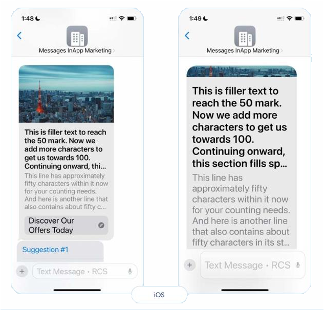
Media cropping with large text
iOS prioritizes rendering title and action elements over description text and media. This can result in image cropping when users have large text sizes enabled.
Prevention:
- Limit titles and descriptions to 3 lines maximum
- Use single CTAs
- Limit suggested replies to 3
- Use medium media dimensions
Suggested actions
Android:
- Rich card buttons remain visible after clicking
- Suggested actions (outside rich cards) disappear after clicking
- Both button types work as expected
iOS:
- Rich card buttons and suggested actions outside rich cards remain visible after clicking
- Suggested replies may appear in incorrect order
- Suggested actions inside and outside cards may combine into a single group
Recommendations:
- Design for both persistent and disappearing button behaviors
- Test action sequences on both platforms
- Provide clear visual feedback after clicks