Advanced analytics
EARLY ACCESS
Early Access for Advanced Analytics is available only to customers who meet specific criteria. For more information about the early access program, contact your Infobip account manager.
The Moments analytics tab is the main place for tracking flow campaigns performance at a glance and creating custom reports and dashboards.
Campaign managers and analysts can find key metrics across flow campaigns and audience activity for further improvements and communication strategy optimization.
Available features [#available-features]
Depending on your Moments package, the following Analytics features are available:
| Feature | Start/Starter Package | Grow/Enterprise Package | Scale Package |
|---|---|---|---|
| Standard dashboards | Overview MEP consumption | Overview MEP consumption | Overview MEP consumption |
| Custom dashboards | No | No | Visualizations Custom dashboards |
| Explore from here | No | No | Yes |
| Export | No | Yes | Yes |
| Data refresh rate | 24 hours | 6 hours | 2 hours |
Analytics dashboard [#analytics-dashboard]
To view reports and dashboards:
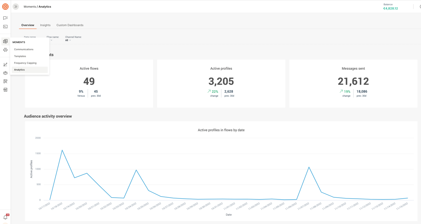
- Go to Moments > Analytics.
- When you access analytics for the first time, select Enable in this section. A screen containing the terms and conditions is displayed.
- Go through the agreement.
- You must select Accept to access analytics.
- By default, you will land on the overview dashboard that shows a high-level view of all your flow communication performance.
Standard dashboards
Use standard reports to get a detailed insight into how flows are performing. Standard reports are available for all pricing plans.
Overview [#overview-standard-dashboards]
The overview dashboard provides a detailed view of all flow communication performances. It is tailored to glance at the fundamental metrics so you can quickly identify how well it affects your audience engagement.
By default, the report shows data for the last 30 days for all flows and all channels. Make sure to adjust your filters as required for specific flow campaigns to track joined metrics over specific campaigns and channels.
Flow highlights [#flow-highlights-standard-dashboards]
Flow highlights give you the key metrics for your flows at a glance.
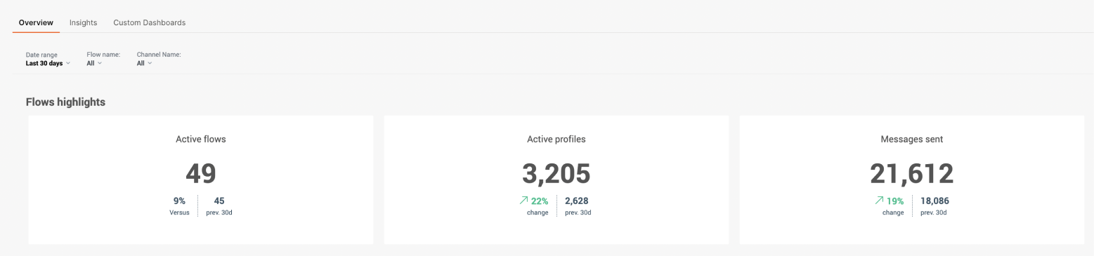
Active flows
Active flows show the number of flows that have been active within the selected period. Active flows can mean the following:
- Flows launched before the selected timeframe and finished due to the timeframe.
- Flows launched and finished due to the timeframe.
- Flows launched due to the timeframe and finished after the selected timeframe.
Active profiles
Active profiles shows the number of total profiles that have entered flows and interacted with communication channels within the selected time period.
The activity is determined by the following condition: a sent inbound message or performed at least one of the following standard channel events.
| CHANNEL | EVENT |
|---|---|
| EmailOpened | |
| WhatsApp, Viber, Mobile push | MessageSeen |
| SMS | LinkClicked |
Messages sent
Messages sent show the number of all sent messages based on the count of messageSent events during the selected period.
Audience activity overview [#audience-activity-overview-standard-dashboards]
The audience activity overview lets you track active profiles and activity during the selected period.
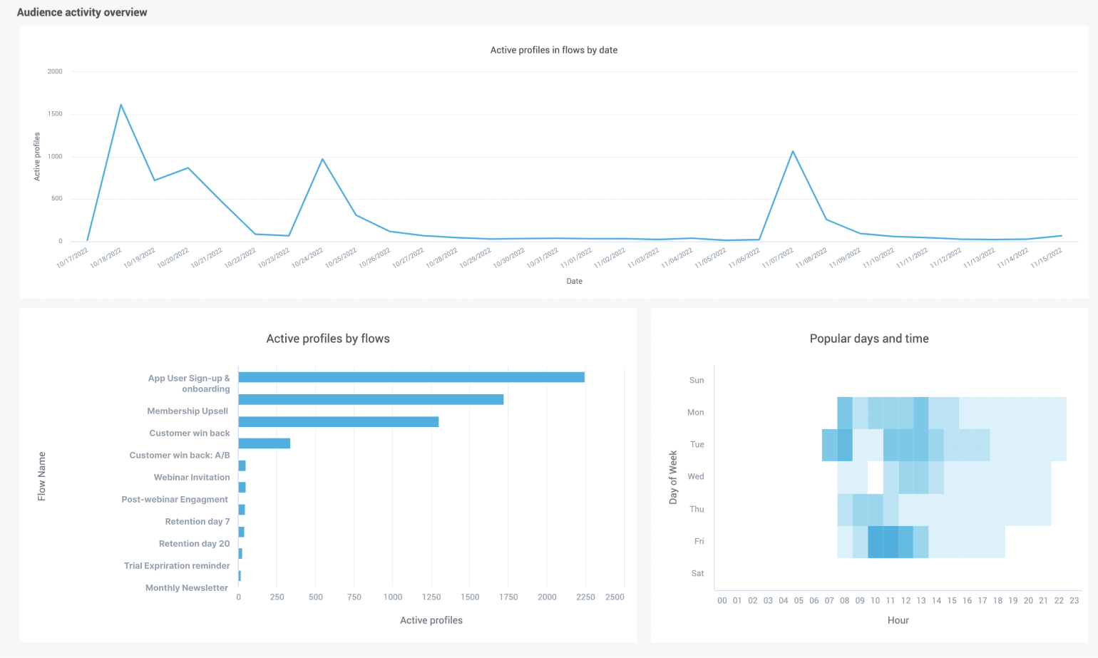
Active profiles in flow by date
Track the trend of total active profiles in flows over time. This is useful to see how your campaigns impact your audience engagement during the selected period.
Active profiles by flow
Use Active profiles by flow to track your most successful flows by seeing how many active profiles enter a flow during the selected period.
Popular days and time
Use the popular days and time heatmap to visualize how people's activity is distributed over time. Scorecards show the day of the week and the time when active profiles are most active. Select a day/time square to drill into metrics for that time,
This heatmap is useful for seeing the most popular day and time for the most user activity and then using this data when you come to plan new campaigns.
Also, consider enabling send-time optimization (STO) in order to increase audience engagement automatically.
Flow performance summary [#flow-performance-summary-standard-dashboards]
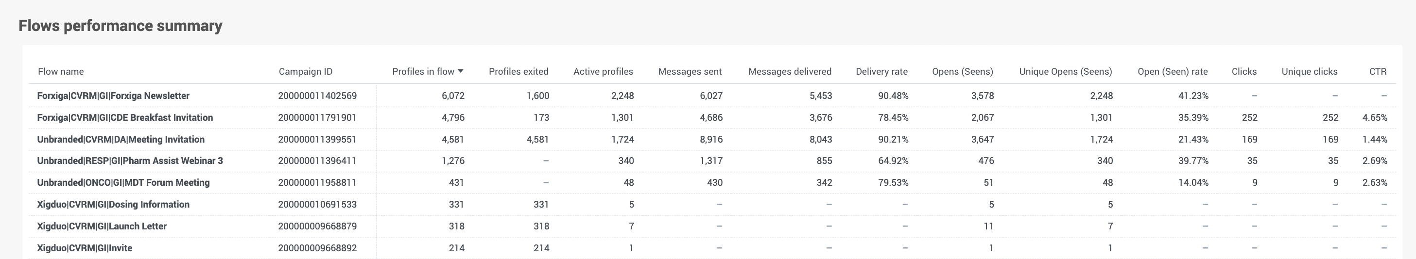
Use the Flow performance summary to get a detailed overview of all flow campaigns in a convenient table view.
Use this summary to track campaign reach, message delivery rates, opens, clicks, and click through rate (CTR) to name a few.
You can sort records by field values and compare the performance of different Flow campaigns.
Channel details overview [#channel-details-overview-standard-dashboards]
The Channel Details Overview section provides channel-specific metrics for your flows.
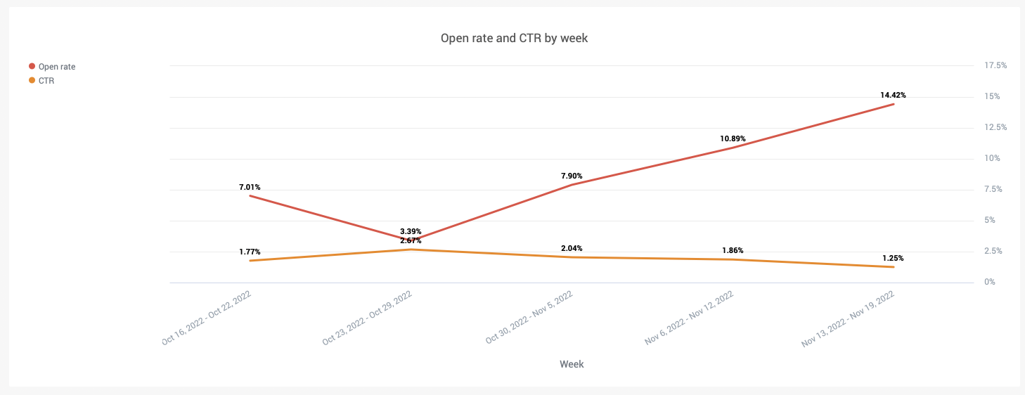
Average Weekly Open Rate and CTR
This table shows the average metrics values across all channels in all flows grouped weekly.
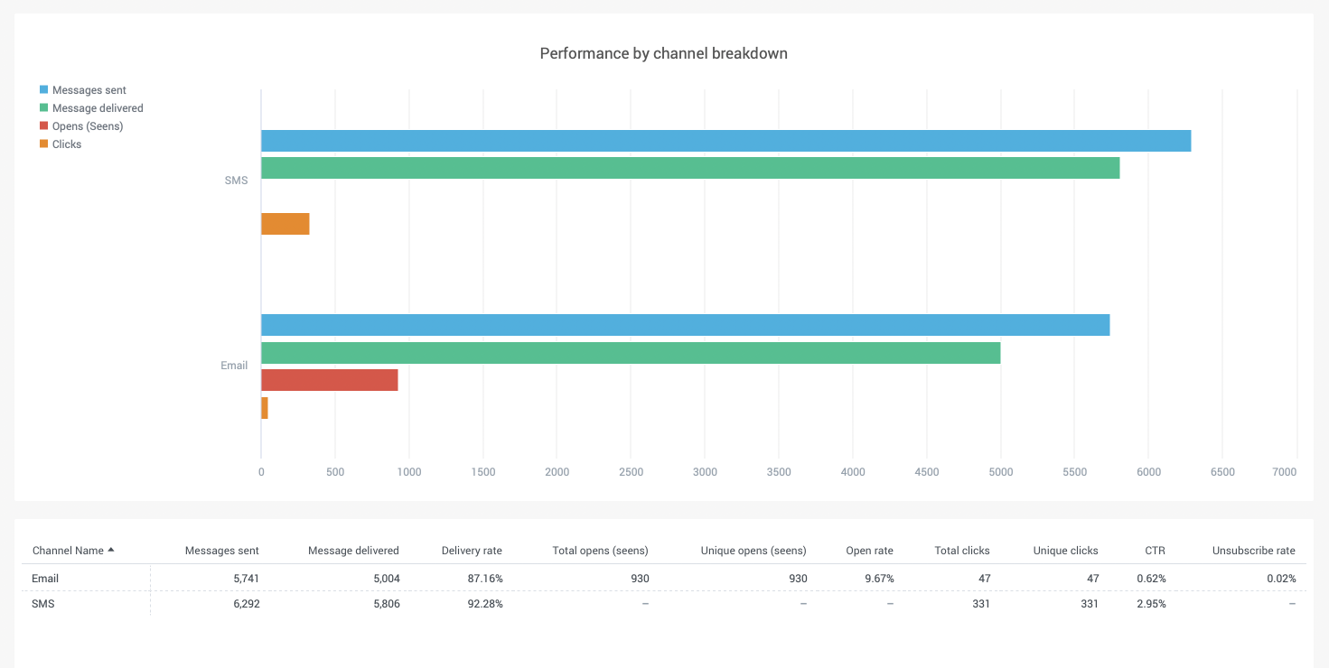
Performance by channel breakdown
This bar chart shows the channel metrics to compare channel performance. For every channel used in your flows see the total number of sent, delivered, opened, and clicked messages.
Filters [#filters-standard-dashboards]
There are three filters on the dashboard: date range, channel, and flow name. You can pick specific flow campaigns to track joined metrics over specific campaigns and channels.
Export [#export-standard-dashboards]
You can export any widget to CSV or excel format. To export a report on the standard dashboard, select on the button (…) and choose the file format.
Flow performance dashboard [#flow-performance-dashboard-standard-dashboards]
The Flow performance dashboard provides specific campaign performance details. Once your flow is launched, you can track performance metrics for each message sent, and audience engagement impacted by a specific channel.
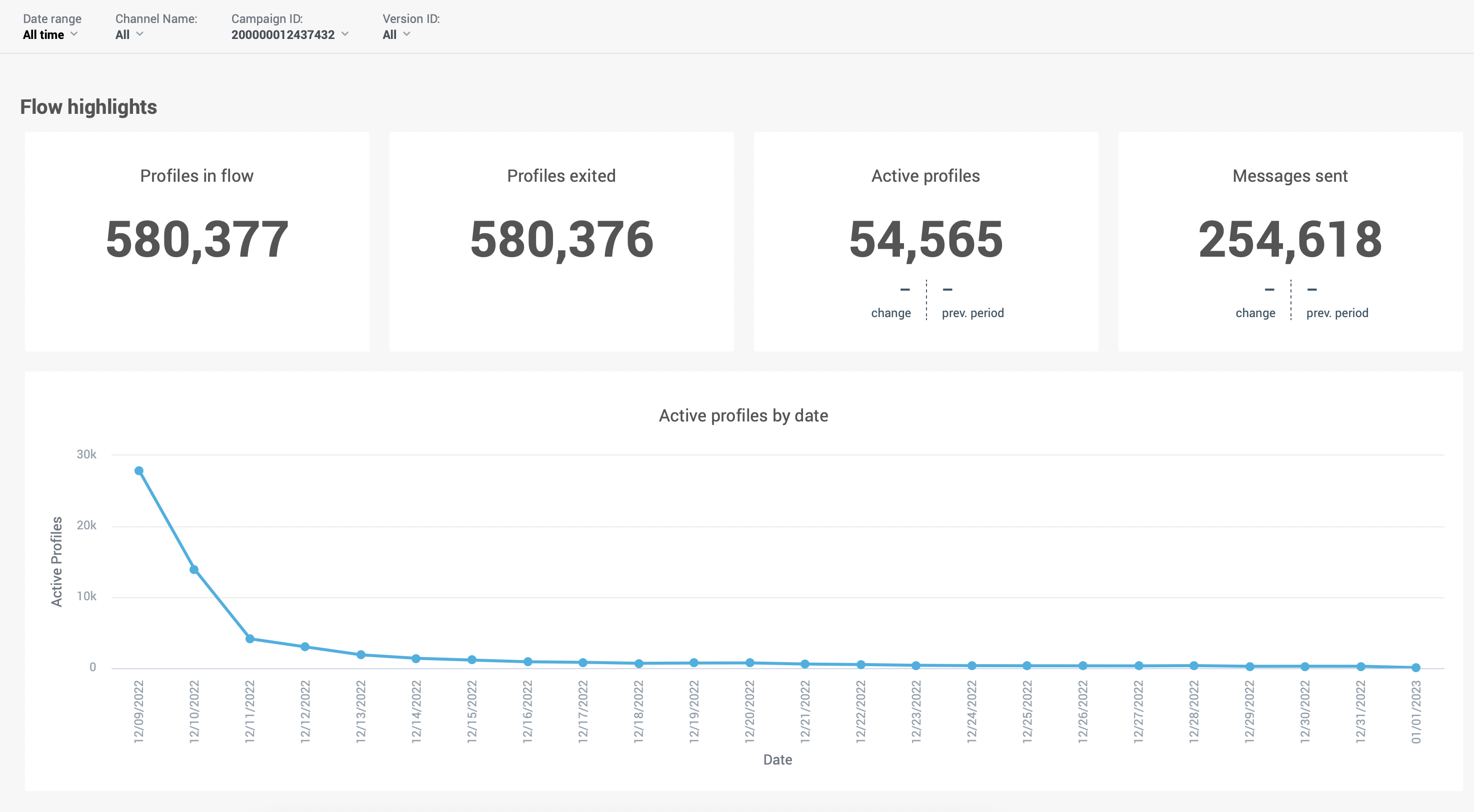
Inside the flow, select the View Flow Performance box to see the flow highlights and additional information related to your communication campaign. The Flow Performance box opens to show Flow highlights and graphs and tables relating to the flow.
Flow highlights [#flow-highlights-standard-dashboards]
| PERFORMANCE METRIC | DESCRIPTION |
|---|---|
| Profiles in flow | The number of unique users who have entered the flow. This helps you visualize the audience reach of your campaign within a time range. |
| Profiles exited | The number of people who exit the flow at an exit point. This metric helps you to see all customer journeys that are complete and did not exit early. It provides an insight into how effectively your flow is working and if your customers are reacting to your flow in the way you want. Example: Your flow reaches 7000 customers but only 1500 customers exit the flow. You may want to review your existing flow and optimize future flows so that more people exit it in the way you want. In flows where there is no clear goal, this is an important metric for measuring success. |
| Active profiles | The number of people that entered a flow, receive communication, and then perform an event such as message view, message opened, or link clicked. This metric allows for the measurement of audience activity and gives you the opportunity to view which channel or specific message had the most impact on the customer. |
| Messages sent | The sum of all messages sent within the flow for all channels. To view a breakdown by channels, see the Channel Details found at the bottom of the Flow Performance box. |
Channels performance [#channels-performance-standard-dashboards]
The channels performance widgets show channel metrics across all channels used in Flow.
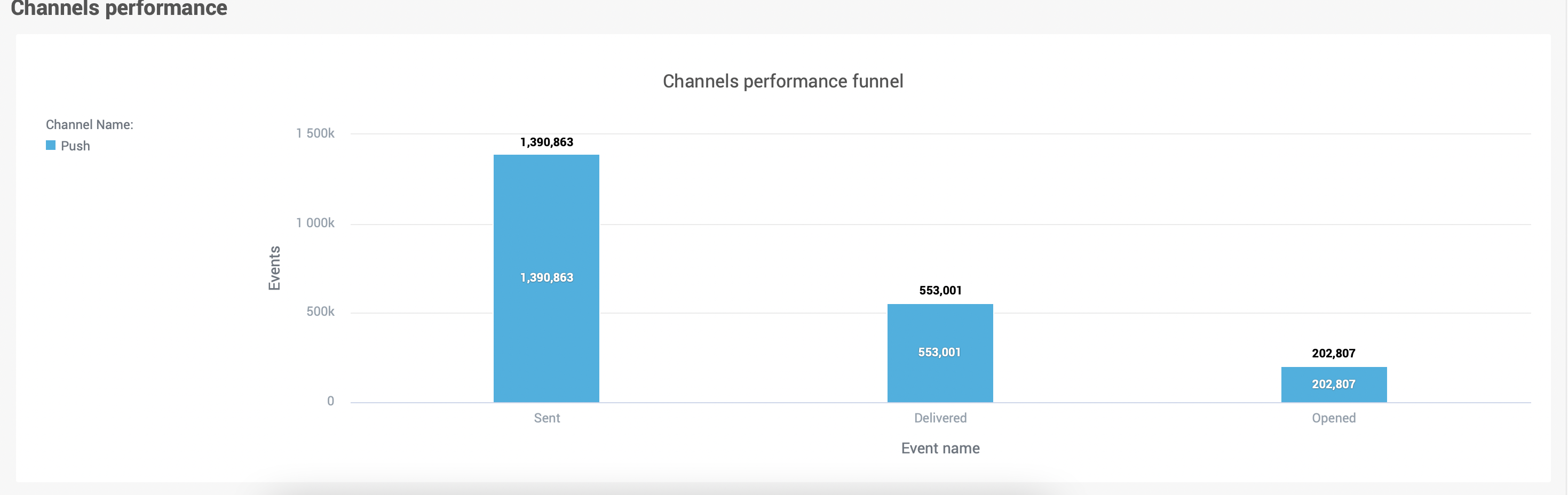
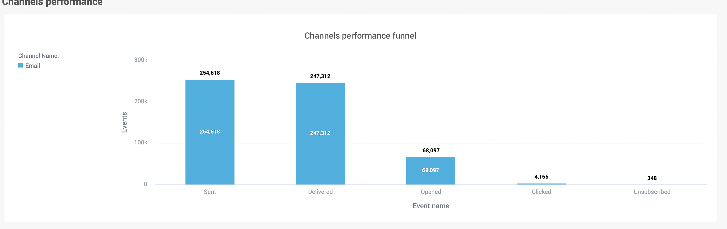
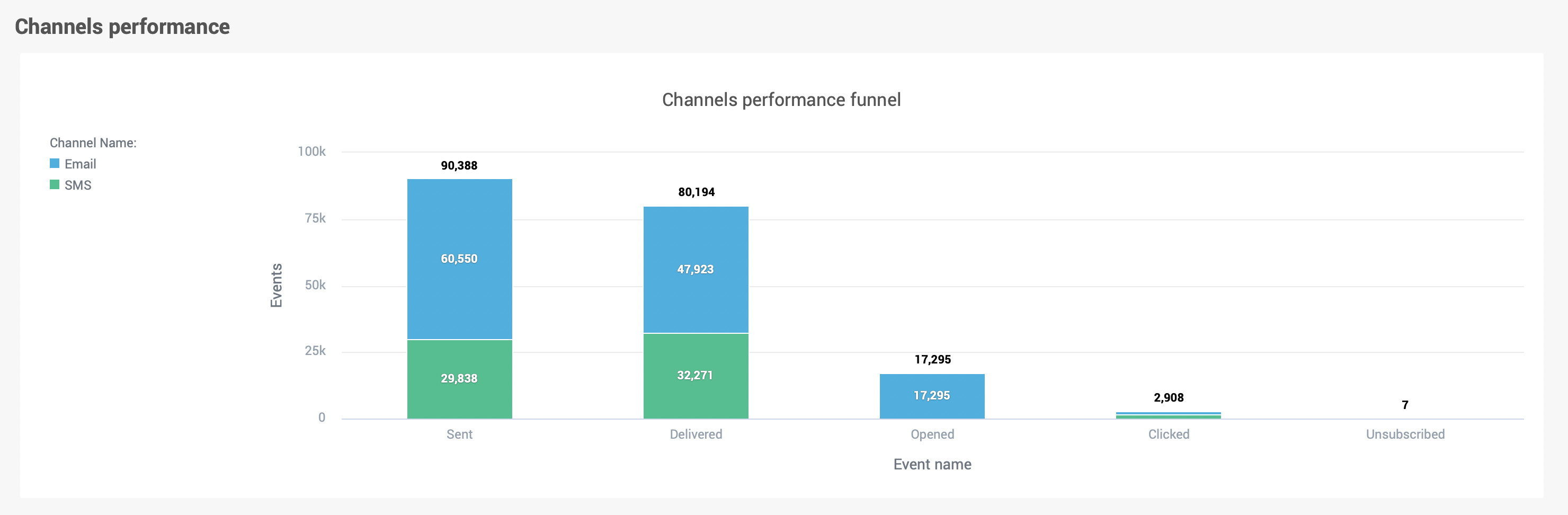
Channels Performance Funnel
Depending on the channel, the funnel chart shows unique events breakdown by events type across all channels.
The below image shows an example of push channel performance with the sent, delivered, and opened events.
This example shows a channel performance funnel for the email channel which includes link clicked and unsubscribe event tracking.
This final example shows the channel performance funnel for omni-channel communications in flow (SMS and email).
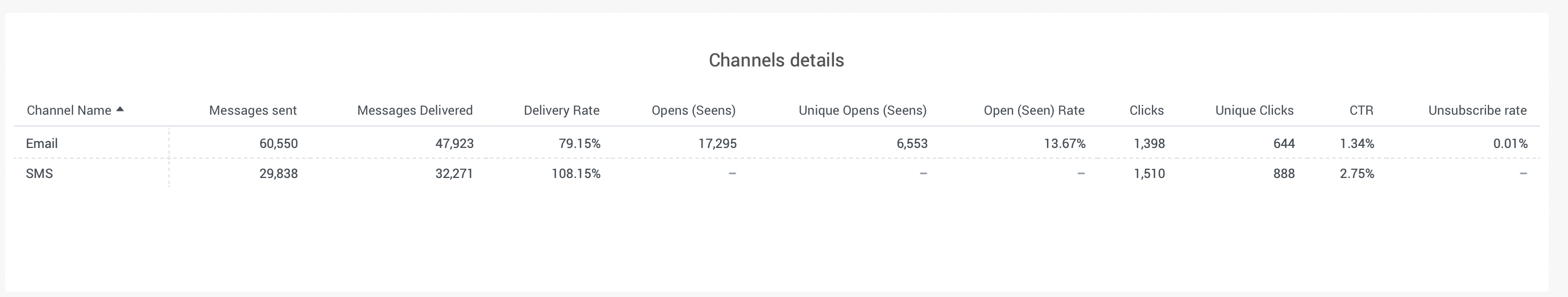
Channel details
The channel details widget shows all channel metrics across all channels used in flow - total and relative metrics.
| PERFORMANCE METRIC | DESCRIPTION |
|---|---|
| Messages sent | Total sent messages |
| Messages delivered | Total delivered messages |
| Delivery rate | Delivery rate %. (Delivered / Sent * 100) |
| Opens (Seens) | Total opened or seen messages. This depends on the channel in the flow. Seen is for Push, WhatsApp, and Viber channels. |
| Unique Opens (Seens) | The number of profiles that have opened or seen a message. |
| Open (Seen) rate | Open or seen rate in %. (Total seen / Delivered * 100) |
| Clicks | Total clicks events |
| Unique Clicks | The number of profiles that performed a click |
| CTR (Click Through Rate) | Click through rate in % (clicks / delivered) |
| Unsubscribe rate | Rate of unsubscription in %. (Number of unsubscribed users / delivered * 100) |
| Traffic Cost | The total cost of send traffic for the flow |
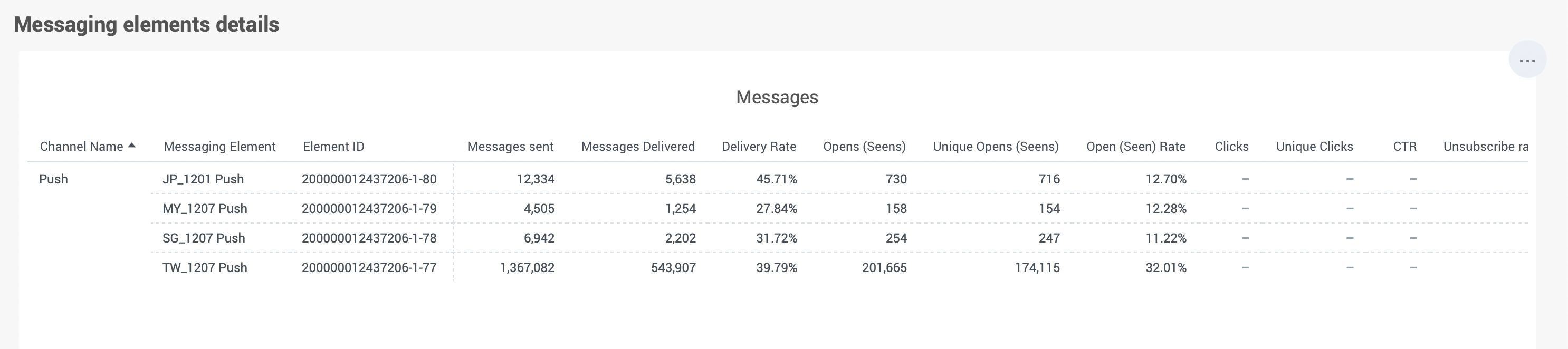
Message elements details
Message elements details metrics are the same as in the Channel details widget above, but it also includes a breakdown by each messaging element.
| PERFORMANCE METRIC | DESCRIPTION |
|---|---|
| Messaging Element | The display name of the message |
| Element ID | Unique ID of the element |
| Messages sent | Total sent messages |
| Messages delivered | Total delivered messages |
| Delivery rate | Delivery rate %. (Delivered / Sent * 100) |
| Opens (Seens) | Total opened or seen messages. This depends on the channel in the flow. Seen is for Push, WhatsApp, and Viber channels. |
| Unique Opens (Seens) | The number of profiles that have opened or seen a message. |
| Open (Seen) rate | Open or seen rate in %. (Total seen / Delivered * 100) |
| Clicks | Total clicks events |
| Unique Clicks | The number of profiles that performed a click |
| CTR (Click Through Rate) | Click through rate in % (clicks / delivered) |
| Unsubscribe rate | Rate of unsubscription in %. (Number of unsubscribed users / delivered * 100) |
Filters [#filters-standard-dashboards]
The flow performance dashboard contains the following filters: date range, channel name, and version ID.
When you open the Flow dashboard, the current flow campaign ID is selected by default. You can use the Version ID filter to filter metrics by specific flow version. By default, the dashboard displays the combined metrics for all versions.
Activity overview dashboard [#activity-overview-dashboard-standard-dashboards]
The Activity overview dashboard provides a summary view of key performance indicators for the audience in People.
These KPIs include the total number of profiles in People, the number of new profiles added during a selected period, and the number of active profiles. The dashboard also allows users to compare these KPIs with the previous period. For example, if we select 7 days in the time range filter, the dashboard will automatically compare metrics with the previous 7 days.
This information is intended to give users an overview of the audience and their activity within People. To learn more about the Activity Overview Dashboard metrics, take a look at People Analytics.
Custom reports and dashboards
As well as providing you with out-of-the-box analytics functionality you can also create custom reports and dashboards. By using advanced analytics, you can build reports that match your exact needs.
Custom reports and dashboards are only available in the Scale pricing plan.
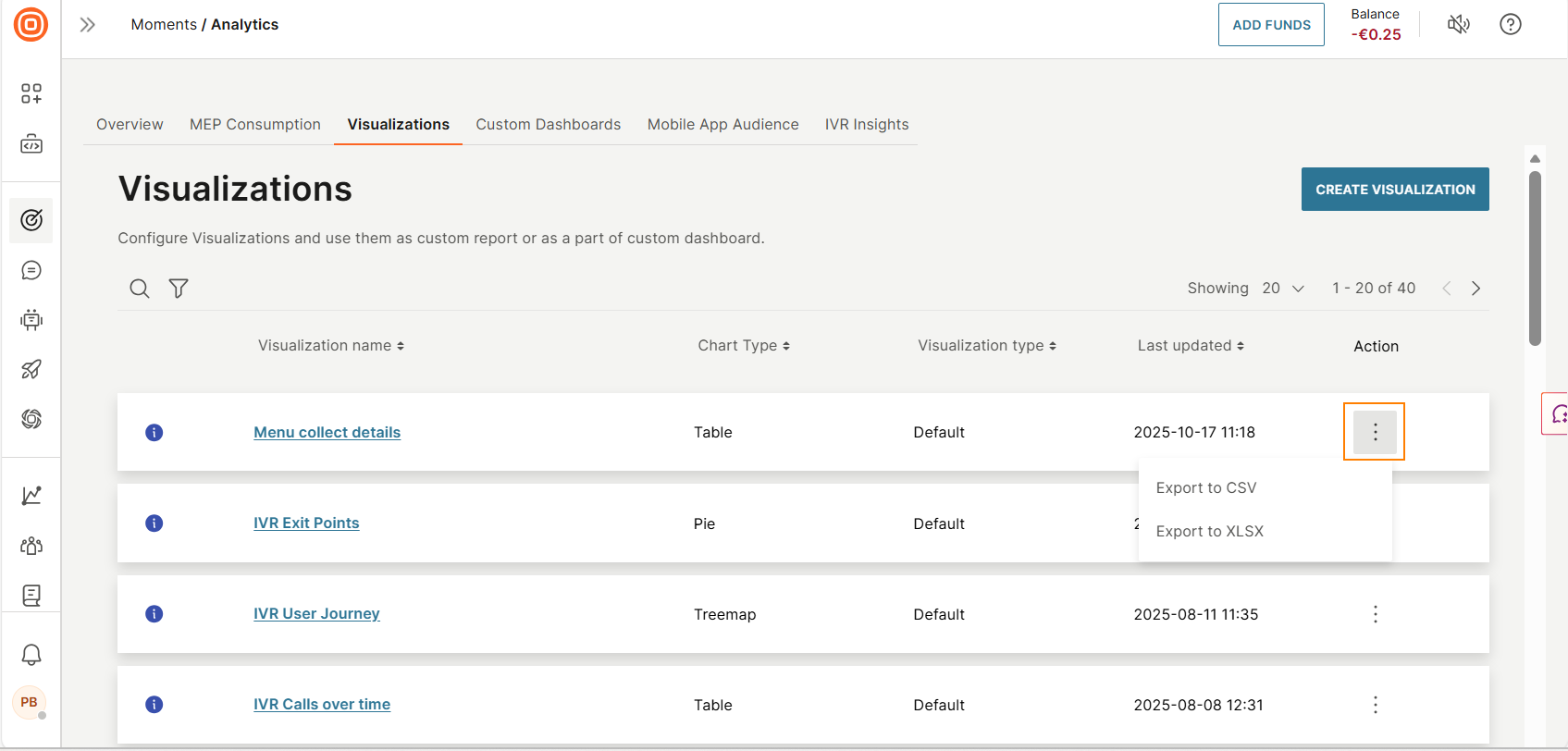
Visualizations [#visualizations-custom-reports-and-dashboards]
Visualizations are multi-layer analytics that enable you to add and slice data based on multiple metrics. Visualizations are the most extensive report types. You can use visualizations either as a standalone report or as part of a custom dashboard.
To access visualizations, go to Moments > Analytics > Visualizations tab on the Infobip web interface.
You can do the following:
- Create a new visualization.
- View a list of visualizations.
- View details of a visualization. Select the Information icon.
- Search for a visualization by its partial or complete name.
- Filter visualizations. Example: by visualization type or last updated.
- Sort visualizations. Use the table headers.
- Export visualizations.
- Set the number of visualizations you can view on a single page.
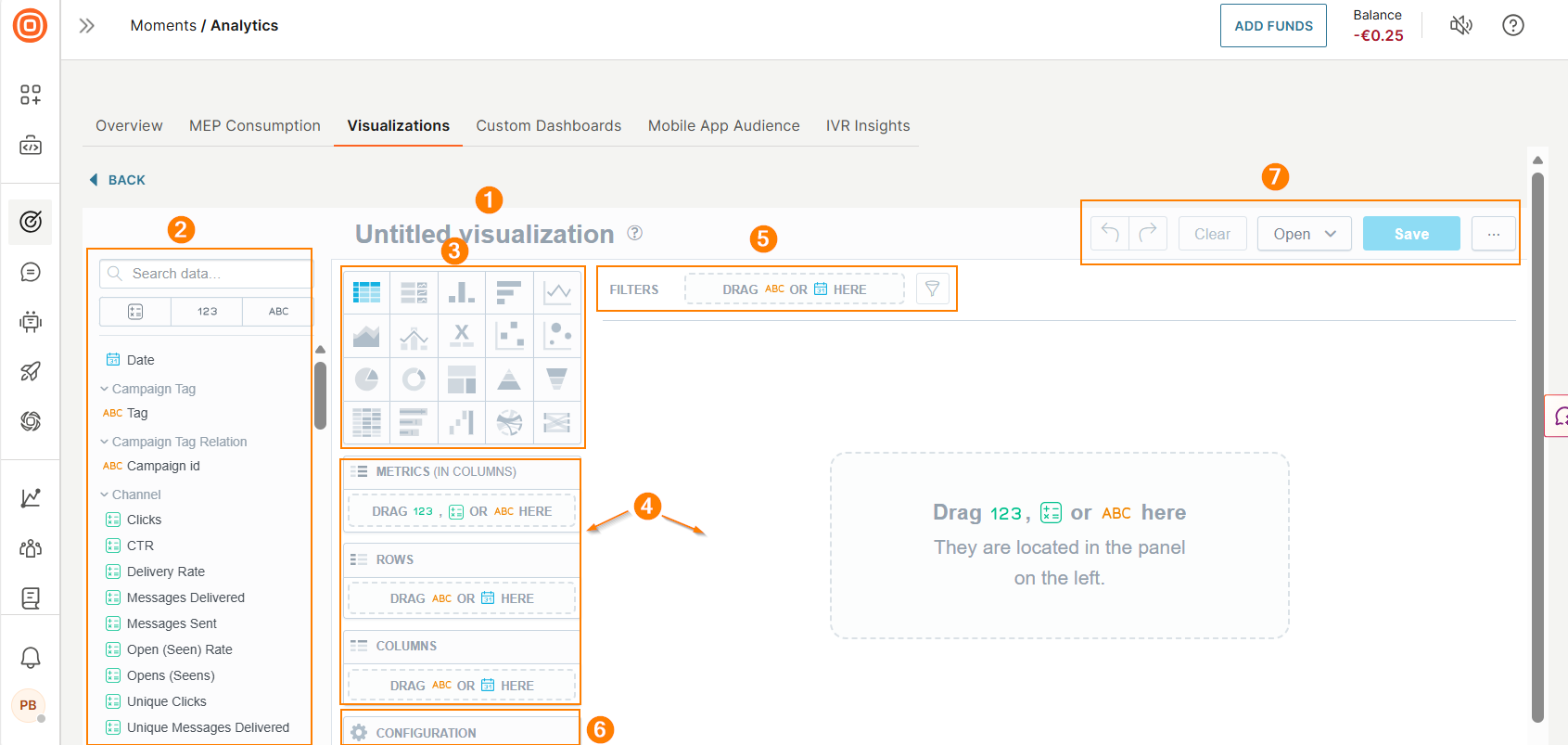
Visualizations editor
Use the Visualizations editor to create new or edit existing reports.
To access the Visualization editor:
- Go to the Analytics > Visualizations tab.
- Select Create visualizations.
- The editor opens with the following controls:
- New report name field
- Data Catalog: The data catalog contains qualitative and quantitate data points you can add to your report. See Data Types to learn more about available data types.
- Visualization type: Change the chart type depending on your requirements. The system recreates the visualization to match the selected type. Each chart type may support specific types of data. Example: The Stack by field is available for a column chart but not for a table
- Active zones: Drag and drop items from the data catalog to these areas of the canvas. The editor provides guidance about the supported data items for each active zone. For a visualization of type table, you can define rows, columns, and metrics.
- Filters: Filter the visualization based on specific criteria. To add a filter, drag and drop the Date or any attribute from the data catalog to this field. Alternatively, select the filter button and select the required attributes. The editor displays a message if there is any data that cannot be filtered.
- Configuration: define the look and feel of the visualization. Example: change colors or position the legend.
- Undo, Redo, Clear, Cancel, and Save: Undo or redo your changes. Select Clear to remove all data from the visualization. Cancel to return to visualizations. To save your report, you must give it a name.
Create visualization
Follow these steps to create a basic visualization. Alternatively, we've provided some useful Visualizations examples to help you get started.
- On the Analytics > Visualizations tab, select Create visualization.
- Select a visualization type. Each chart type supports specific data types.
- Drag and drop one or more data items (fact, metric, attribute) from the data catalog to the active zones. You can view the data immediately after you add items to the fields. To create a new metric, add at least two data items.
- (Optional)
- To get more detailed data, drag and drop the Date or an Attribute to the Rows/Columns field (only for tables) or to the View by, Trend by, or Attribute fields (for other chart types).
- To split the data into stacked groups, drag and drop an Attribute to the Stack by or Segment by field. For Line charts, there must be only one data item in the Metrics field.
- To format the chart, use the Configuration options.
- To make changes, use the Undo, Redo, and Clear options. To delete a data item, select the item in the editor and drag it to the left.
- Use additional customization options. For more information, refer to the Additional Customization Options documentation.
- Name the visualization.
- Select Save.
Export Visualization
On the Visualizations tab, select the three dots next to a visualization and choose one of the following file formats:
- .csv
- .xls
The visualization is downloaded as a static file.
Visualizations examples [#visualizations-examples-custom-reports-and-dashboards]
We have provided you with some example visualizations to showcase what is possible and highlight some useful features to help you get the most out of the tool. Depending on the amount and type of data in your instance, you may see different results than what is shown in the following examples.
- How to track clicks, opens, and CTR trends
- Compare unique opens (seens) across all channels and campaigns
- Find the best day to send messages and get the most clicks / opens
- Analyze A/B test results
- Track and compare metrics in different versions of multichannel flows
Example 1: Track Clicks, Opens, and CTR trends [#example-one-track-clicks-opens-and-ctr-trends-custom-reports-and-dashboards]
Let's see how to use the editor with an example of how to build a line chart to analyze the performance of flow campaigns. This report will allow you to track clicks, opens, and CTR across all flow campaigns, helping you to understand trends in audience engagement and adjust your communication strategy.
To create this report in Moments analytics, follow these steps:
- Go to Moments > Analytics > Visualizations.
- Select Create visualization to open the visualizations editor.
- Name the report. Example: Clicks, Opens, and CTR.
- Select the Line chart type in the Visualization type menu.
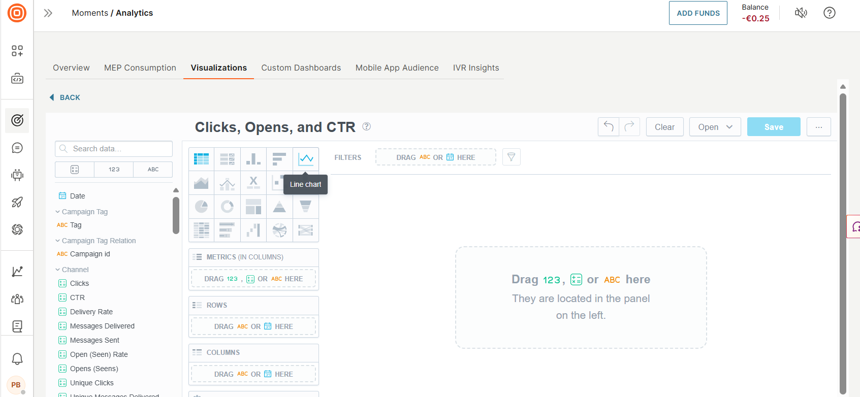
- Drag the Clicks and Opens (Seens) metrics from the Data catalog to the Metrics section. You will see two points in the canvas - these show the total number of events.
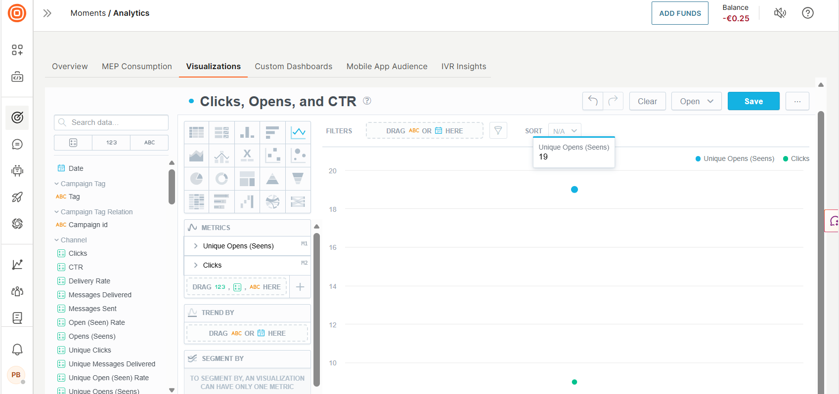
- To see how these metrics change over time, drag the Date dimension to the Trend by section, which is under the Metrics. To see detailed trends, change the grouping type in the Group by selector. For example, to observe trends for the last month, select "Day" as the grouping type.
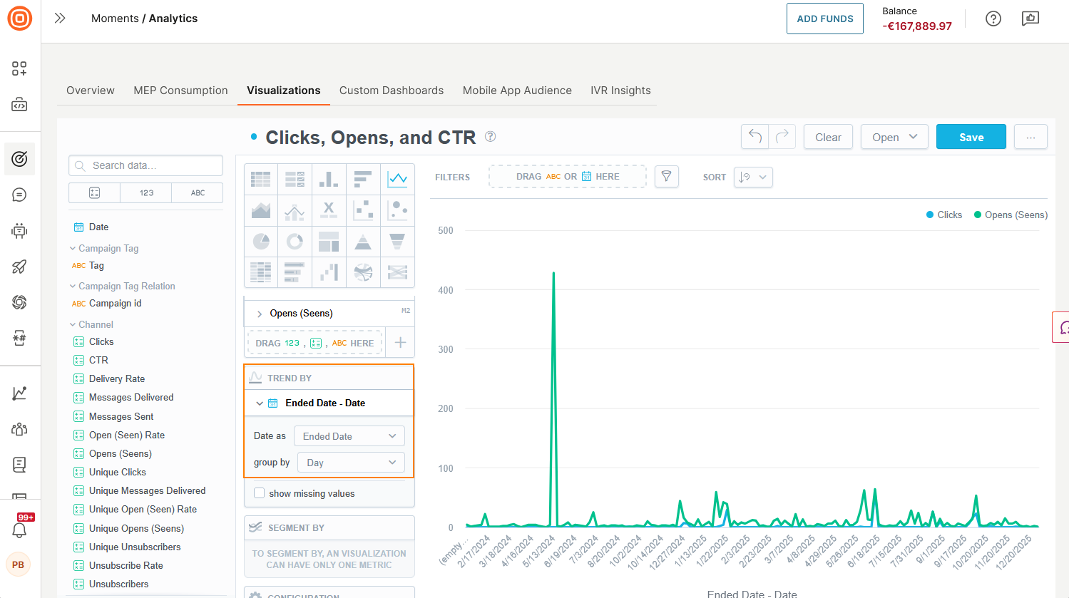
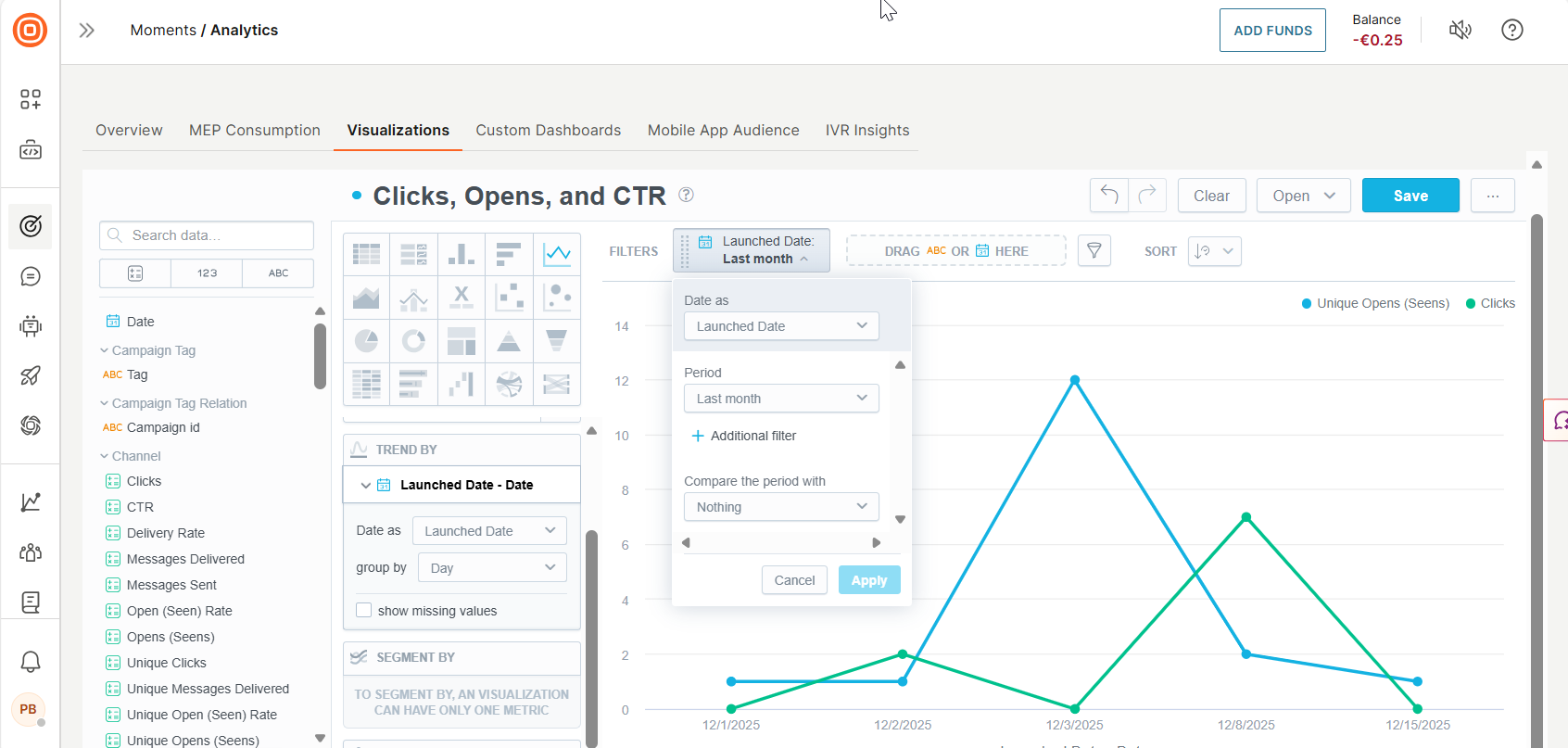
- Let's narrow down the reporting period to one month. For a longer period of observation, it is recommended to change the grouping type. For example, to observe trends for the last quarter, grouping by week is more suitable. To narrow down the reporting period, select the Date dimension from the data catalog again and drag it to the Filter bar. Select it, select the Last month value, and select Apply.
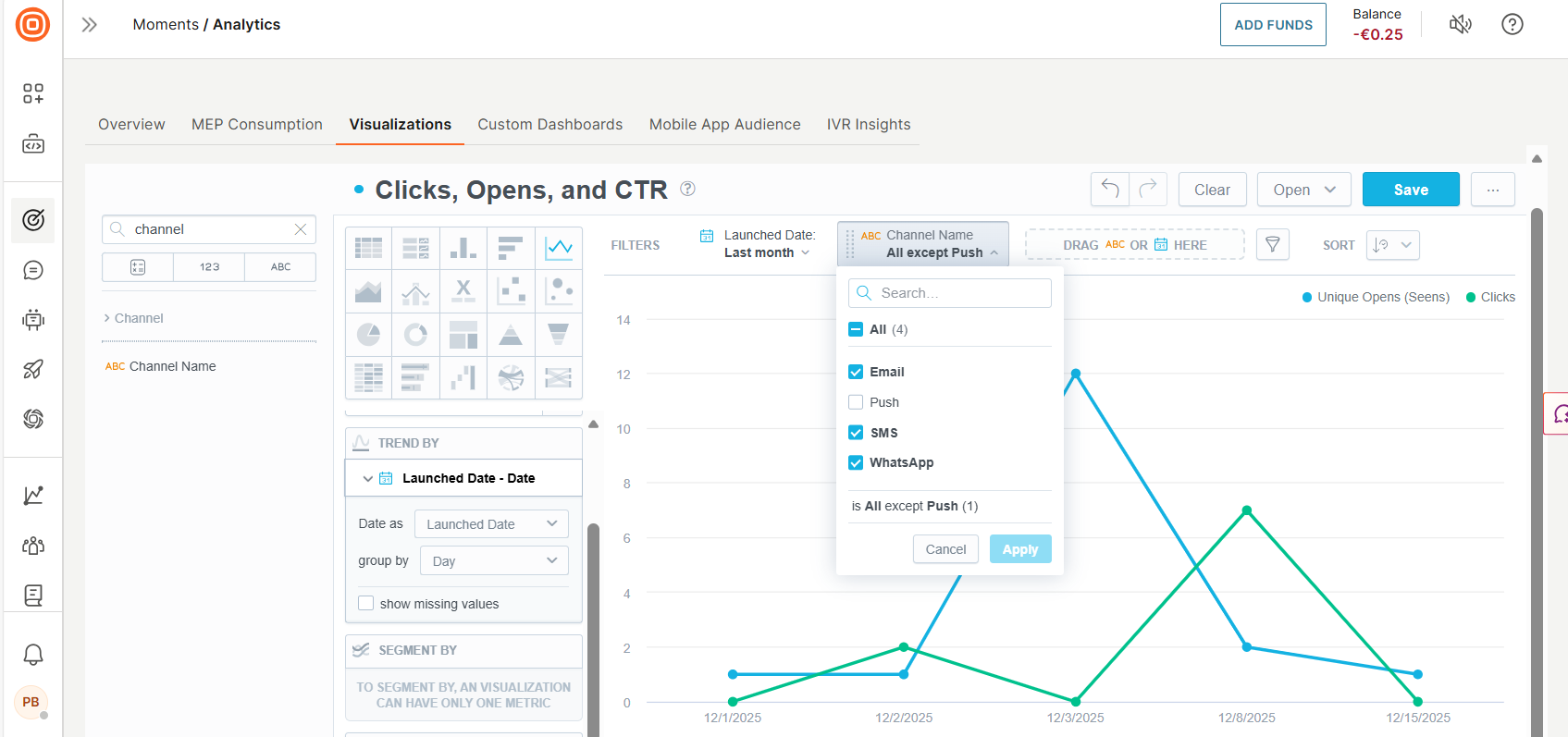
- To filter out irrelevant channels that don't have click events, drag the Channel Name field to the Filter bar, select it, unselect the "Push" option, and press the "Apply" button.
- Finally, drag the CTR metric to the graph and set a separate axis for this metric, since it shows a percentage value. Enable the option by selecting Show in right axis checkbox.
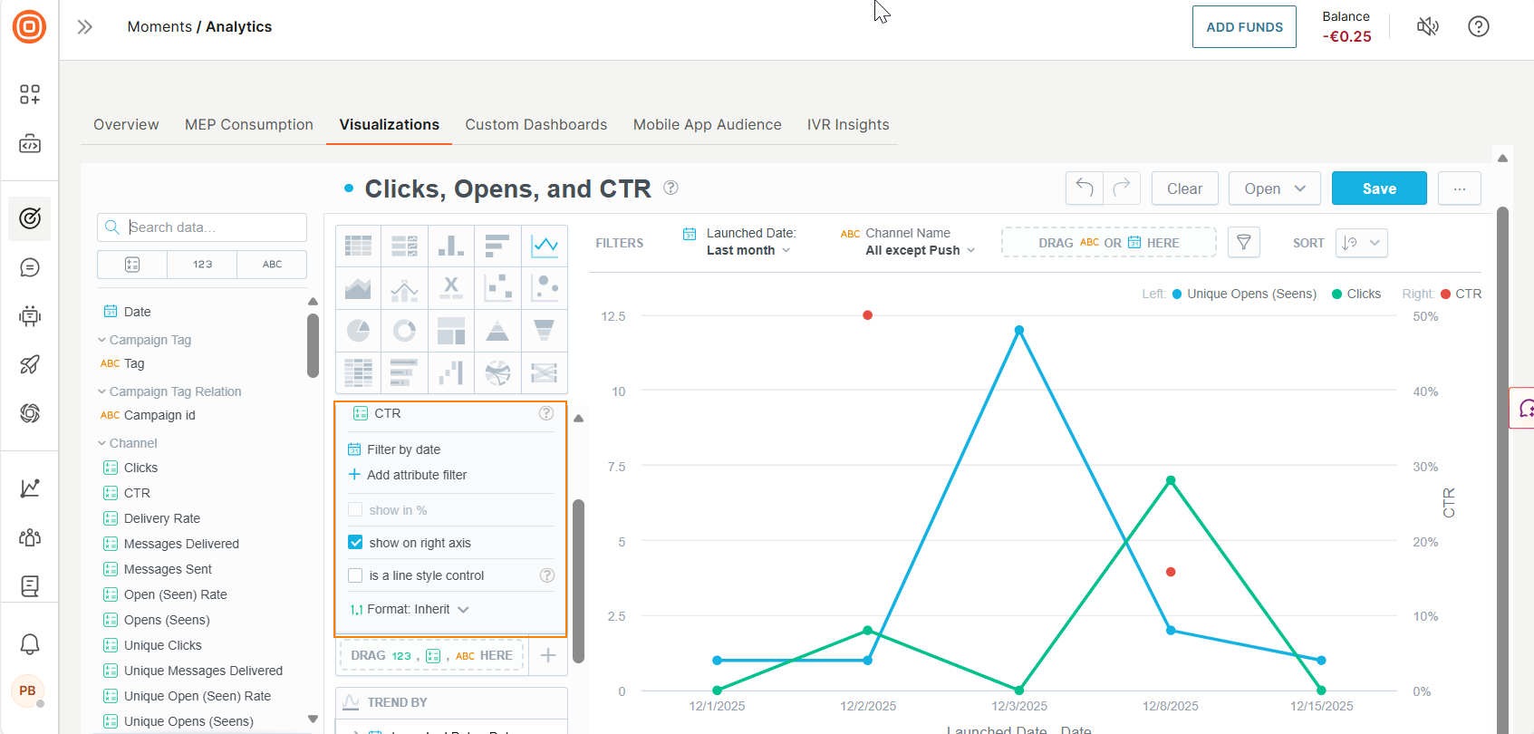
- You can adjust look and feel options in the Configuration section. You can also change the legend place or chart colors.
- Select Save.
- The graph is ready to help you analyze your communication performance. Additionally, you can pick this graph as a widget in your custom dashboard or export as csv or excel file.
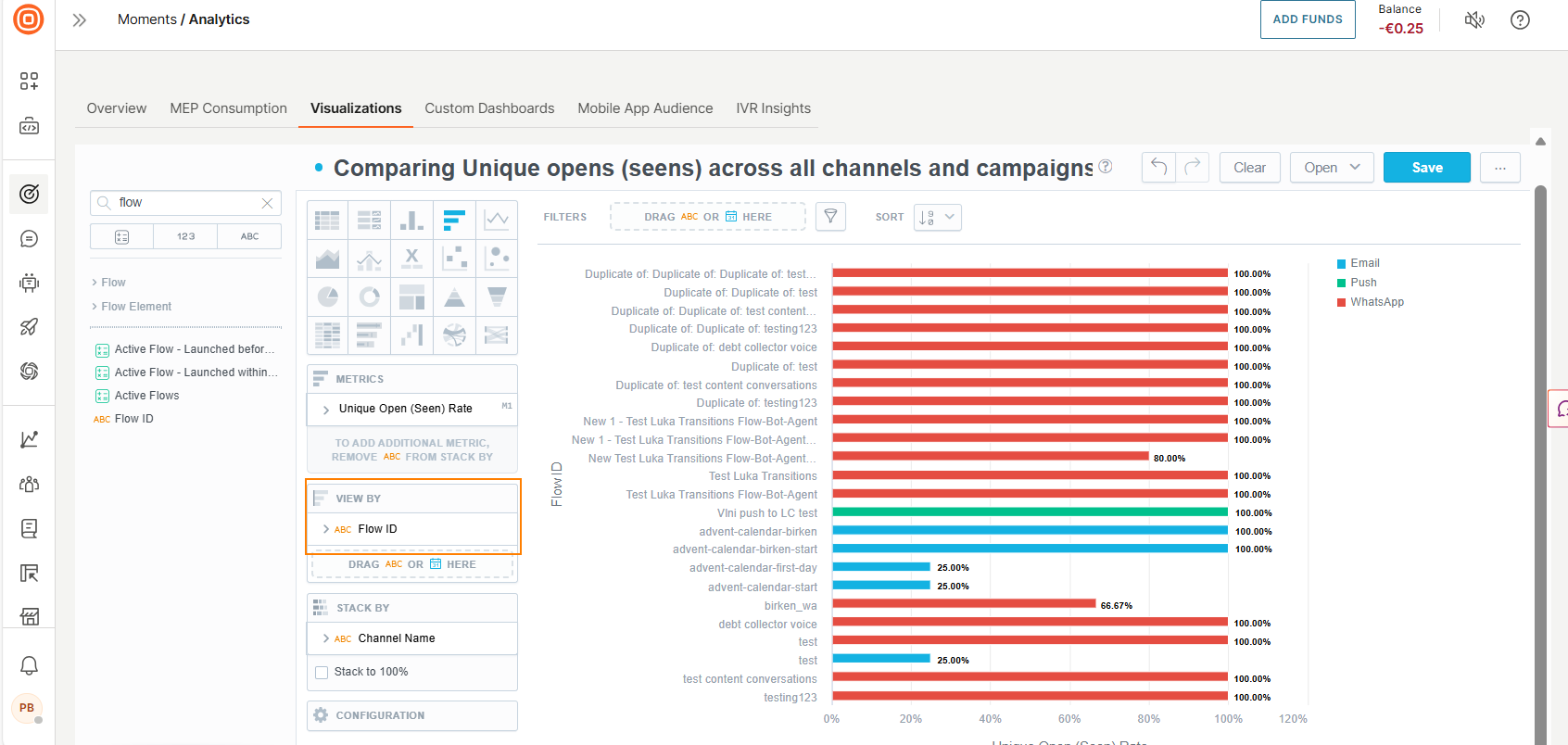
Example 2: Compare unique Opens across all channels and campaigns [#example-two-compare-unique-opens-across-all-channels-and-campaigns-custom-reports-and-dashboards]
In this example report, you will see a breakdown of the number of unique opens by channel and campaigns, and see what campaigns performed best.
- Go to Moments > Analytics > Visualizations.
- Select Create visualization to open the visualization editor.
- Name the report. Example: Comparing Unique opens (seens) across all channels and campaigns.
- Select the Bar chart type in the Visualization type menu.
- Drag the Unique Open (Seen) rate metric from the Data catalog to the Metrics section.
- Drag Channel name attribute to the Stack by section. You will see one column stacked by all channels that you have with link click tracking capabilities. Infobip Moments offers such capability in WhatsApp, Viber, Email, SMS, and Line channels. In this example, we have Email, Mobile push, and WhatsApp channels.

- Drag Flow ID to the View By section to see metric breakdown by each flow.
- Let us narrow the list of flows by selecting the top 10 best performing campaigns. To filter that out, select on the filter icon and enable Top/bottom values. In the example screenshots, you will see that we also decided to filter the Date to only see data from the Last 4 quarters.
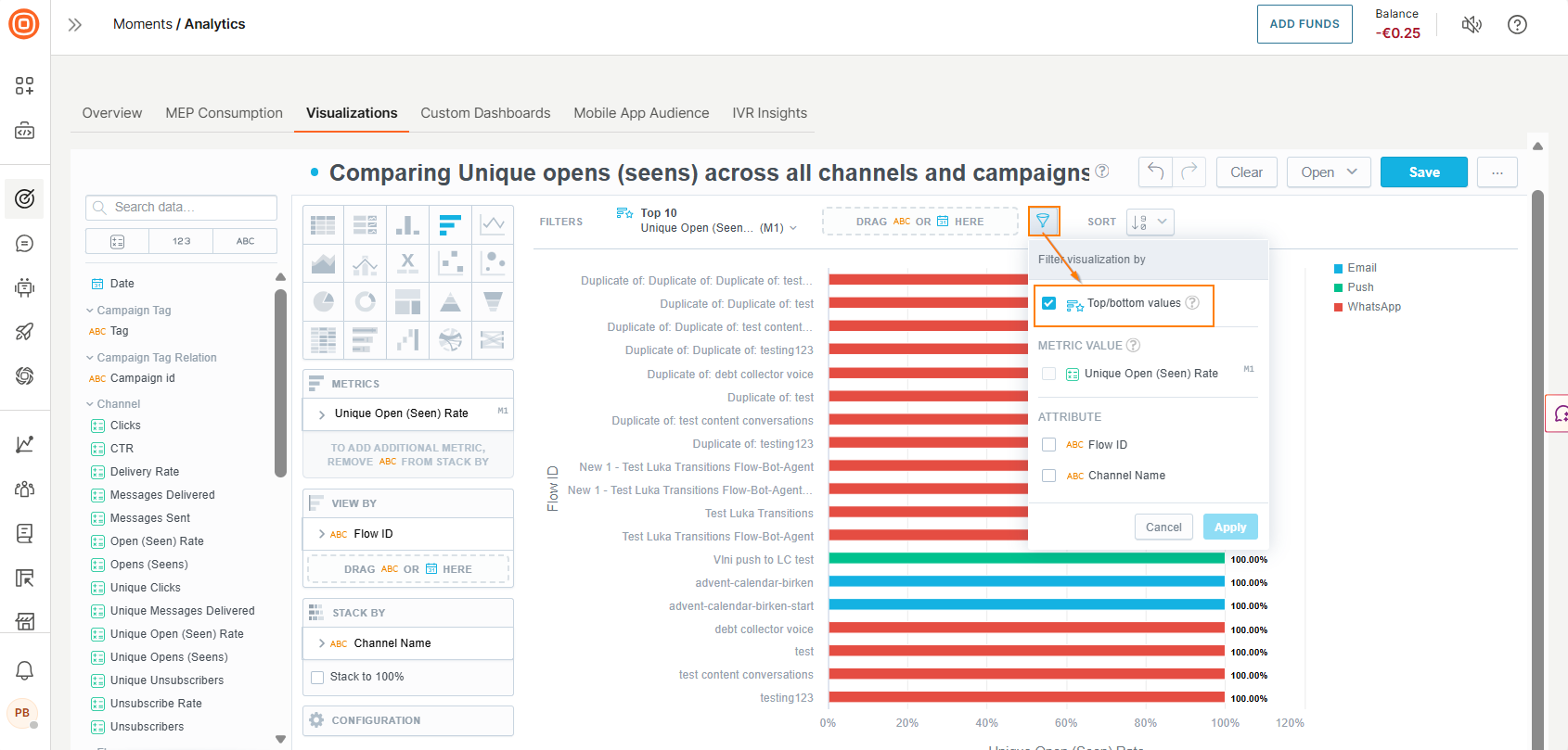 This feature automatically filters our items by top values. Now the graph is easy to read and see what flows gained the most of unique clicks and what channel contributed to that.
You can further customize the report by adding other metrics to analyze. Example: Add Unique Opens (Seens).
This feature automatically filters our items by top values. Now the graph is easy to read and see what flows gained the most of unique clicks and what channel contributed to that.
You can further customize the report by adding other metrics to analyze. Example: Add Unique Opens (Seens). - Save the report so you can export it, or use it in your custom dashboard.
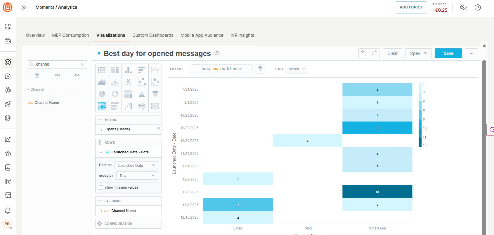
Example 3: Find the best day to send messages to get the most clicks [#example-three-find-the-best-day-to-send-messages-to-get-most-clicks-custom-reports-and-dashboards]
There is a Best Day widget on the Moments Overview dashboard to engage your audience based on the activity tracking. This metric aggregates all activities of your profiles such as clicks, opens, or seens.
When you need a more specific and granular slice of data to identify the best day for a particular channel and event then create a custom report.
- Go to Moments > Analytics > Visualizations.
- Select Create visualization to open the Visualization editor.
- Name the report. Example: Best day for opened messages.
- Select Heatmap as the chart type.
- Drag the Opens (Seens) metric from the Data catalog to the Metrics section.
- Drag the Date dimension from the Data catalog to the rows section and group it by Day. This will show the distribution of Open events over days for the entire history of data, unless a specific timeframe is selected.
- Add the Channel Name attribute to the Columns section to see the best day for Open events for each channel. The graph will show the distribution of Open events for each day for each channel.
- You can modify this report by replacing other events, such as clicks, and filtering by channel.
- Optimize the sending time of your messages and increase the number of Open and click events, consider enabling the AI-powered Send time optimization feature.
Example 4: Analyze A/B test results [#example-four-analyze-ab-test-results-custom-reports-and-dashboards]
A/B testing, also known as split testing, is a great tool to improve the results of your email campaigns. It allows you to test different versions of your emails and see which one performs better.
By comparing the results of the different versions, you can determine which message elements (such as the subject line, the layout, the call-to-action, or even the timing) are most effective at driving engagement.
Follow these steps:
- Go to Moments > Analytics > Visualizations.
- Select Create visualization to open the Visualization editor.
- Name the report. Example: A/B test results.
- Select the Column chart type in the Visualization type menu.
- Drag the Campaign ID into the Filter bar to select a specific campaign to analyze.
- Drag the Unique Clicks and CTR metric from the Data catalog to the Metrics section.
- Drag Channel name and Element ID attributes to the View by section.
- In Element ID > Display as section, select Element name.
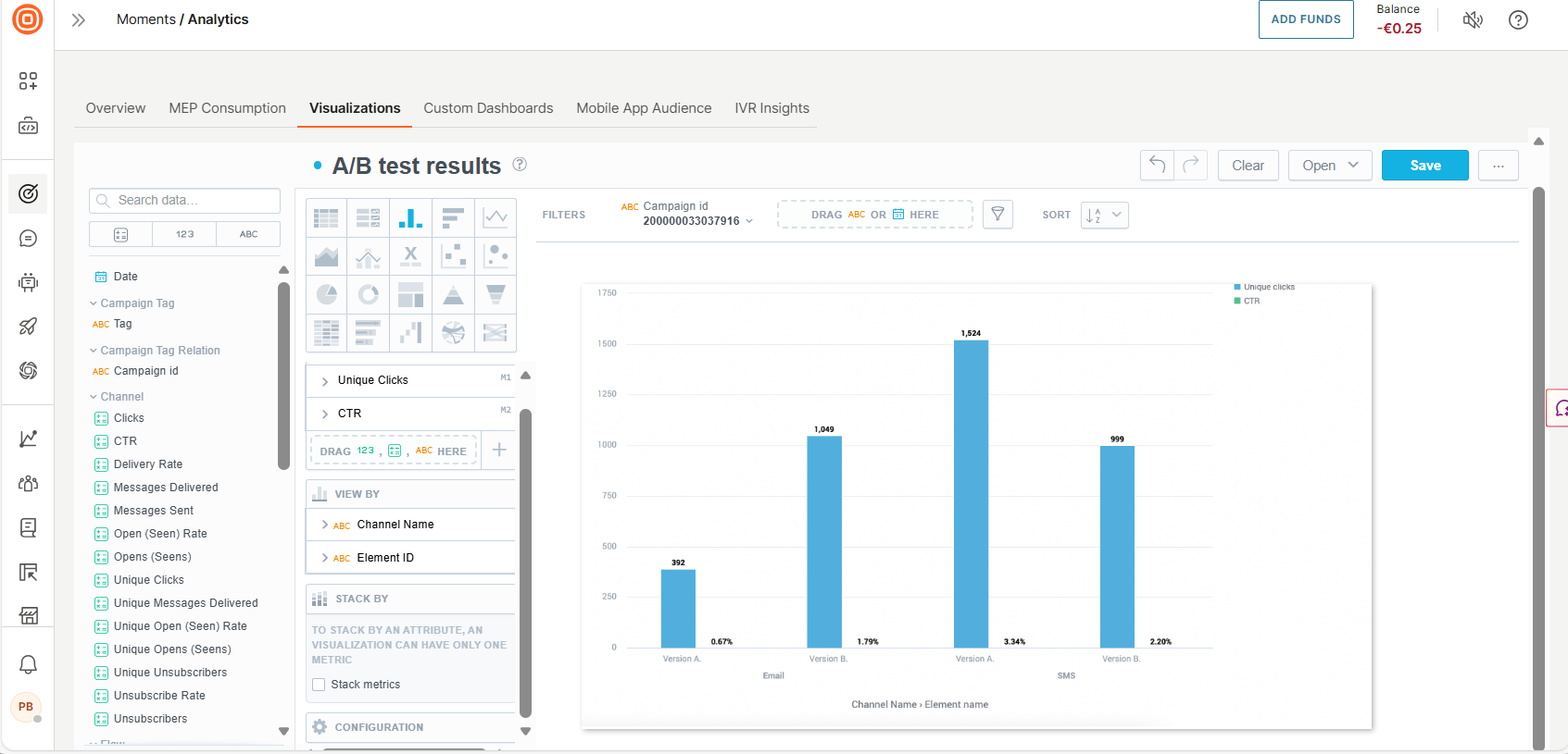
- If you have correctly segmented your audience in your flow, then you will see several columns for each element. In our example, you will see a four-column graph displaying the number of clicks for each testing option. You will also see a CTR value which is better to compare when you analyze the A/B result.
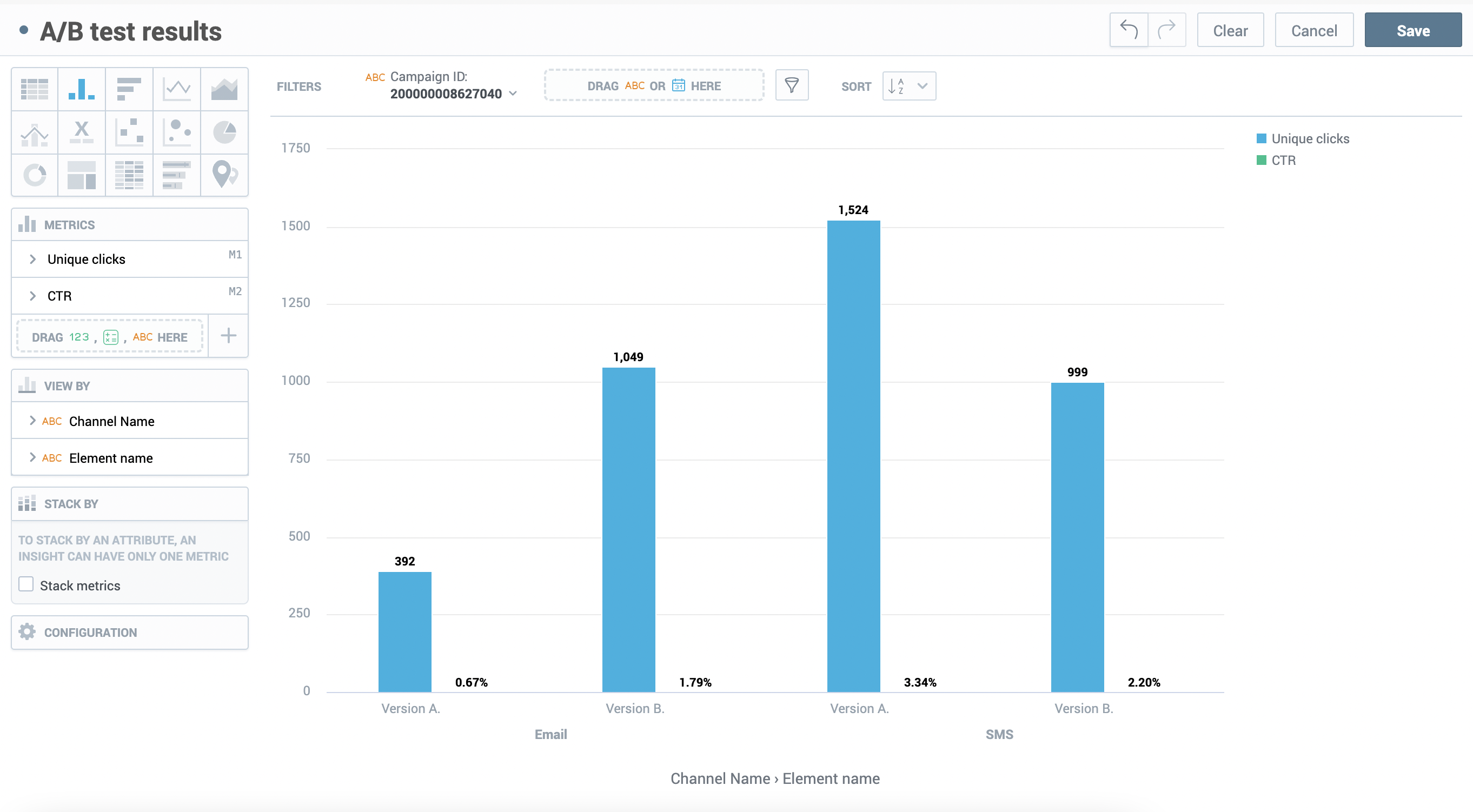
- Now you can see that in the first test where we compared two email messages Version B is the winner.
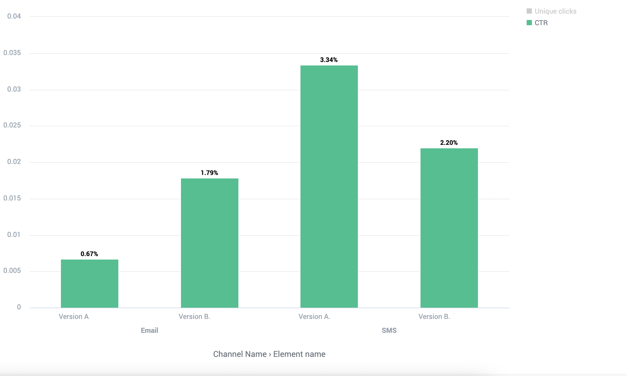
- Select the graph legend to compare CTR results. The winning CTR is more than double. Version A is the winner for SMS with a CTR of 3.34% versus 2.30% or 1524 unique clicks vs. 999 unique clicks.
- Save your report if you want to reuse it as a template for future A/B tests.
Example 5: Track and compare metrics in different versions of multichannel flows [#example-five-track-and-compare-metrics-in-different-versions-of-multichannel-flows-custom-reports-and-dashboards]
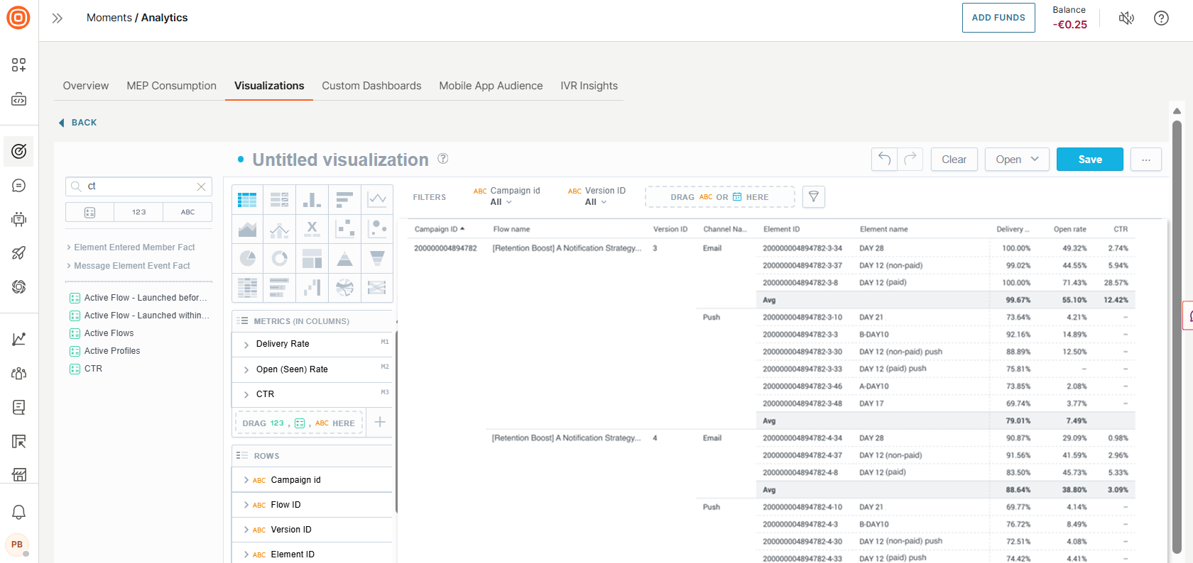
In this example report, you will learn how to track and compare metrics between specific flow versions and see a detailed breakdown by messages within the flows using the Moments Analytics Visualizations feature.
This can be helpful for understanding the effectiveness of specific automation programs and identifying areas for improvement.
- Go to Moments > Analytics > Visualizations.
- Select Create visualization to open the Visualization editor.
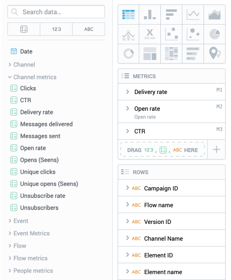
- Drag the Campaign ID, Flow name, Version ID, Channel name, Element ID, and Element name from the flow section of the Data catalog to the Rows section.
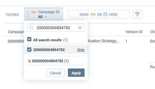
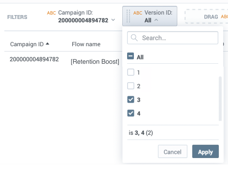
- Filter the report by a specific flow by dragging Campaign ID to the Filter bar. Then, copy and paste a Campaign ID value into the search bar and select Only, then Apply.
- Select the Version ID filter to choose the versions you want to analyze
- Drag Delivery rate, Open rate, and CTR data types into the Metrics section
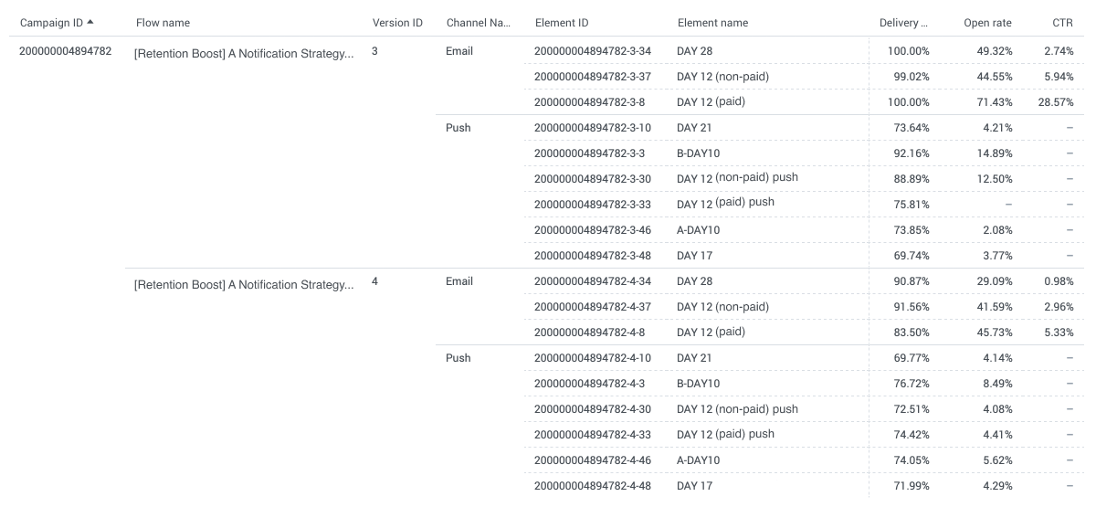
 Now you see the detailed breakdown of metrics for each element in each flow version and grouped by channel name which makes the report well structured and easy to read.
- Add aggregates to the report to make it easier to compare the performance of each channel. Hover your cursor over the Delivery rate field name and select the burger icon. From the dropdown list of aggregates, hover over Avg and select the within Channel Name option to aggregate the values by channel. Repeat this process for the Open rate and CTR metrics.
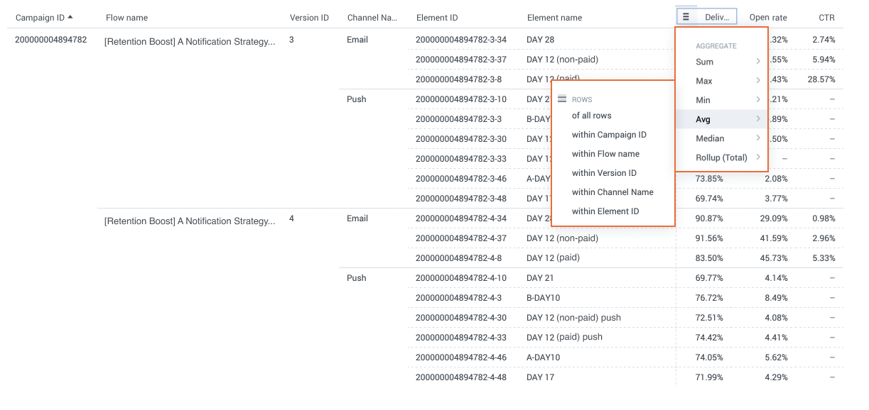
- Now the report shows detailed metrics for each element within each version of the selected flow. Aggregated average metrics for each channel help to compare the performance between versions.
- Name the visualization and save it. Your table should look as shown in the following image:
Custom dashboards [#custom-dashboards-custom-reports-and-dashboards]
The custom dashboards feature allows you to create customized visualizations of your campaign data.
With custom dashboards, you can quickly access the information that's most relevant to you and monitor the performance of your campaigns. You can:
- Track changes to your campaign KPIs.
- Compare current data across time periods.
- Add, slice, and filter data.
Custom dashboards can contain one or more of the following components:
- Visualizations: Multi-layer analytics that enables you to add and slice data based on multiple metrics
- Key Performance Indicators (KPIs): Mono-layer analytics that displays a single metric in numeric format. KPIs can be whole number, a decimal, or a percentage.
- Attribute filter: Additional filters that you can add to the standard filtering options to filter reports by specific chatbot components. These filters are predefined.
Custom dashboards can contain more than one item of the same type. For example, you can have multiple visualizations on a single custom dashboard.
The key to building a successful custom dashboard is to group elements together and create dashboards that contain KPIs and Visualizations that fulfill a common purpose. For example, consider creating a dashboard for overall performance and then leveraging the filters to drill into channels, dates, and campaigns.
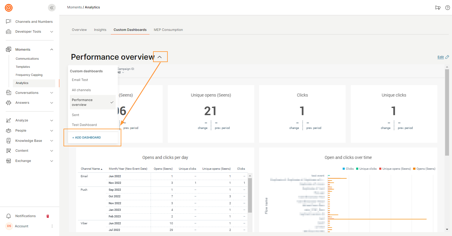
To access custom dashboards, on the web interface, go to Moments > Analytics > Custom Dashboards.
You can do the following:
- View custom dashboards. By default, the latest custom dashboard that you created is displayed. To view other custom dashboards, select the dashboard from the Custom Dashboards dropdown menu.
- Create custom dashboards. You can either use custom metrics to customize an existing standard report or create a new custom dashboard from scratch.
- Edit custom dashboards. Select a custom dashboard and then select Edit.
Create custom dashboard [#create-dashboard-custom-reports-and-dashboards]
To create a new custom dashboard:
-
Go to Moments > Analytics > Custom Dashboards
-
Select the dashboard selector dropdown, then Add dashboard.
-
Give your dashboard a name.
-
Select Create.
-
Drag one or more of the following items to the dashboard editor. You can add more than one item of the same type. Example: multiple attributes. The editor provides guidance about where you can add each of these items.
-
Visualization: Create a new visualization to display results by multiple data types. For more information, refer to Visualizations.
-
Filter: Add the Filter element and then search for or choose an attribute from the list. Example: channel name or flow name. For each attribute, choose the values to filter. By default, all values are selected. You can add or edit these filters at any time, for example, if there are new reports.
-
Column container: Create a vertical group of widgets placed in a single column inside your section. Use this option to stack multiple items.
-
Visualization switcher: Combine multiple visualizations into a single dashboard. At a time, only one visualization is displayed. Use the arrow keys to switch between them. This feature enables you to compare data between multiple visualizations.
-
Saved Visualizations: Search for a visualization or choose an existing one from the list to display results by multiple data types. You can add visualizations that you created or those that are shared with you.
After you add the visualization, select the visualization to view the menu options. You can do the following:
- Add filters or hide the visualization title: Select Configuration
- Make changes: Select Edit
- Drill into data. For more information, refer to the Drill into data documentation.
-
Rich text: Add rich text such as images, links, code blocks, lists, formatting, and text to your dashboard. Use markdown syntax to add this content.
-
-
Add titles and descriptions for each section you add.
-
(Optional) To configure or delete a KPI or Visualization, select the item to get the menu options, and then select Remove from Dashboard. To delete an attribute filter, select the item and drag and drop it to the left.
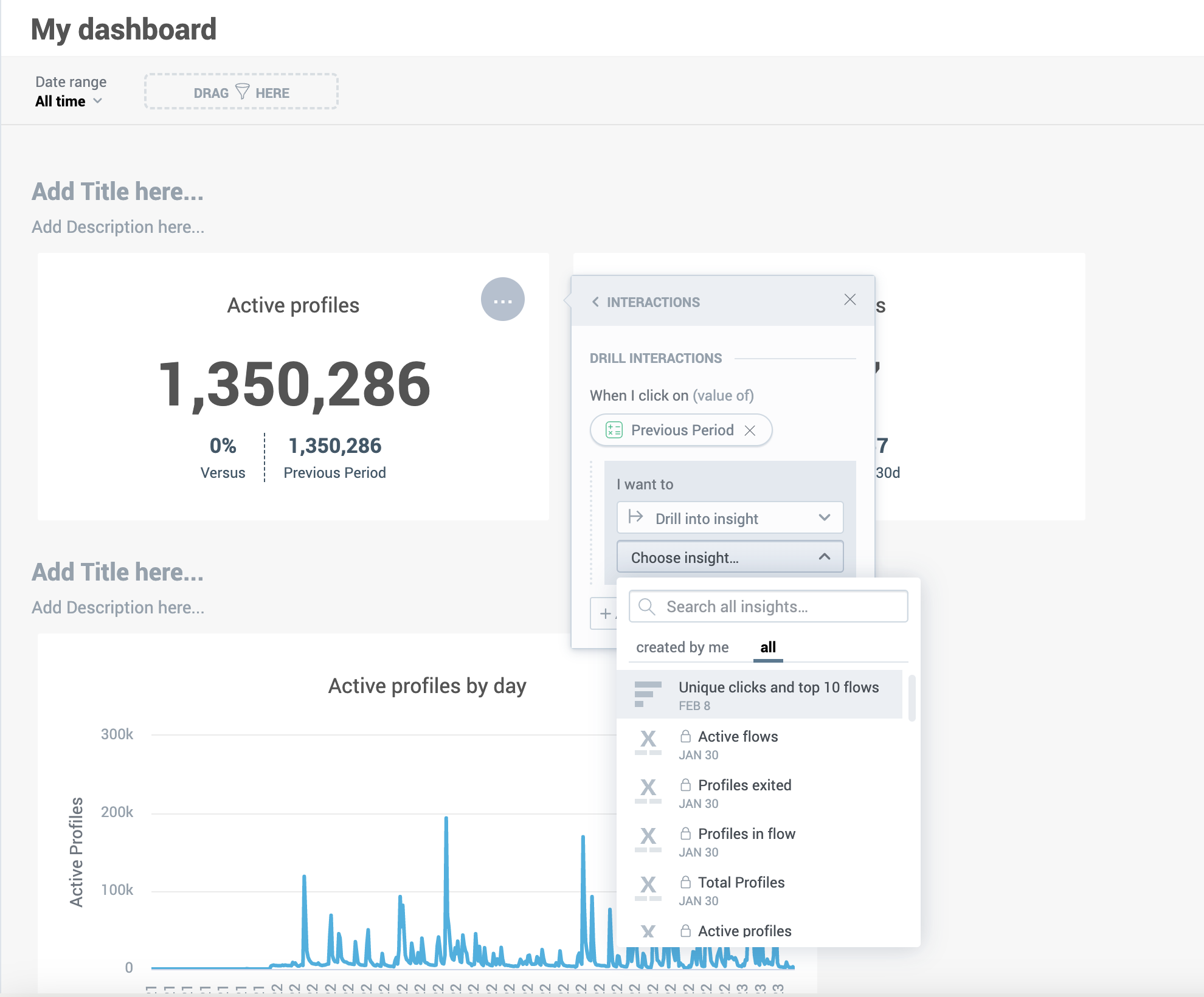
Drill into data [#drill-into-data-custom-reports-and-dashboards]
After you add a visualization to your dashboard, you can further configure it by drilling deeper into the visualization and creating additional actions that run when you select a value. For example, link specific metrics or widgets with detailed breakdowns or other reports. You can drill into the following:
- Visualization
- Dashboard
- URL
It is not possible to drill into KPIs.
To drill into data
- Select the visualization to view the menu options.
- Select Interactions > Drill Interactions > Add interaction.
- Choose the data item for which you want to drill.
- In the I want to section, choose whether you want to drill into the visualization, another dashboard, or a URL.
- Drill into Dashboard: Choose an existing dashboard. You can choose the dashboards that you created or those that are shared with you.
- Drill into visualization: Choose the visualization that you want to drill into. You can choose visualizations that you have created or those that have been shared with you.
- Drill into URL: Either choose an existing URL or create a custom URL.
After you have configured the drilled visualization, the target visualization, dashboard, or URL will open when you select the fact, metric, or attribute when you are viewing the dashboard.
To view the results:
- On the dashboard, go to the visualization you want to view.
- Select the item that you want to drill into. Then select an item in either the Drill down or Drill into sections.
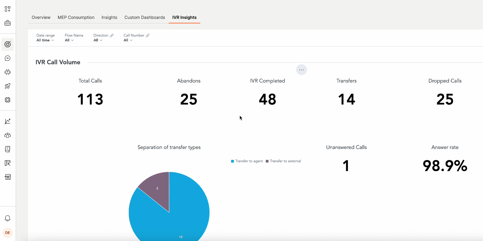
IVR insights [#ivr-insights]
If your flow contains an IVR session, you can view insights for the session. Use these insights to track key metrics such as IVR completion rate, transfers, and abandonment. You can then optimize the IVR call flows.
To access IVR insights, go to Moments > Analytics > IVR insights on the Infobip web interface.
The dashboard contains the following sections:
Filters
You can use one or more of the following filters for the entire dashboard:
- Date range: Configure the time period for which you want the insights.
- Flow name: Select one or more flows.
- Direction: Select Inbound, Outbound, or All.
- Call number: Select one or more senders.
IVR call volume
This section contains the following metrics for the selected time period:
- Total calls: The total number of IVR calls.
- Abandons: The number of calls that were hung up before the IVR session was completed.
- IVR completed: The number of calls in which the end user query was resolved without agent intervention.
- Transfers: The number of IVR calls that were transferred to either a live agent or an external phone number.
- Dropped calls: The number of IVR calls that were disconnected during the IVR session because of technical reasons. Example: Operator error, application error, or insufficient funds.
- Unanswered calls: The number of calls that were not answered by either the end user or an answering machine.
- Answer rate: A percentage of the number of calls that were answered / the total number of calls.
You can also view a graph that shows the number of calls that were transferred to an agent and to an external phone number.
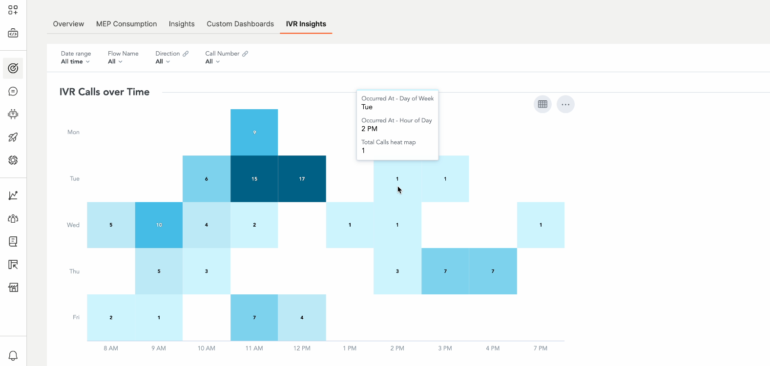
IVR calls over time
The graph in this section shows the number of calls made during each hour of a day. Select a section of the graph to see the number of calls made during that hour.
The following image shows that at 2 PM on Tuesday, 1 call was made.
IVR performance
This section contains the following metrics for the selected time period. For some metrics, you can select the arrow against the metric to change between Average and Total values.
- Completion rate: A percentage of the calls in which the end user query was resolved without agent intervention / the total number of calls.
- Transfers rate: A percentage of the number of calls that were transferred to either a live agent or an external phone number / the total number of calls.
- Abandon rate: A percentage of the number of calls that were hung up before the IVR session was completed / the total number of calls.
- Average completion handling time: The average time duration of the IVR calls.
- Total completion handling time: The total time duration of the IVR calls.
- Average transfer time: The average time duration of the IVR calls before they were transferred to either an agent or an external phone number.
- Total transfer time: The total time duration of the IVR calls before they were transferred to either an agent or an external phone number.
- Average abandonment time: The average time before end users abandoned the IVR (hang up before reaching an agent or completing self-service)
- Total abandonment time: The total time before end users abandoned the IVR (hang up before reaching an agent or completing self-service)
- Average IVR time per call: The average duration of the IVR session within the flow.
- IVR bounce rate: A percentage of the calls where the end user hung up immediately after the first IVR prompt / the total number of calls.
- Calls drop rate: A percentage of the number of IVR calls that were disconnected during the IVR session because of technical reasons / the total number of calls. Example: Operator error, application error, or insufficient funds.
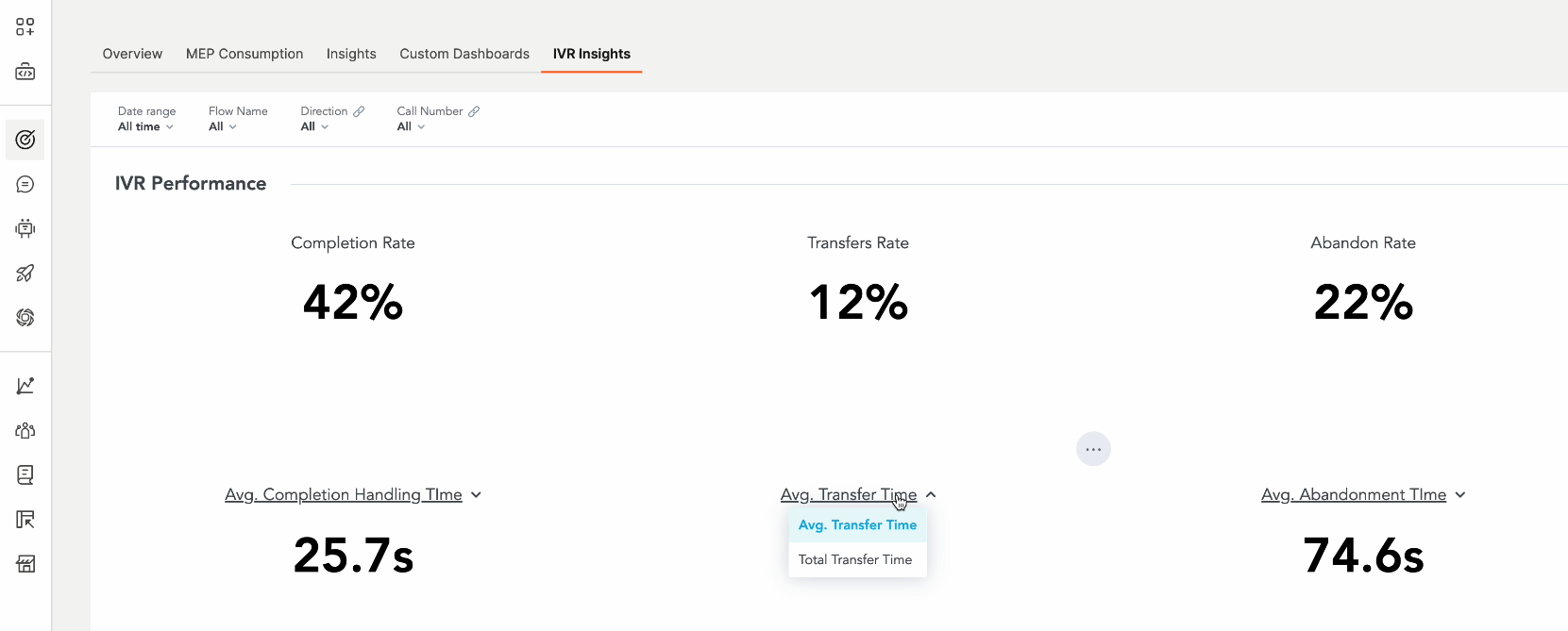
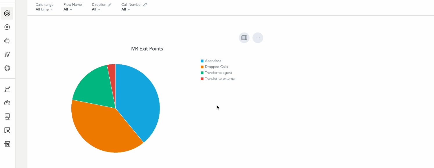
You can also view a graph that shows the various reasons that the IVR session ended. Example: Calls were abandoned, dropped, or transferred.
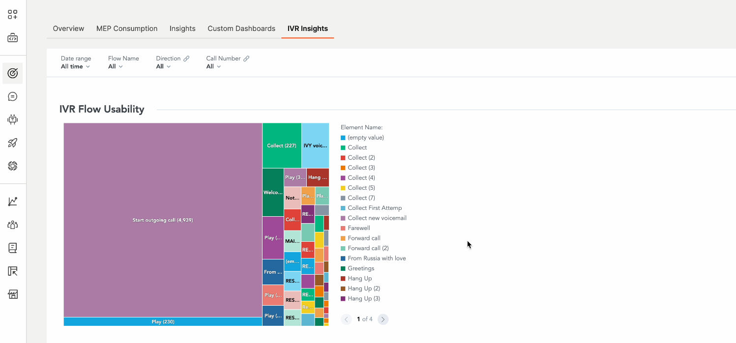
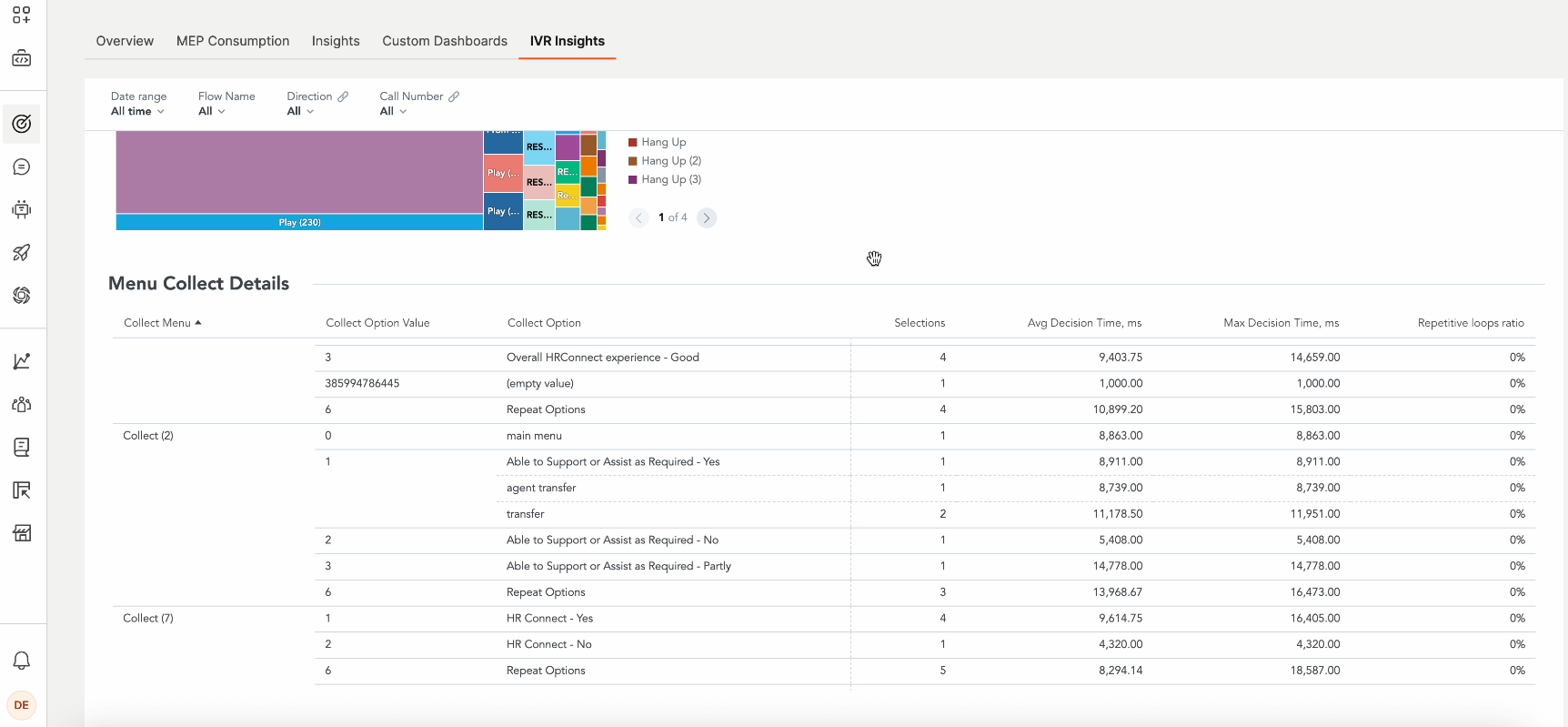
IVR flow usability
The graph in this section shows the different elements that were used in the IVR calls.
Menu collect details
This section shows details about the Collect elements used in the IVR sessions.
Data types
Use this reference to understand available data types.
Date [#date-data-types]
| Data Type | Description |
|---|---|
| Date | Represents all your dates. It allows you to break down or group data by Day, Week, Month, Quarter, and Year. |
Attributes [#attributes-data-types]
| Data type | Description |
|---|---|
| Channel name | The name of the channel. Example: Email, Push, WhatsApp |
| Event name | Name of the event. Example: Sent, Delivered, Opened, Clicked, Unsubscribed |
| Campaign ID | The unique ID of a flow campaign. |
| Sender | The sender ID used for the flow (conversation). |
| Flow name | The display name of a flow campaign. |
| Version ID | The version of a flow campaign. |
| Element ID | The unique ID of a messaging element in a flow. |
| Element name | The display name of a flow element. Flow automatically assigns a name to the element. Example: SMS1, SMS2, and SMS3 |
| Profile ID | A unique anonymized profile ID in People. This is used for calculating such metrics as unique clicks and unique opens. |
Metrics [#metrics-data-types]
Channel Metrics [#channel-metrics-data-types]
| Data Type | Description |
|---|---|
| Clicks | The total count of click events. |
| CTR | Click-through rate (Unique clicks / Messages delivered ratio). |
| Delivery Rate | Ratio of Messages delivered / Messages sent. |
| Messages Delivered | The total count of delivered messages. |
| Messages Sent | The total count of sent messages. |
| Open (Seen) Rate | Ratio of Unique Opens (Seens) / Messages delivered. |
| Opens (Seens) | The total count of Open (Seen) events. |
| Unique Clicks | The total number of clicks grouped by profile ID. |
| Unique Messages Delivered | The total number of messages delivered grouped by profile ID. |
| Unique Open (Seen) Rate | Ratio of Unique Opens (Seens) / Messages delivered. |
| Unique Opens (Seens) | The total number of opens grouped by profile ID. |
| Unique Unsubscribers | The total number of unsubscribe events grouped by profile ID. |
| Unsubscribe Rate | Ratio of Unsubscribers / Messages delivered. |
| Unsubscribers | The total number of unsubscribe events. |
Flow metrics [#flow-metrics-data-types]
| Data Type | Description |
|---|---|
| Active Flow - Launched before and ended after interval start or not ended | The total number of flows that meet all the following criteria: - Flow was launched before the start of the selected period. - Flow either ended after the start of the selected period or has not ended. |
| Active Flow - Launched within interval | The total number of flows that were launched during the selected period. |
| Active Flows | The total number of flows that were active during the selected period. |
| Profiles Exited | The total number of profiles that exited a flow by passing through the exit element. Like the profiles in flow metric, this one is aggregated and counts all profiles from the date of campaign launch. Used in the Flow performance standard dashboard. |
| Profiles in Flow | The total number of profiles in flow. The metric is aggregated and counts all profiles from the date of campaign launch. This metric is used in the Flow performance dashboard and shows the total size of the audience that entered the flow, regardless of the date. |
People metrics [#people-metrics-data-types]
| Data Type | Description |
|---|---|
| Active Profiles | The number of unique profiles that have entered a flow within the selected period and performed at least one of the following events: - Open (Seen) for Email, WhatsApp, Viber, and Push channels - Click for SMS - Sent inbound message (for any channel) |