Custom dashboards
In addition to using predefined dashboards, you can create your own dashboards. Custom dashboards enable you to create personalized views of your chatbot performance data. You can select, arrange, and visualize the metrics that matter most to your business.
Use custom dashboards to monitor key performance indicators, track trends, and make data-driven decisions tailored to your specific needs.
Visualizations
Visualizations are interactive, multi-layer analytics that enable you to add and slice data based on multiple metrics. Visualizations are the most extensive report types and can be used as standalone reports or as part of your custom dashboards.
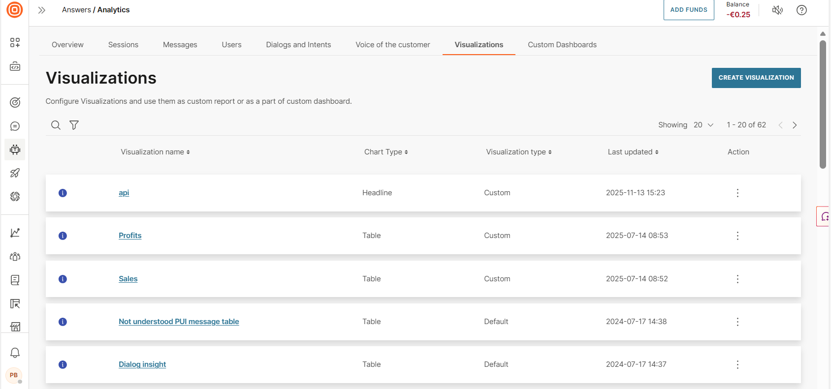
To access visualizations, go to Answers > Analytics > Visualizations on the Infobip web interface. You can do the following:
- View a list of visualizations
- Create a new visualization
- View details of a visualization. Select the information icon.
- Search for visualizations by partial or complete name
- Filter visualizations, for example, by visualization type or last updated
- Sort visualizations by using the table headers
- Export visualizations
- Set the number of visualizations displayed on a single page
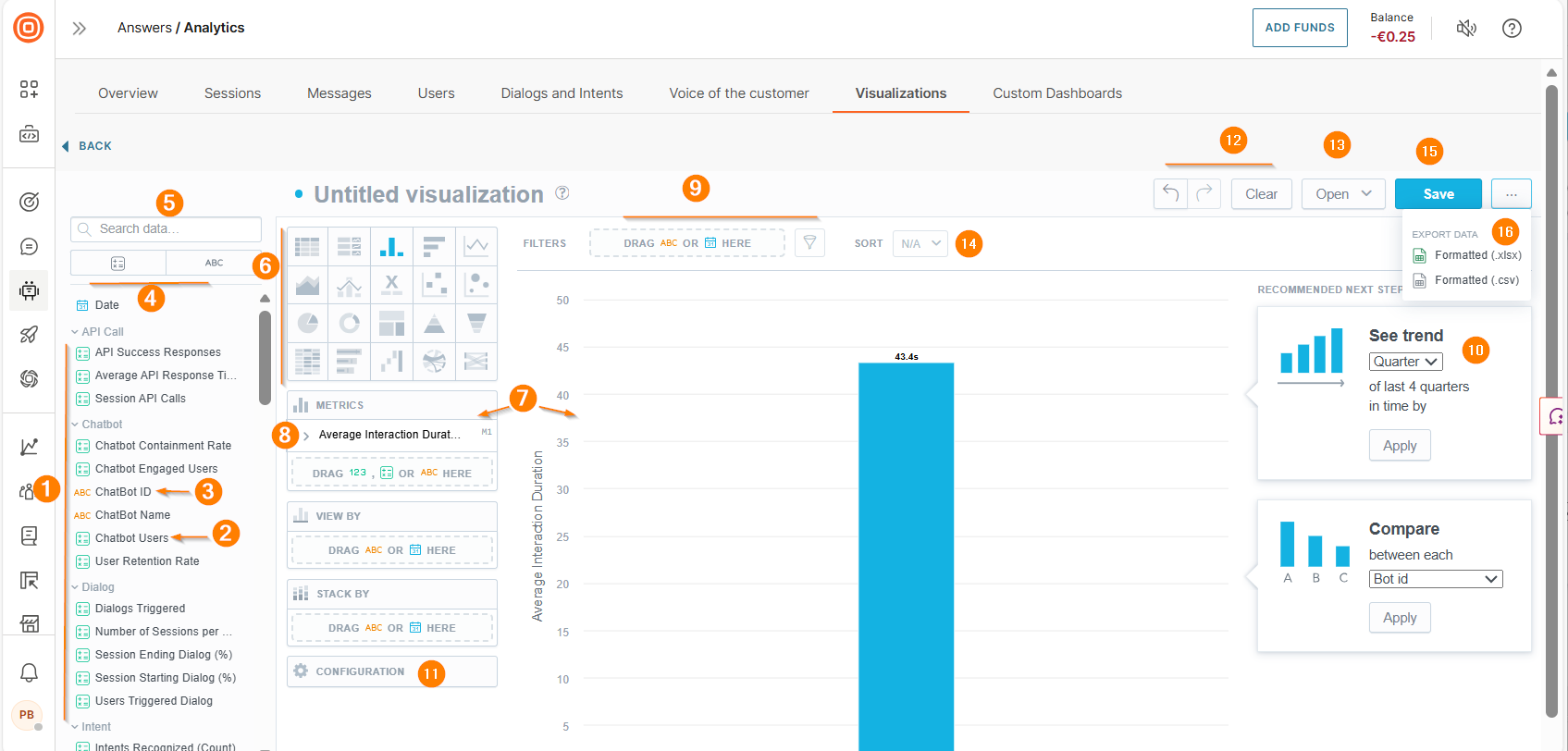
Visualizations editor [#visualization-editor-visualizations]
Use the Visualizations editor to do the following:
- Create a visualization
- Edit a visualization
- Export a visualization
- Duplicate an existing visualization. Select Save as new.
To access the editor, go to the Analytics > Visualizations tab. Select Create visualization.
This page contains the following:
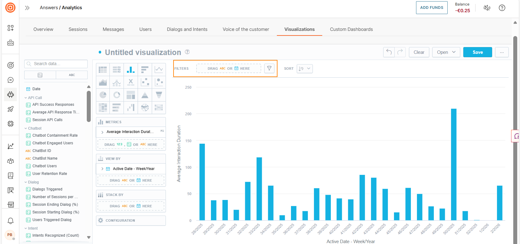
- Data catalog: Contains metrics and attributes. Expand the menu items to view available data items.
- Metrics: Quantitative data that you can add to the visualization.
- Attributes: Qualitative data that you can add to the visualization.
- Filter options for data catalog: Select the relevant data type (metrics and attributes) to view a list of data items of that type.
- Search: Search for data items by partial or full name.
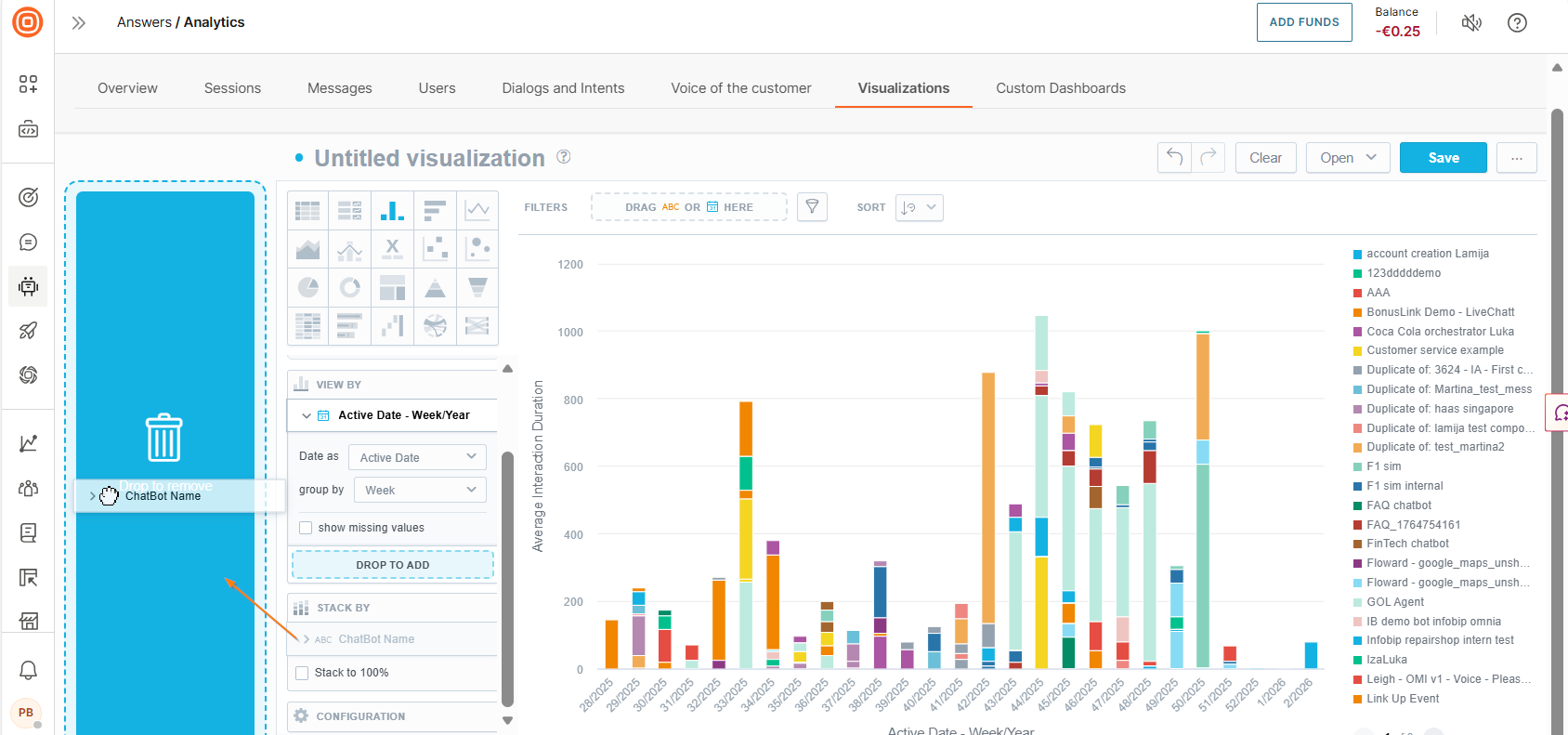
- Visualization type: Change the chart type as needed. The system updates the visualization to match the selected type. Each chart type may support specific data types. Example: The Stack by field is available for a column chart but not for a table.
- Active zones: Drag items from the data catalog to these areas of the canvas. The editor guides you about supported data items for each active zone.
- Ad hoc metrics: Use basic arithmetic functions to create metrics. Select the + sign to add more.
- Filter: Filter the visualizations by specific criteria. Drag the Date or any attribute from the data catalog or use the filter button to select attributes. The editor displays a message if data cannot be filtered.
- Recommendations: Modify the visualization based on usage patterns.
- Configuration: Format the visualization. Example: Change colors or position the legend. Some charts may have limited configuration options.
- Undo, Redo, and Clear: Undo or redo your changes. Select Clear to remove all data from the visualization.
- Open: View a visualization. Filter to view only the visualizations that you created. Alternatively, type the partial or full name of a visualization in the Search field.
- Sort: Sort data alphabetically, numerically, or chronologically. Sorting is available for bar charts, column charts, area charts, combo charts, bullet charts, pie charts, donut charts, and heatmaps.
- Save: Save your visualization.
- Export: Export your visualization.
Create visualization [#create-visualization]
Follow these steps to create a visualization:
- On the Analytics > Visualizations tab, select Create visualizations.
- Choose a visualization type. Each chart type supports specific data types.
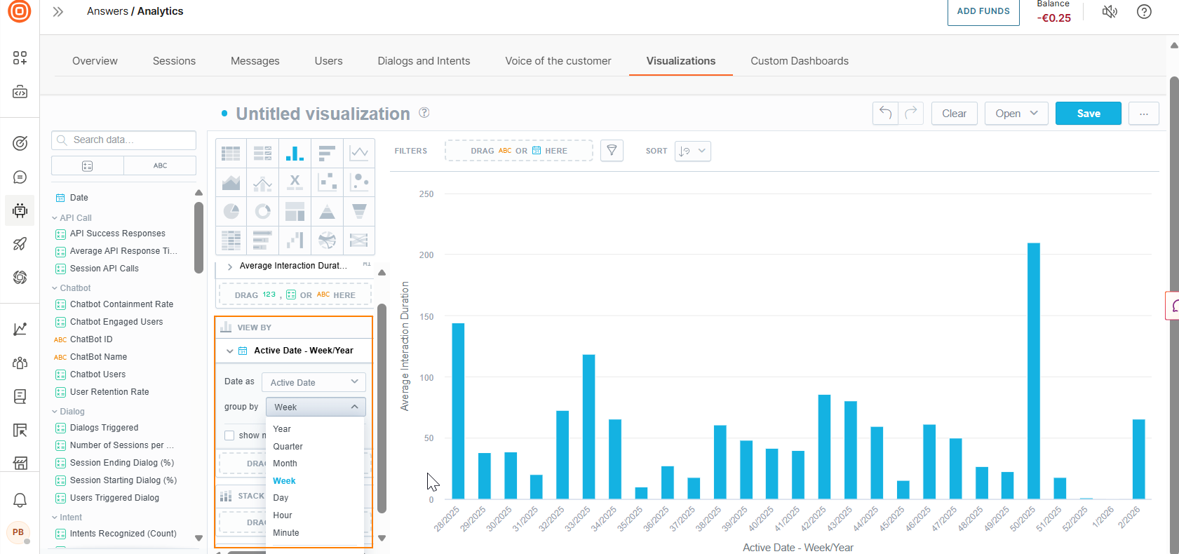
- Drag one or more data items (metric, attribute) from the data catalog to the active zones. You can view the data immediately after you add items to the fields. To create a new metric, add at least two data items.
- (Optional)
- To get more detailed data, drag the Date or an Attribute to the Rows/Columns field (only for tables) or to the View by, Trend by, or Attribute fields (for other chart types).
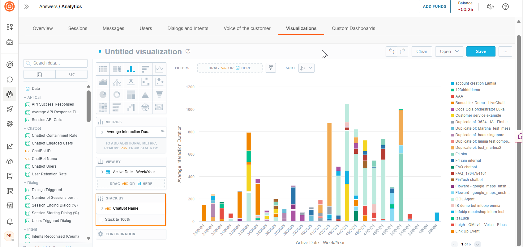
- To split the data into stacked groups, drag an Attribute to the Stack by or Segment by field. For Line charts, there must be only one data item in the Metrics field.
- To format the chart, use the Configuration options.
- To make changes, use the Undo, Redo, and Clear options. To delete a data item, select the item in the editor and drag it to the left.
- Use additional customization options - refine data items or add filters.
- To get more detailed data, drag the Date or an Attribute to the Rows/Columns field (only for tables) or to the View by, Trend by, or Attribute fields (for other chart types).
- Name the visualization.
- Select Save.
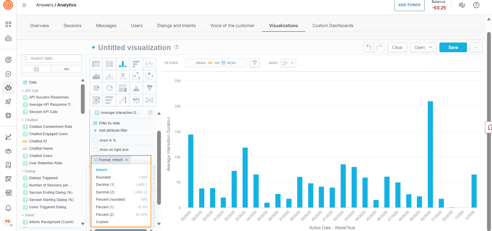
Refine data items [#refine-data-items-visualizations]
You can refine metrics and attributes.
In the Metrics section, select the arrow next to a data item.
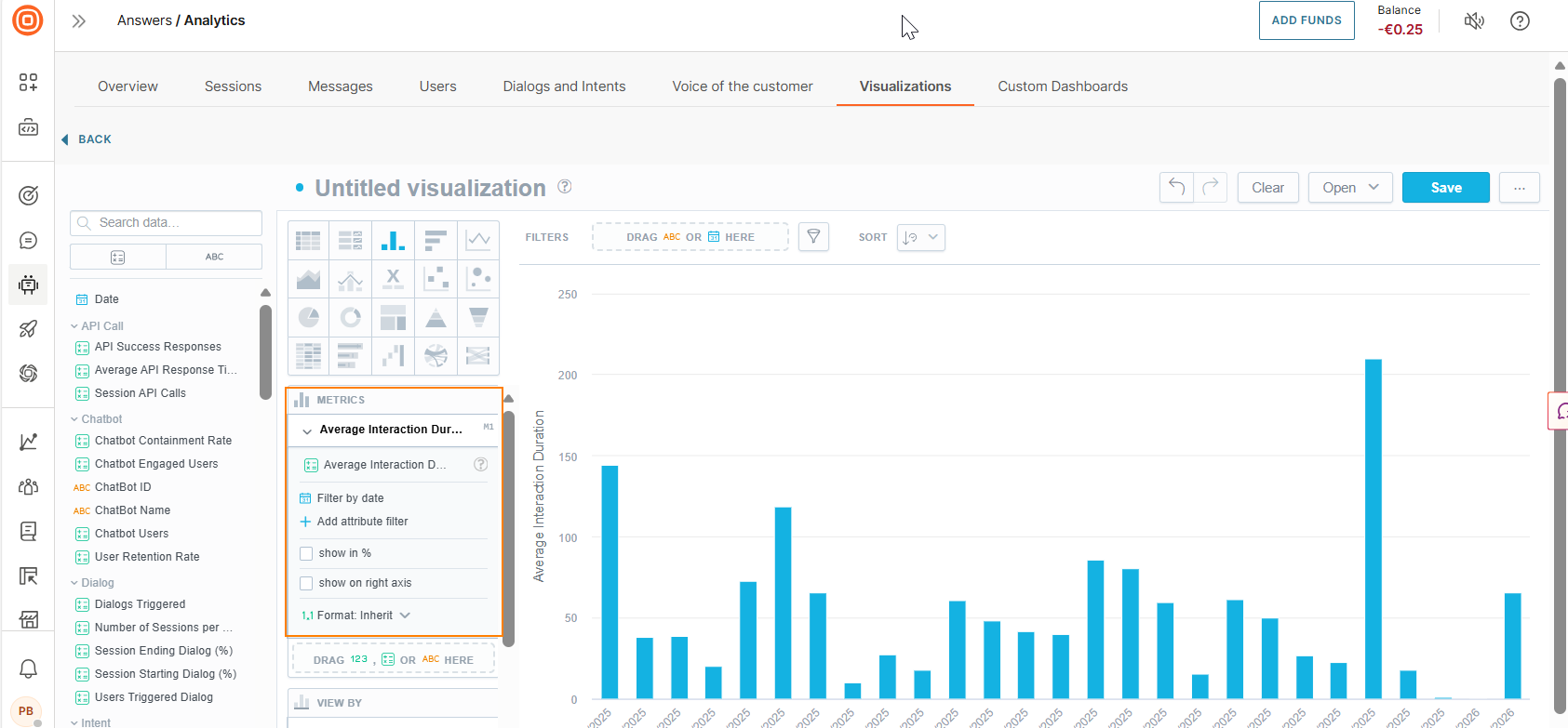
You can do the following:
-
Display the filter as a percentage
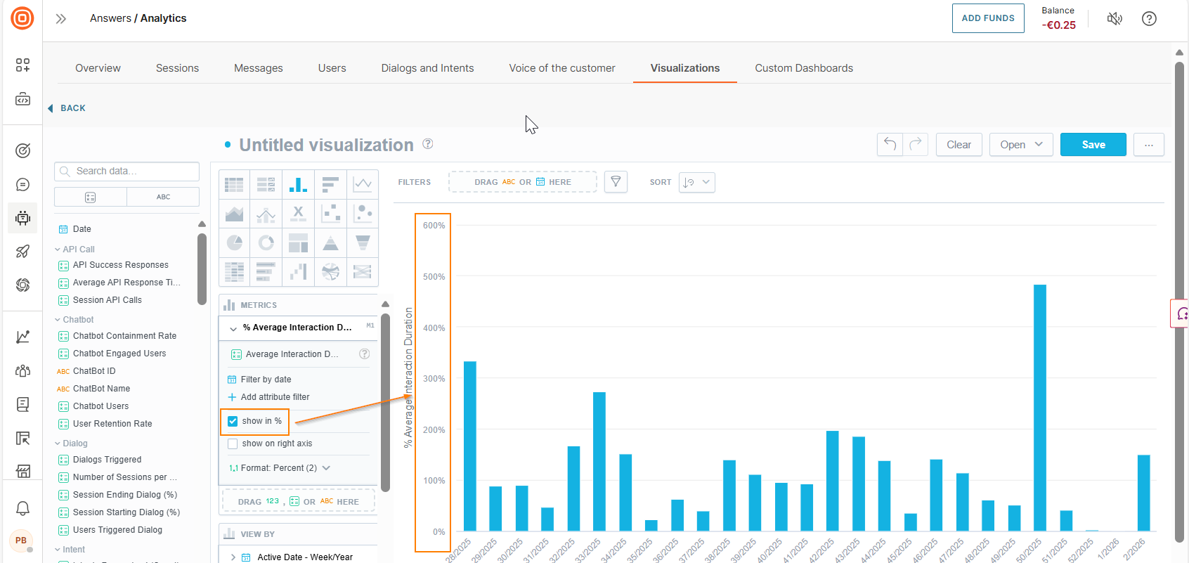
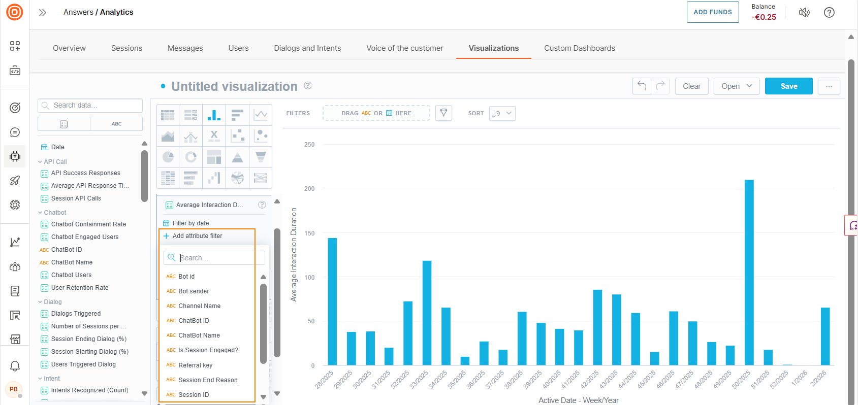
-
Filter the attribute. Select Add attribute filter and then either choose a filter from the list or search for a filter by its complete or partial name. You can add the date and a maximum of 20 data items (metrics and attributes). All filters that you add are applied at the same time.
-
Format the data values
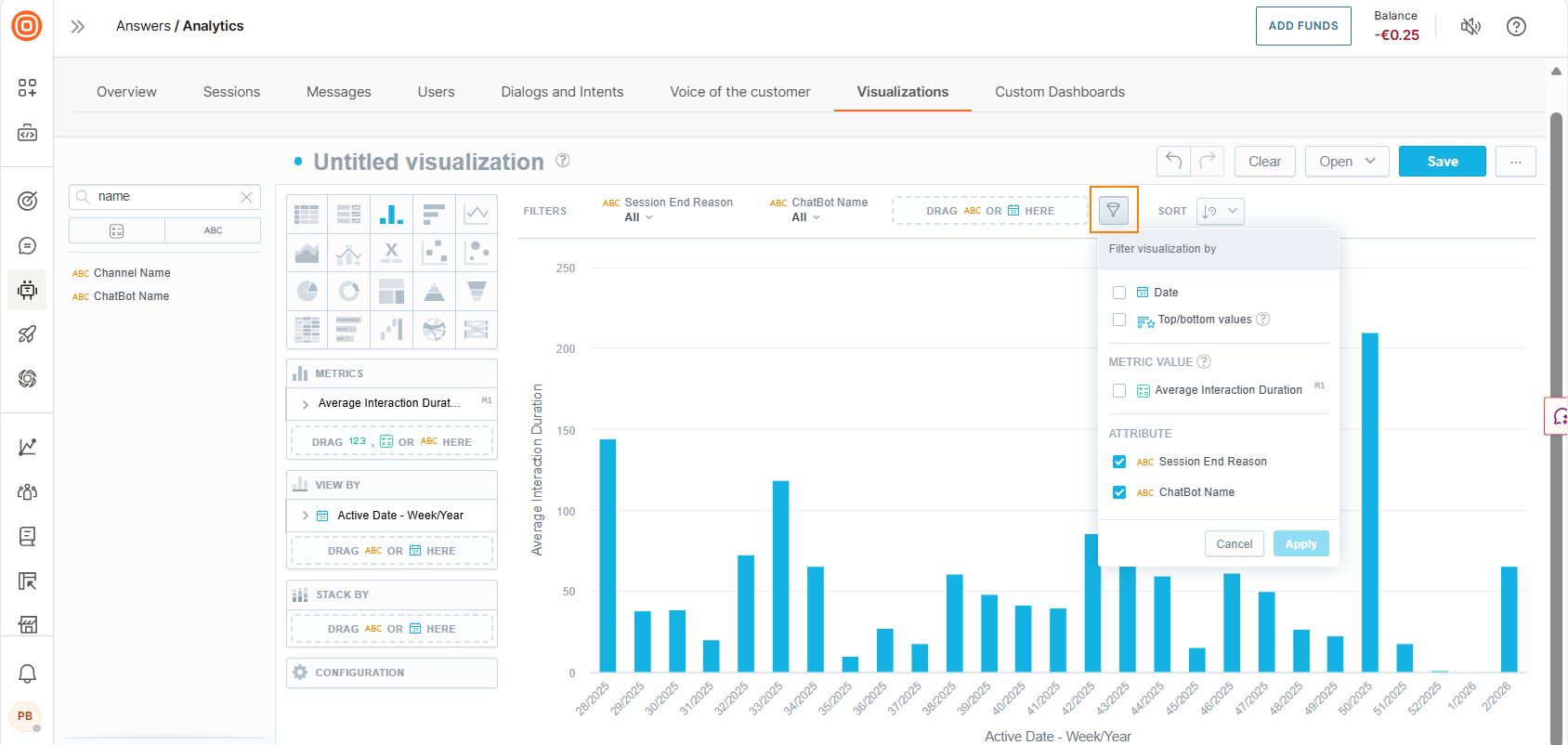
Add filters to the visualization [#add-filters-to-visualization]
This section is for filtering the visualization. For details about filtering the Attribute section, refer to the Refine Data Items section.
To filter the visualization, do the following:
-
Drag Date and other attributes to the filter at the top.
-
(Optional) Select the item added to the filter and choose the required options.
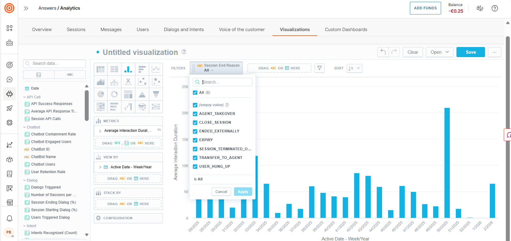
-
(Optional) Select the filter icon and choose the filters to apply.
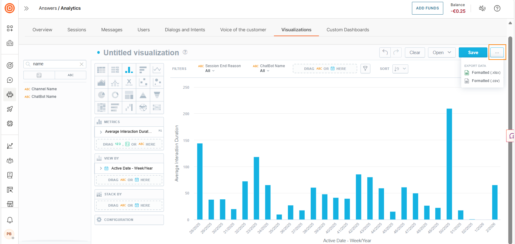
Export visualization [#export-visualization]
On the Visualizations tab, select the three dots next to a visualization and choose one of the following file formats:
- .csv
- .xlsx
The visualization is downloaded as a static file.
Custom dashboards
Dashboards are visual representations of data. Create custom dashboards to obtain specific, relevant information about the performance of your chatbots.
You can do the following:
- Track changes to your KPIs
- Compare current data across time periods
- Add, slice, and filter data
- Compare data in multiple visualizations
Custom dashboards can include one or more of the following:
- Visualizations: Multi-layer analytics that enable you to add and slice data based on multiple metrics.
- Key Performance Indicators (KPIs): Single-metric analytics displayed in numeric format. Can be a whole number, decimal number, or a percentage.
- Attribute filter: Additional filters that you can add to standard filtering options to filter reports by specific building blocks of the chatbot. These filters are predefined and are based on the standard Answers fields.
Custom dashboards can contain more than one item of the same type. Example: multiple visualizations.
All the elements on the custom dashboard must work together to fulfil a common purpose.
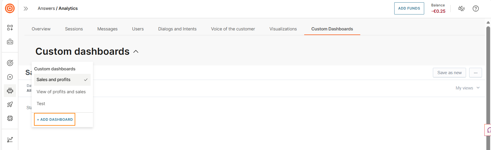
To access custom dashboards, go to the web interface > Answers > Analytics > Custom Dashboards.
You can do the following:
- View custom dashboards: By default, the latest custom dashboard that you created is displayed. To view other custom dashboards, choose from the Custom Dashboards menu.
- Create a custom dashboard: Either use custom metrics to customize an existing predefined dashboard or create a new custom dashboard from scratch.
- Edit a custom dashboard: Select a custom dashboard and then select Edit.
- Export a custom dashboard: Select a custom dashboard. In the menu on the right, select Export to PDF. Supported file type is .pdf.
- Duplicate a custom dashboard: Select an existing custom dashboard and then select Save as new.
- Share a custom dashboard: Share with other people in your organization. Select a custom dashboard and then select Share.
Create dashboard from a predefined dashboard [#create-dashboard-from-a-predefined-dashboard-custom-dashboards]
-
On a predefined dashboard, select the menu button and then select Explore from here.
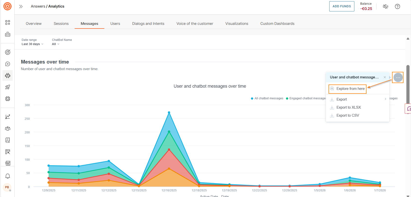
The report opens in the visualization editor.
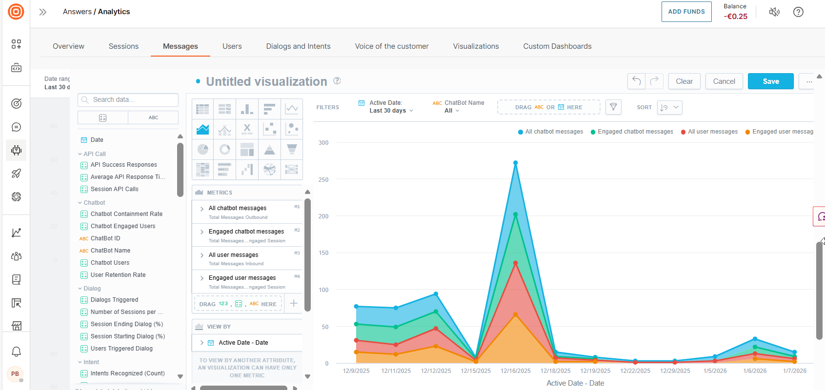
-
Add other reporting elements to the editor.
-
Select Save.
Create dashboard from scratch [#create-dashboard-from-scratch-custom-dashboards]
Follow these steps to create a new dashboard:
-
Go to Analytics > Custom dashboards > Custom dashboards, and select Add dashboard.
-
Enter the dashboard name. Choose one of the following dashboard availability options:
- Public: Accessible by everyone who has access to Answers analytics
- Shared: Shared with specific users or groups
- Private: Accessible only to the creator of the dashboard
-
Select Create.
-
Drag one or more of the following items to the dashboard editor. You can add more than one item of the same type. Example: multiple attributes. The editor provides guidance about where you can add each of these items.
- Visualization: Create a new visualization to display results by multiple data types. For more information, refer to Visualizations.
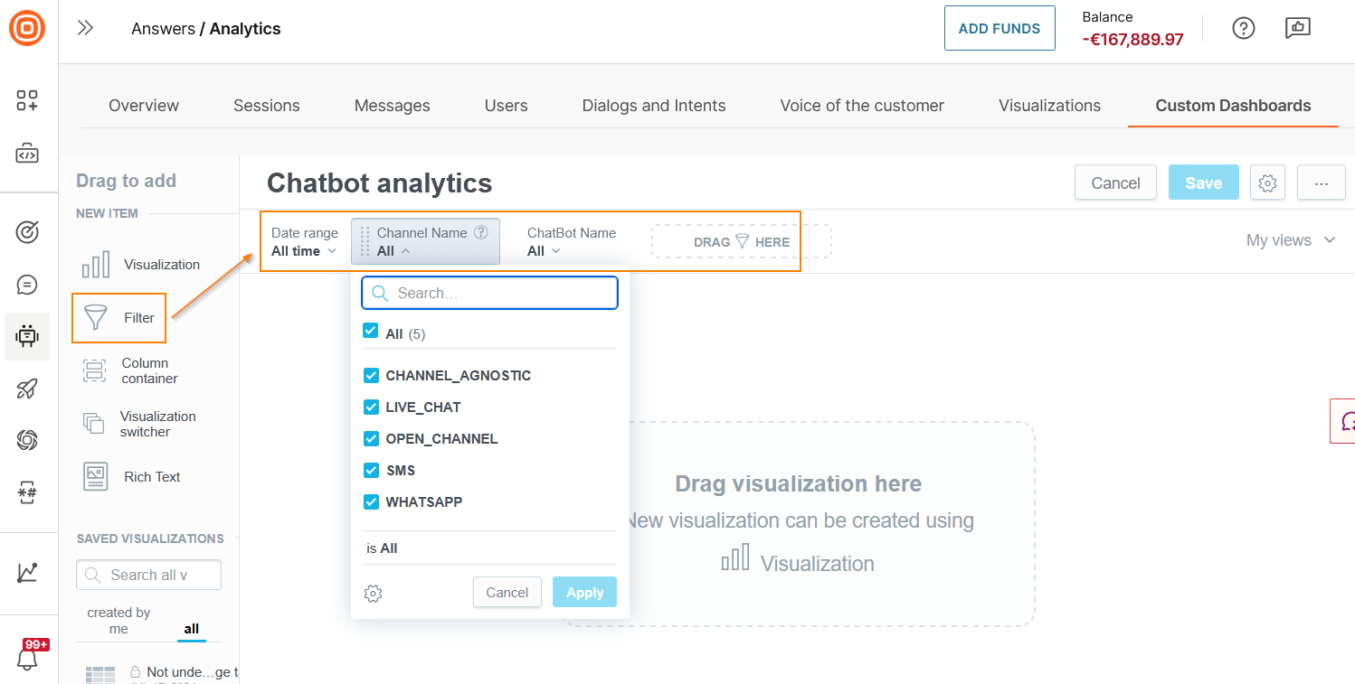
- Filter: Add the Filter element and then search for or choose an attribute from the list. Example: channel name or CSAT score. For each attribute, choose the values to filter. By default, all values are selected. You can add or edit these filters at any time, for example, if there are new reports.
-
Column container: Create a vertical group of widgets placed in a single column inside your section. Use this option to stack multiple items.
-
Visualization switcher: Combine multiple visualizations into a single dashboard. At a time, only one visualization is displayed. Use the arrow keys to switch between them. This feature enables you to compare data between multiple visualizations.
-
Saved Visualizations: Search for a visualization or choose an existing one from the list to display results by multiple data types. You can add visualizations that you created or those that are shared with you.
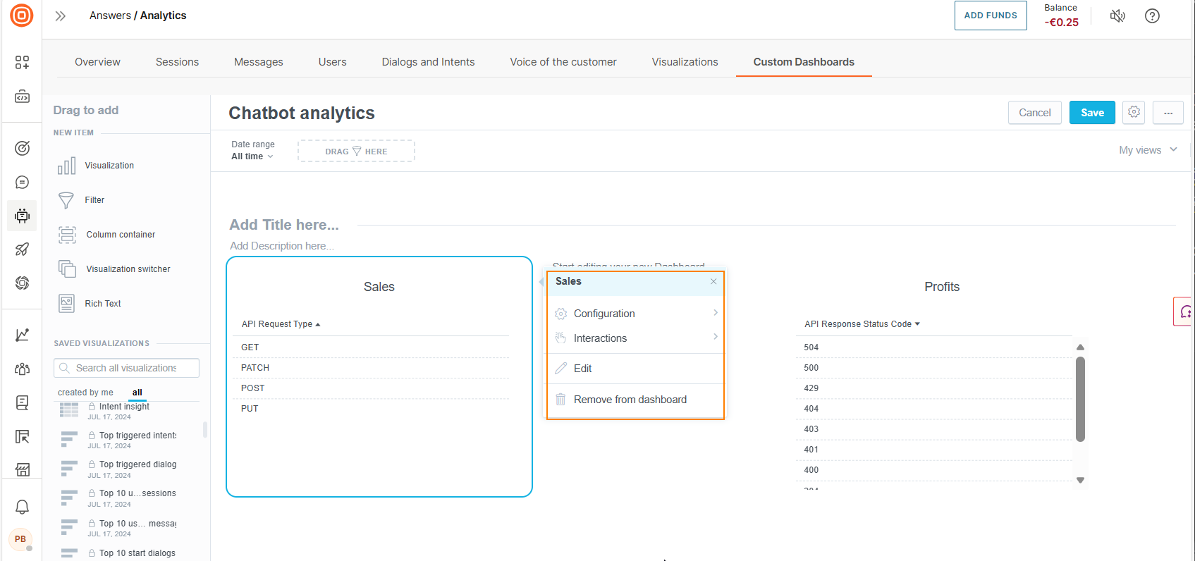
After you add the visualization, select the visualization to view the menu options. You can do the following:
- Add filters or hide the visualization title: Select Configuration
- Make changes: Select Edit
- Drill into data. For more information, refer to the Drill into data documentation.
-
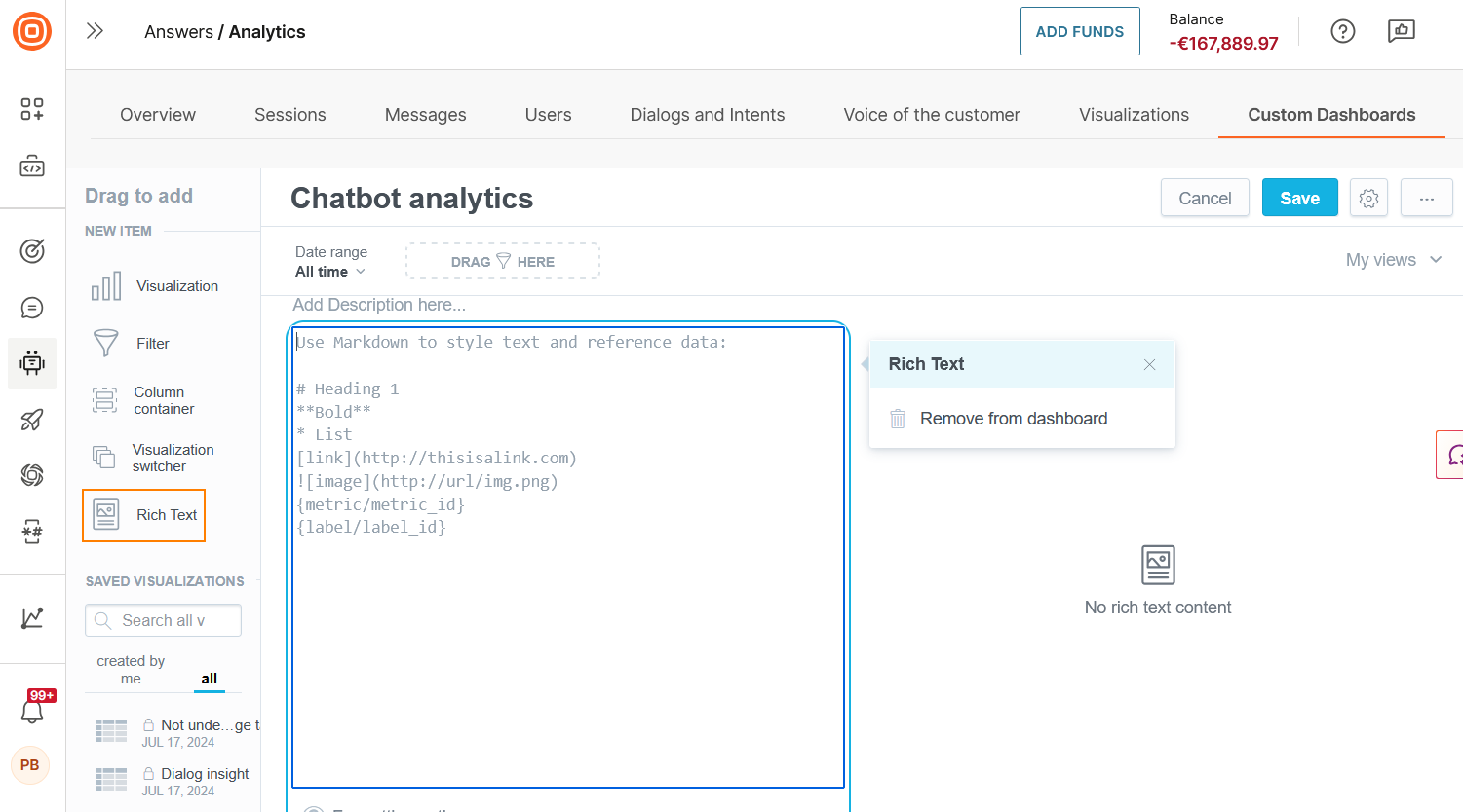
Rich text: Add rich text such as images, links, code blocks, lists, formatting, and text to your dashboard. Use markdown syntax to add this content.
-
Add titles and descriptions for each section.
-
(Optional) To configure or remove a visualization, select it to get the menu options, and then select Remove from dashboard.
-
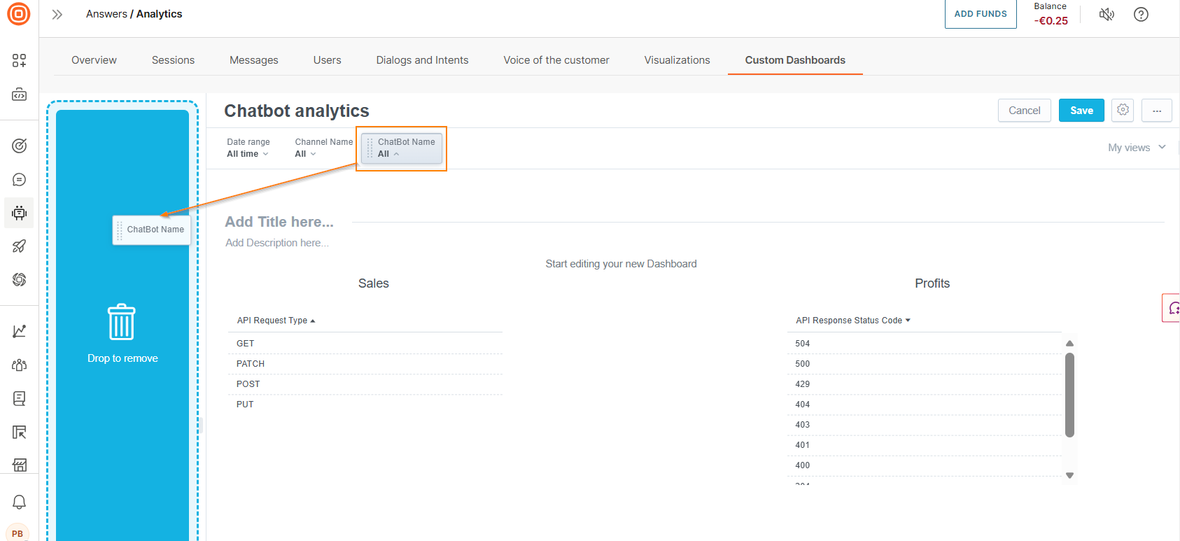
(Optional) To remove an attribute filter, select the item and drag it to the left.
-
Select Save.