Components
A component is a reusable block that does a specific task. It gets specific inputs, processes the input, and gives a structured output.
A component is built in Answers and uses the same building blocks as an Answers chatbot. So, it is a smaller version of a chatbot. It can be integrated into multiple solutions such as chatbots.
Example: Create separate components to do end user authentication, collect feedback, and answer FAQ, and use them across multiple Infobip solutions.
A component can only be used within a solution, such as a chatbot.
Advantages of components [#components-advantages]
Reusability: Some sections of the chatbot might be repeated, either in the same chatbot or in multiple chatbots. Instead of recreating the same section in multiple places, create a component and use it wherever required.
There is no limit to the number of times you can use a component either within the same solution or in multiple solutions.
Easier updates: If you need to make changes, update the component, not the solution in which it is used. The change is automatically applied wherever the component is used. This saves time and increases consistency.
Simpler maintenance and troubleshooting: Break down large tasks into multiple components. Each component focuses on a specific task, thus making it easy to maintain and troubleshoot.
Simpler solution design: Components help simplify the design of the solution. Example: Components can reduce the number of dialogs required in a chatbot.
Platform-independent: Components can be used across multiple Infobip solutions, such as Answers chatbots.
Supports collaboration: Because components are modular, different people can work on separate components at the same time. These components can then be added to the solution.
Use components with Infobip solutions [#use-with-infobip-solutions]
| Product | How to use | Example |
|---|---|---|
| Answers |
| Create components to do various tasks such as validating user information or providing the location of the nearest store. |
How components work [#how-components-work]
Process overview
- The component is created in Answers.
- An Infobip solution such as an Answers chatbot calls the component.
- The component receives the input values from the solution.
- The component processes the input and generates an output.
- The component returns the output values to the solution.
- The solution then either uses these values for further processing or shares with the end user.
Types of components [#component-types]
Components can be of the following types:
- Channel agnostic
- Channel specific
Channel agnostic
Channel agnostic components are not dependent on a specific communication channel. They can be used in any supported solution, regardless of the channel.
These components do not contain Send elements. So, they cannot send or receive messages. However, they can perform other types of processing.
Channel specific
Channel-specific components are designed for a specific communication channel. They can be used only in a supported solution that has the same channel as the component.
These components contain Send elements. So, they can send or receive messages.
Differences between chatbots and components [#differences-component-chatbot]
A component is a smaller version of a chatbot. The following are some differences between chatbots and components.
| Feature | Chatbot | Component |
|---|---|---|
| Ability to manage multiple tasks | Yes | Does a specific task |
| Supported elements | All chatbot elements | Does not support: |
| User-facing | Yes | No. Gets inputs from the solution and returns outputs to the solution. |
| Channel specific | Yes | Can be either channel specific or channel agnostic |
| Sender | Has a sender | No sender |
| Supports Intents, NER attributes, Custom data types | Yes | No |
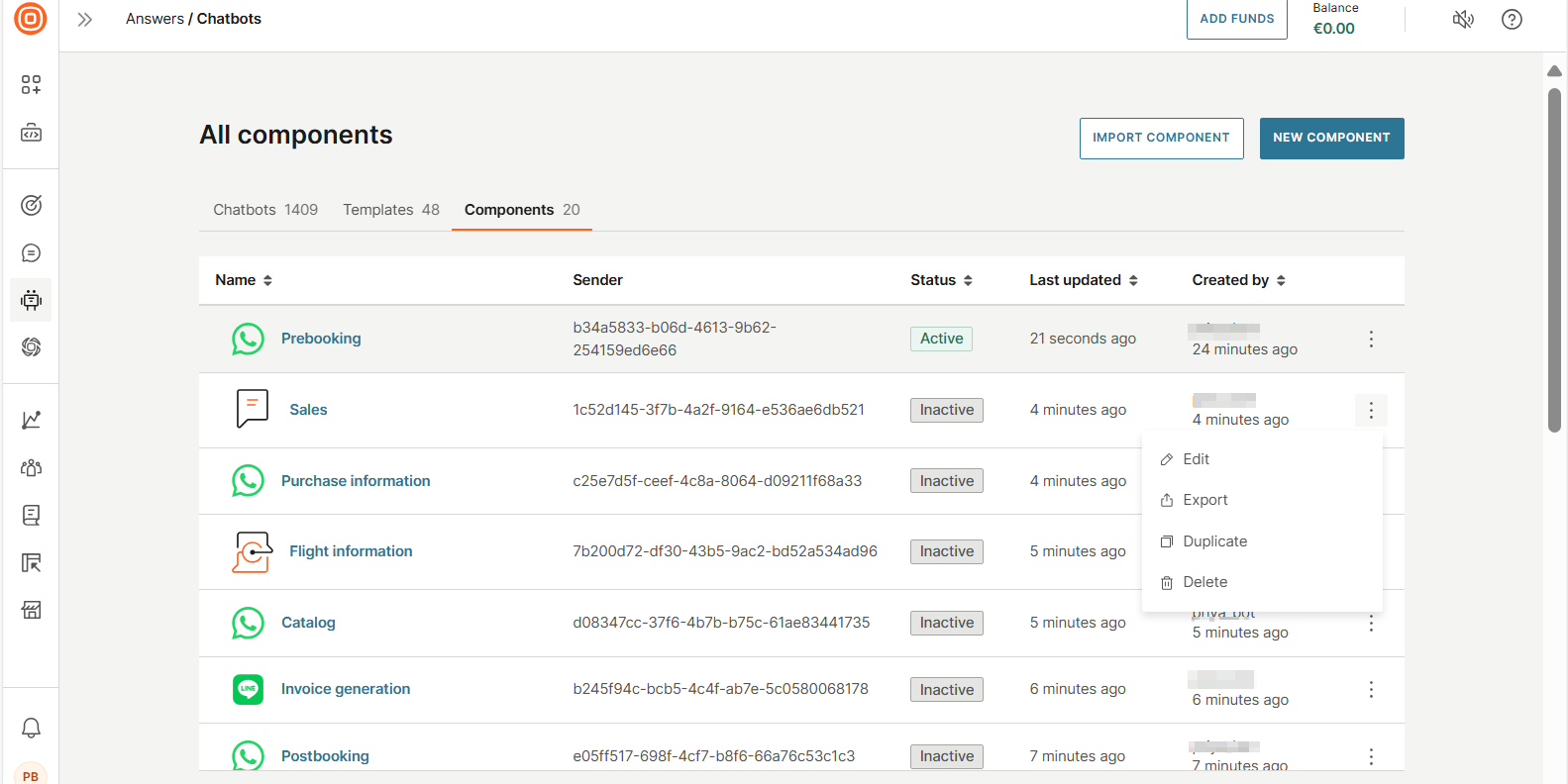
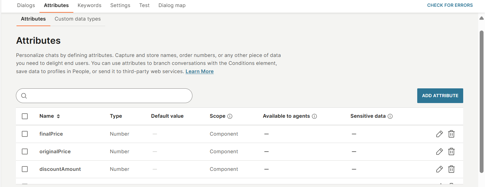
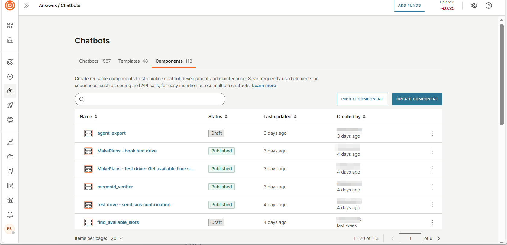
Components tab [#components-tab]
In the Chatbots > Components tab, you can view and manage all components.
You can do the following.
-
View a list of components. Each component shows the following information.
- Name: Name of the component.
- Status: Shows whether the component is in Published or Draft status.
- Last updated: The date the component was last updated.
- Created by: Name of the component creator and the date it was created.
-
Sort components. Select a column header to sort.
-
Import previously exported components, including their settings and setup.
-
Search for components. Use the Search box.
Create a component in Answers [#create-component]
Components are built in Answers. The process of creating a component is similar to that of building an Answers chatbot.
Process overview [#create-component-process-overview]
- Create a draft component by using one of the following ways:
- Create manually.
- Create from dialogs in an existing chatbot.
- Create input and output attributes for the component. The component gets the input from the chatbot and passes the output to it through these attributes.
- Design the component.
- Configure the settings.
- Test the component.
- Publish the component.
- Use the component in your chatbot.
Create a draft component manually [#create-draft-component-manually]
To create a draft component manually, do the following:
- On the Infobip web interface, go to Answers > Chatbots > Components tab.
- Select Create component.
- In the New component screen, complete the following fields.
-
Component name: Enter a unique name.
-
Channel
- To create a channel-specific component, select the required channel.
- To create a channel-agnostic component, select Any channel.
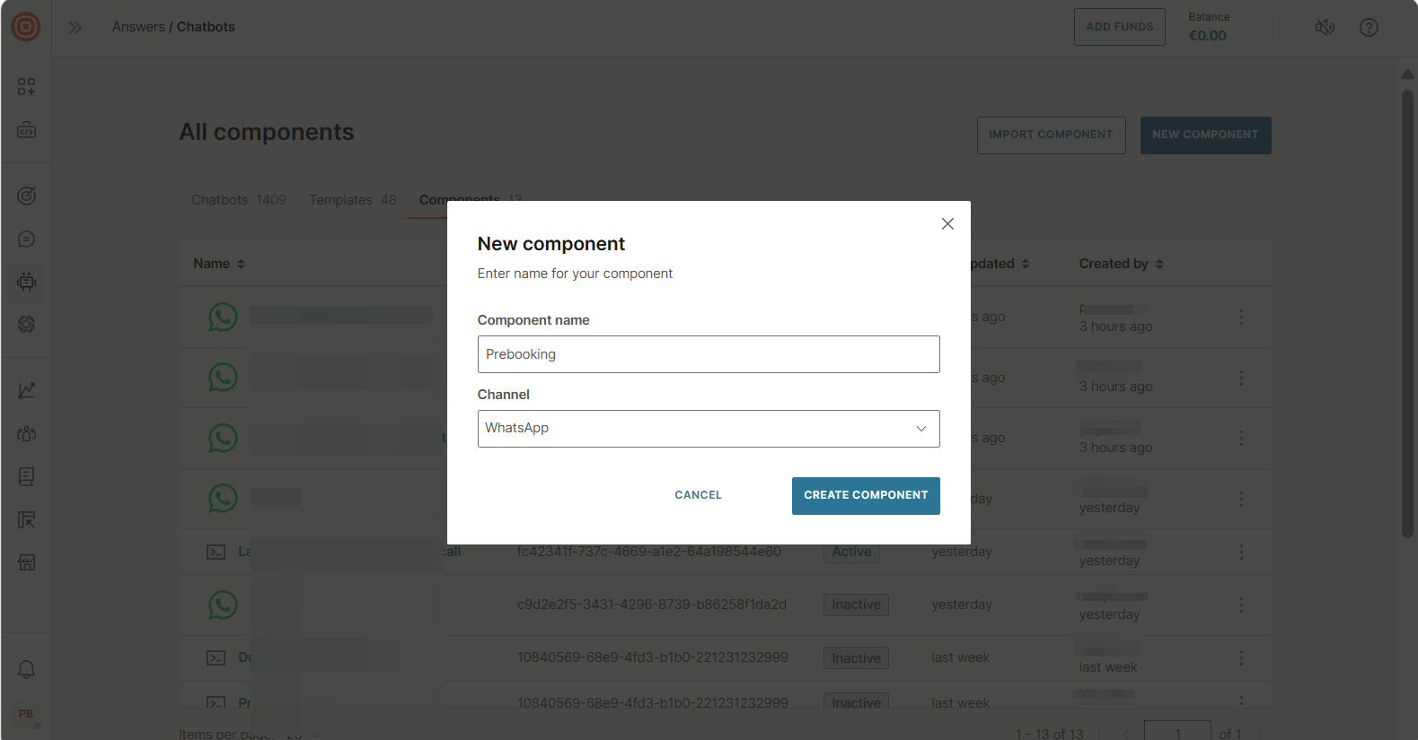
-
- Select Create component.
A new component is created and opens at the Dialogs tab. The Default dialog contains a Start dialog block.
Create a draft component from existing chatbot dialogs [#create-component-from-chatbot-dialogs]
Create a draft component by selecting specific dialogs and dialog groups in an existing chatbot.
What is included in the component
The component contains the following chatbot building blocks from the source chatbot.
- Dialogs: The dialogs and dialog groups that you select
Note
The Default dialog is not copied. The component has a new Default dialog that contains a Start block.
- Chatbot building blocks: The following are included if they are used in the selected dialogs. Any chatbot building blocks that are not used in these dialogs are not added to the template.
- Keywords and synonyms
- Attributes
- Settings: Any chatbot settings that are also applicable to components. Chatbot settings that are not available in components are not copied.
Create the draft component
-
On the Infobip web interface, go to Answers > Chatbots.
-
Open the chatbot from which you want to create the component.
-
Select one or more dialogs and dialog groups that you want to add to the component. To select all dialogs and dialog groups, use Select all.
-
Select Create component.
-
In the Create component screen, complete the following fields.
-
Component name: Enter a unique name.
-
Channel
-
If one or more of the selected dialogs contain channel-specific elements, you cannot change the channel. The component uses the same channel as the chatbot.
-
If none of the selected dialogs contain channel-specific elements, you can select a channel that is different from the chatbot.
- To create a channel-specific component, select the required channel.
Note
Currently, you can change only to WhatsApp, Live Chat, Messenger, or Telegram.
- To create a channel-agnostic component, select Any channel.
- To create a channel-specific component, select the required channel.
-
-
-
Select Create component.
A new draft component is created and opens at the Dialogs tab. The Default dialog contains a Start dialog block.
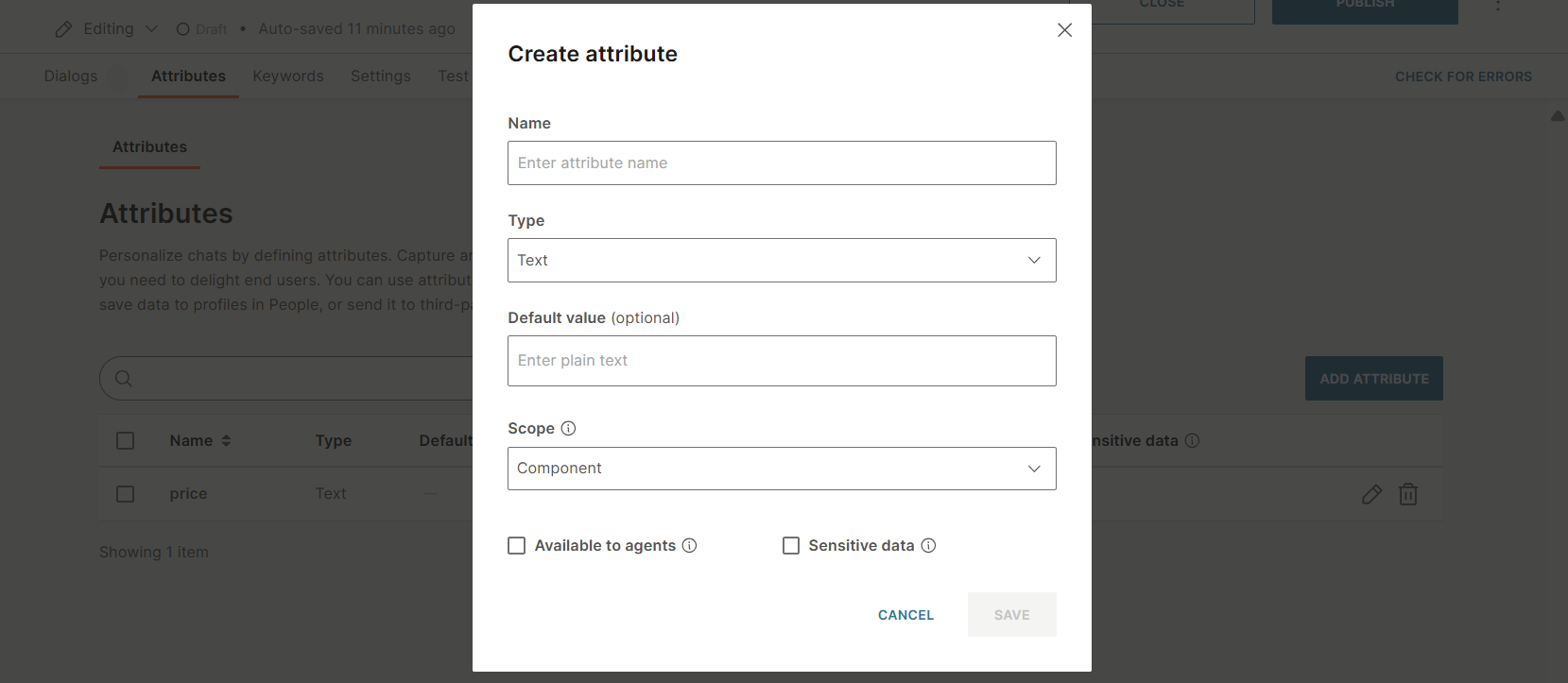
Create input and output attributes for the component [#create-component-create-attributes]
Components get inputs from the chatbot and return outputs to it.
In the Attributes tab, create the input and output attributes that are required for the component. Also, create any other attributes that are used by the component.
Do the following:
-
Select Add attribute.
-
In the Create attribute window, configure the following fields:
-
Name: Each attribute must have a unique name.
-
Type: Data type of the attribute.
-
Default value (Optional): Specify a default value for the attribute.
-
Scope: Select one of the following:
-
Dialog: The attribute value is specific to a dialog. If this attribute is used in other dialogs, the attribute value in those dialogs is either the default value or blank.
Example: The default value of the opt_in attribute is False. In a specific dialog, the opt_in attribute value changes to True. But in all other dialogs, the attribute still has the default value, False.
-
Component: The attribute value is the same across all dialogs in the component.
Example: The default value of the opt_in attribute is False. In a specific dialog, the opt_in attribute value changes to True. In all other dialogs, the attribute now has the value, True.
-
-
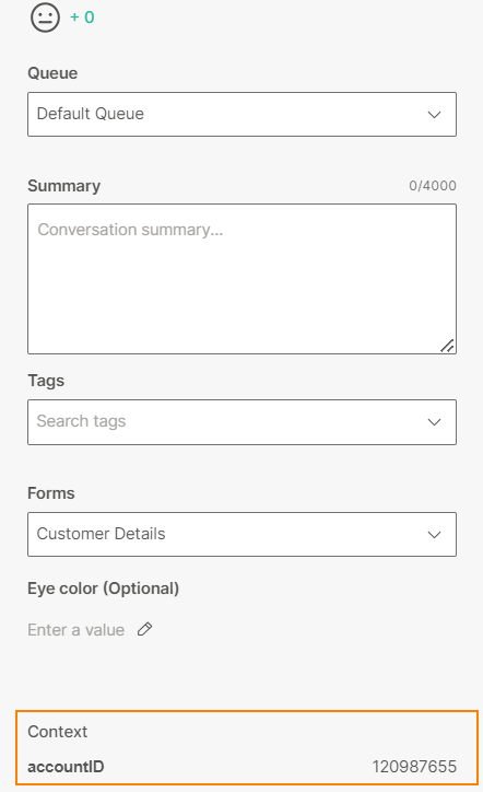
Available to agents: If you select this field, the attribute value is visible to an agent when the chat is transferred from the chatbot to an agent in Conversations. In Conversations, the attribute value is displayed in the context card of the conversation and the conversation history.
If you also select Sensitive data, the attribute value is displayed as a hashed value in Answers and Conversations.
To hide the attribute value from agents, deselect this field.
Example: For the accountId attribute, the Available to agents field is enabled. So, in Conversations, this attribute is displayed in the context card, as shown in the following image:
-
Sensitive data: If you select this field, the attribute value, including default value, is encrypted when it is stored in the database. It is displayed as hashed data in Answers and Conversations.
Example: The message is displayed as follows.
When this field is disabled: Your account balance is 2123.32.
When this field is enabled: Your account balance is ####.##.
Use this field if the attribute contains sensitive data. This setting is especially useful when chats are transferred to live agents.
This setting is applicable only for sensitive attributes that are present in outbound messages.
-
-
Select Save.
The attribute is listed in the Attributes tab.
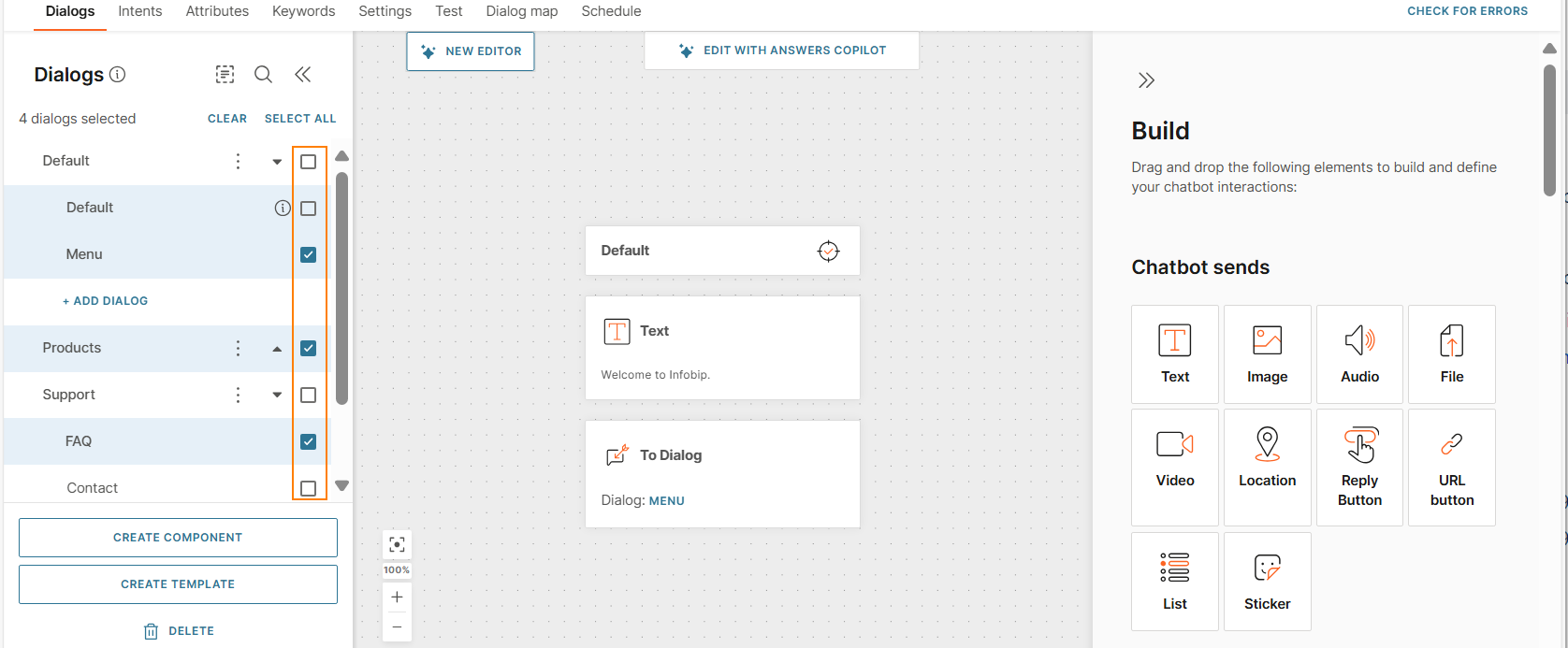
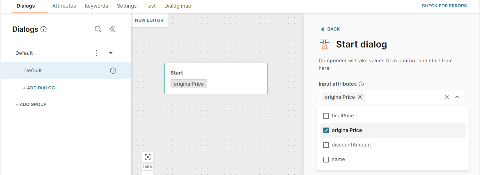
Design the component [#design-component]
Similar to a chatbot, components contain one or more dialogs. These dialogs work together to perform tasks.
The Default dialog is added automatically to the component. In addition to other dialog-related tasks, the Default dialog is used to get input values from the chatbot.
To design a dialog, do the following:
-
(Default dialog only) In the Default dialog > Start dialog block, select the required input attributes that you created.
-
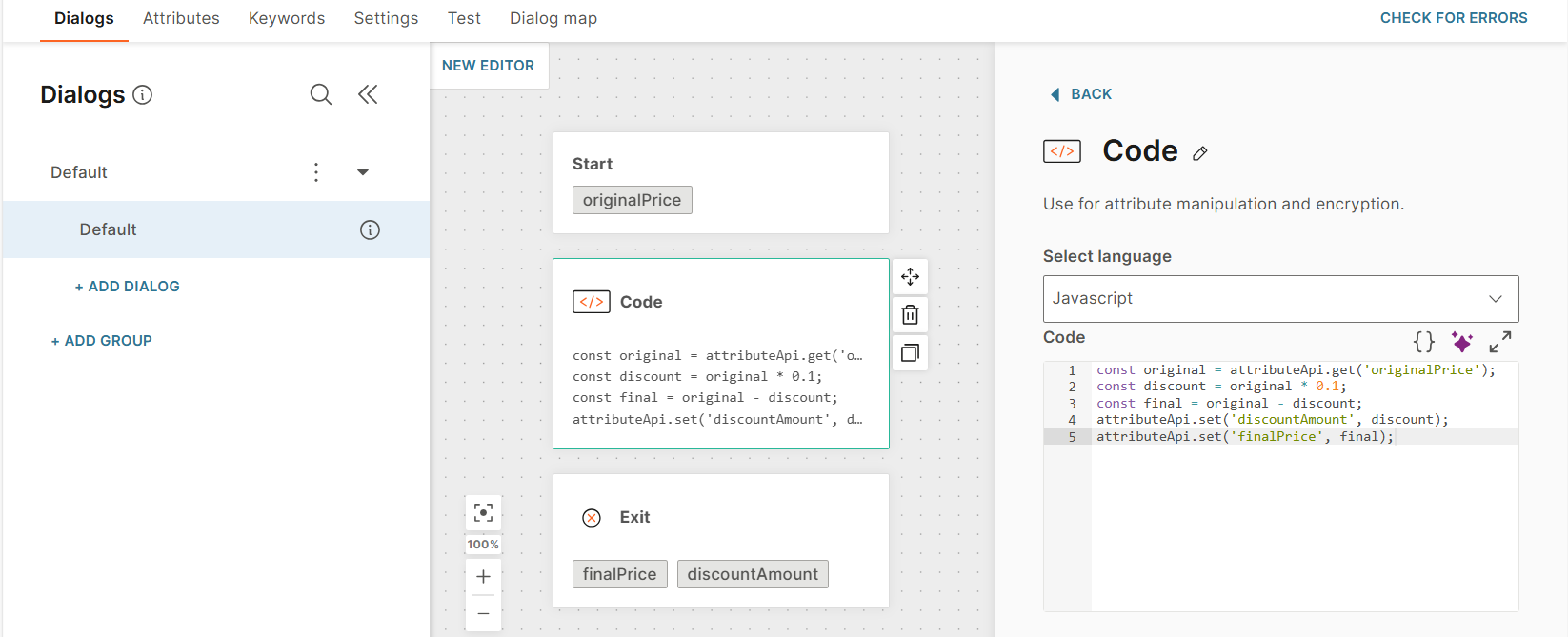
Add elements to configure the dialog as required.
-
At the end of the dialog, either add an Exit element or a To dialog element. Each dialog must have one of these elements.
The Exit element ends the component processing and passes the values of output attributes to the chatbot. So, add this element to the relevant dialogs.
-
In the Exit element, select the required output attributes.
NoteThe output attributes that you select are used across all Exit elements in the component. If you update the output attributes in one Exit element, the changes are applied to all Exit elements.
Configure the component settings [#create-chatbot-component-settings]
Configure the component settings.
Test the component [#create-component-test]
Test the component in the Test tab.
-
Go to the Test tab.
-
Enter the values of the input attributes.
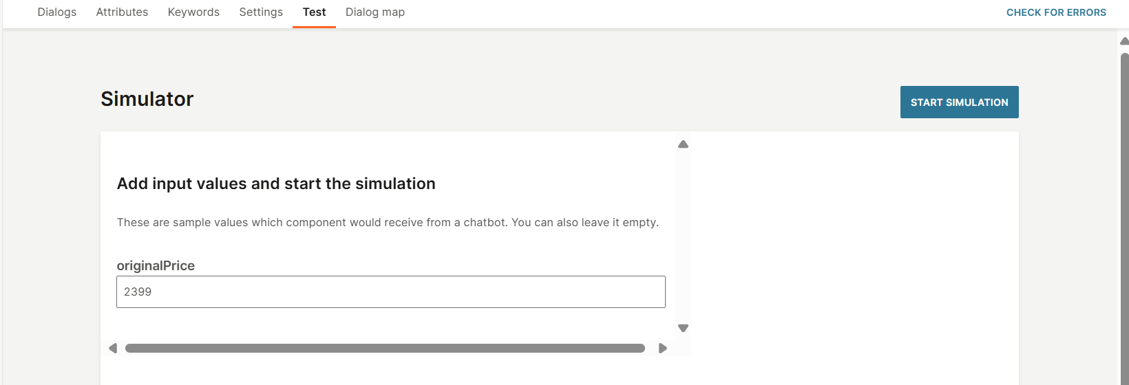
-
Select Start simulation.
-
Select a building block such as Dialog start to see the processing in the right-hand panel. Select Exit to see the values of the output attributes.
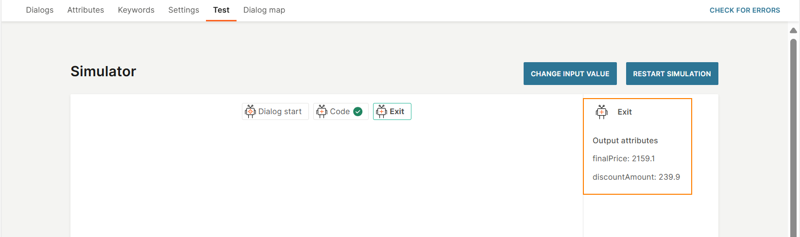
Restart the simulation
You can restart the simulation as follows:
- To use the same input values, select Restart simulation.
- To use different input values, select Change input value.
Publish the component [#component-publish]
Select Publish.
If there is an existing Published component with the same Component ID, that component is unpublished. The new component replaces the existing component in all solutions in which it is used.
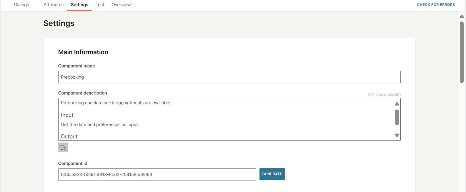
Component settings [#component-settings]
-
Component name: Use a unique name that describes the component.
-
Component description (Optional): Add a description for the component. Select the Text icon to use formatting, such as font size or headings.
-
Component ID: A component ID is created by default. You can update the ID either manually or automatically by selecting Generate.
-
Voice messages: Use voice functionality in your component.
This setting is applicable for channel-specific components that contain messaging elements.
-
Component timeout: Configure the duration that the component waits for either the result of its internal processing or a response from an API call. This field has a predefined value of 5 minutes.
-
Tracking and URL shortening: If your messages contain links (URLs), you can shorten URLs and track URL clicks.
Use a component in a solution [#use-component-in-solution]
- Create the component in Answers.
- Create Input and Output attributes in the component.
- In a supported solution such as an Answers chatbot, call the component.
- In the solution, provide the input to the component through the Input attributes.
- The component processes the input and generates an output.
- The component returns the output through Output attributes.
Use a component in an Answers chatbot [#use-component-in-chatbot]
-
In your chatbot, add the Component element.
-
In the element, select a component.
ImportantYou can only add a component that has the same channel as the chatbot.
The element shows the input and output attributes that are used in the selected component.
-
Enter the values of the input attributes.
-
Map the output attributes of the component to chatbot attributes.
-
Configure a fallback to manage errors. Example: Failure to call the component or component processing fails.
In such cases, the fallback action is triggered.
For more information, refer to the Fallback documentation.
-
Configure the chatbot to meet your use case and requirements.
-
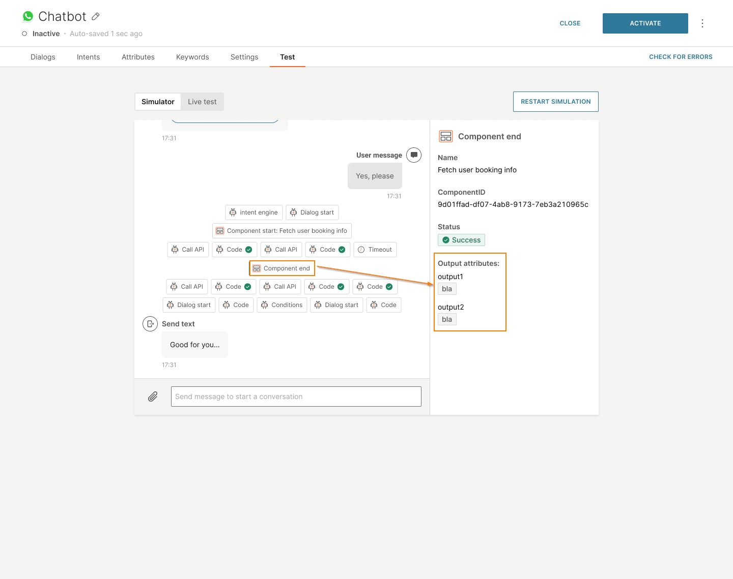
Test the functionality of the component in the Test > Simulator tab.
The Component start field shows the input for the component.
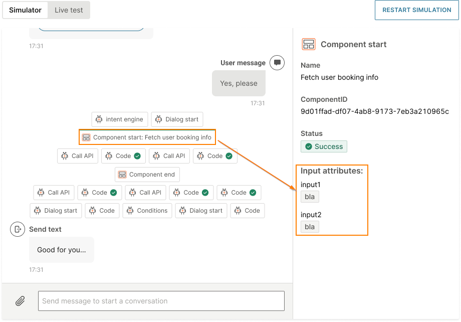
The other fields show the processing in the component.
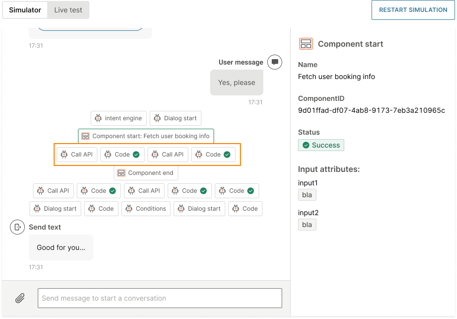
The Component end field shows the output from the component.
-
Activate the chatbot.
ImportantIf the selected component is deleted, you must either use a different component or remove the Component element before you activate the chatbot.
If the selected component has not been published, you must publish it before you can activate the chatbot.
Manage components [#manage-components]
Edit a component [#edit-component]
To edit a component, go to the Components tab. Select the three dots next to the component and select Edit.
Delete a component [#delete-component]
To delete a component, go to the Components tab. Select the three dots next to the component and select Delete.
Unpublish a component [#unpublish-component]
Unpublishing a component makes it unavailable to select in a solution. The status changes from Published to Draft.
Select Unpublish in the component.
You cannot unpublish a component that is used in an active solution. Either duplicate the component or remove it from all the solutions in which it is used.
Example: If the component is used in an active chatbot, deactivate the chatbot, remove or replace the component in the chatbot, and then activate the chatbot.
Duplicate a component [#duplicate-component]
If you want to create a new component that is similar to an existing component, use the Duplicate option. This reduces the time taken to create the component because you do not need to create it from scratch. You can then modify the duplicate component to meet your requirements.
To duplicate a component, follow these steps:
-
Go to the Components tab.
-
Do one of the following:
- Select the three dots next to the component and select Duplicate.
- Open the component and select Duplicate.
The component is now listed in the Components tab in Draft status.
-
In the duplicate component, do the following:
- Rename the component.
- If you want to replace the existing component in all solutions in which it is used, do not update the component ID.
- If you want to retain both the existing component and the new component, update the component ID.
- Make other changes to meet your requirements.
-
Select Publish.
If there is an existing Published component with the same Component ID, that component is unpublished. The new component replaces the existing component in all solutions in which it is used.
Select one of the following options:
-
Terminate sessions gracefully: The existing component continues processing until it finishes. The next time the component is called, the new component is used.
Select a Grace period. The minimum period is 10 minutes and the maximum is 24 hours. The default period is 24 hours.
-
Terminate sessions immediately: The existing component stops processing immediately. The next time the component is called, the new component is used.
-
-
Select Publish.
Export/Import a component [#export-import-component]
If you want to create a new component that is similar to an existing component, export the existing component and import it as a new component. You can then modify the imported component to meet your requirements.
Export-import reduces the time taken to create the component because you do not need to create it from scratch.
There is no limit to the number of times you can export-import a component.
Permissions [#export-import-permissions]
You do not need to have a specific user role to export a component. To import a component, you must have either the Manager or Designer role.
All Answers plans support export and import.
Export [#export-component]
Prerequisites
You can export a component only if it has been validated by Answers and is error-free. This reduces the possibility of errors when importing the component.
Guidelines
When you export a component, the following guidelines and conditions apply:
- Exported components are in a human-readable format. You can search the content and modify it to meet your requirements.
- Exported components retain the following:
- Attributes
- Dialogs
Export a component
To export a component, do the following:
- Go to the Components tab.
- Select the three dots next to the component that you want to export, and select Export.
The system checks if there are any errors in the component. If there are no validation errors, the file is exported and stored on your local device in .export format.
Import [#import-component]
Prerequisites
- The file that you want to import must be in .export format.
- If you import the component to a different account, the target account must support the channel used in the exported component. Example: If you export a WhatsApp component from Account A, you can import the component to Account B only if WhatsApp is enabled in Account B.
Guidelines
When you import a component, the following guidelines and conditions apply:
- You cannot change the channel when you import the component.
- You can import the component either as a new component in the same account or to a different account that supports the channel used in the exported component.
Import the component
- Go to the Components tab.
- Select Import component.
- Upload the required .export file.
- Select Import.
If the export file contains images, videos, or files, you can view the progress of the upload and can also cancel the upload.